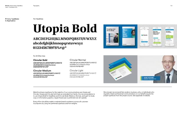
MetLife Visual Identity Guidelines Typography 5.3 Issue 1: December 2016 Primary Typefaces: For Headlines In Application Utopia Bold ABCDEFGHIJKLMNOPQRSTUVWXYZ abcdefghijklmnopqrstuvwxyz 0123456789?$%#@* For All Other Uses Circular Bold Circular Normal ABCDEFGHIJKLMNOPQRSTUVWXYZ ABCDEFGHIJKLMNOPQRSTUVWXYZ abcdefghijklmnopqrstuvwxyz abcdefghijklmnopqrstuvwxyz 0123456789?$%#@* 0123456789?$%#@* Circular Medium Circular Light ABCDEFGHIJKLMNOPQRSTUVWXYZ ABCDEFGHIJKLMNOPQRSTUVWXYZ abcdefghijklmnopqrstuvwxyz abcdefghijklmnopqrstuvwxyz 0123456789?$%#@* 0123456789?$%#@* NAME LASTNAME Business Title Goes Here MetLife primary typefaces for the majority of our communications are Utopia and We strongly recommend that vendors, business units, or individuals who Circular. Utopia and Circular both have an extended font family. Our recommendation is regularly create professional communications on our behalf acquire the to use Utopia Bold for headlines and Circular Bold, Medium, Normal, and Light for body proper typefaces from the proper source. See appendix for details. copy or information graphics. Upper/lowercase is preferred over all-capitals. Every effort should be made to maintain brand consistency across all customer touchpoints by using the preferred typefaces and font weights.
 MetLife Brand Book Page 32 Page 34