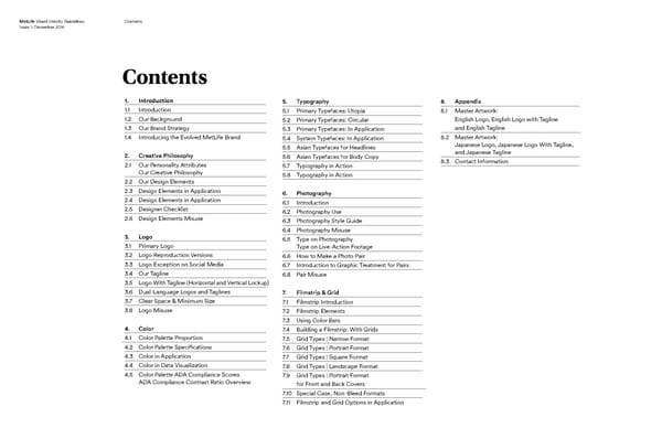
MetLife Visual Identity Guidelines Contents Issue 1: December 2016 Contents 1. Introduction 5. Typography 8. Appendix 1.1 Introduction 5.1 Primary Typefaces: Utopia 8.1 Master Artwork: 1.2 Our Background 5.2 Primary Typefaces: Circular English Logo, English Logo with Tagline 1.3 rand Strategy and English Tagline Our B 5.3 Primary Typefaces: In Application 1.4 Introducing the Evolved MetLife Brand 5.4 System Typefaces: In Application 8.2 Master Artwork: 5.5 Asian Typefaces for Headlines Japanese Logo, Japanese Logo With Tagline, 2. Creative Philosophy 5.6 Asian Typefaces for Body Copy and Japanese Tagline 2.1 Our Personality Attributes 5.7 Typography in Action 8.3 Contact Information Our Creative Philosophy 5.8 Typography in Action 2.2 Our Design Elements 2.3 Design Elements in Application 6. Photography 2.4 Design Elements in Application 6.1 Introduction 2.5 Designer Checklist 6.2 Photography Use 2.6 Design Elements Misuse 6.3 Photography Style Guide 6.4 Photography Misuse 3. Logo 6.5 Type on Photography 3.1 Primary Logo Type on Live-Action Footage 3.2 Logo Reproduction Versions 6.6 How to Make a Photo Pair 3.3 Logo Exception on Social Media 6.7 Introduction to Graphic Treatment for Pairs 3.4 Our Tagline 6.8 Pair Misuse 3.5 Logo With Tagline (Horizontal and Vertical Lockup) 3.6 Dual-Language Logos and Taglines 7. Filmstrip & Grid 3.7 Clear Space & Minimum Size 7.1 Filmstrip Introduction 3.8 Logo Misuse 7.2 Filmstrip Elements 7.3 Using Color Bars 4. Color 7.4 Building a Filmstrip: With Grids 4.1 Color Palette Proportion 7.5 Grid Types | Narrow Format 4.2 Color Palette Specifications 7.6 Grid Types | Portrait Format 4.3 Color in Application 7.7 Grid Types | Square Format 4.4 Color in Data Visualization 7.8 Grid Types | Landscape Format 4.5 Color Palette ADA Compliance Scores 7.9 Grid Types | Portrait Format ADA Compliance Contrast Ratio Overview for Front and Back Covers 7.10 Special Case, Non-Bleed Formats 7.11 Filmstrip and Grid Options in Application
 MetLife Brand Book Page 1 Page 3