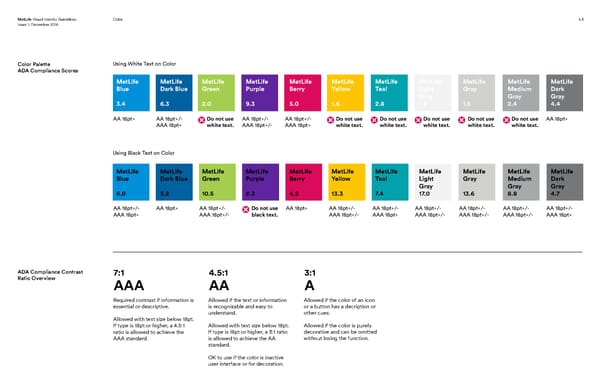
MetLife Visual Identity Guidelines ColorColor 4.5 Issue 1: December 2016 Color Palette Using White Text on Color ADA Compliance Scores MetLife MetLife MetLife MetLife MetLife MetLife MetLife MetLife MetLife MetLife MetLife Blue Dark Blue Green Purple Berry Yellow Teal Light Gray Medium Dark Gray Gray Gray 3.4 6.3 2.0 9.3 5.0 1.6 2.8 1.2 1.5 2.4 4.4 AA 18pt+ AA 18pt+/- Do not use AA 18pt+/- AA 18pt+/- Do not use Do not use Do not use Do not use Do not use AA 18pt+ AAA 18pt+ white text. AAA 18pt+/- AAA 18pt+ white text. white text. white text. white text. white text. Using Black Text on Color MetLife MetLife MetLife MetLife MetLife MetLife MetLife MetLife MetLife MetLife MetLife Blue Dark Blue Green Purple Berry Yellow Teal Light Gray Medium Dark Gray Gray Gray 6.0 3.2 10.5 2.3 4.2 13.3 7.4 17.0 13.6 8.8 4.7 AA 18pt+/- AA 18pt+ AA 18pt+/- Do not use AA 18pt+ AA 18pt+/- AA 18pt+/- AA 18pt+/- AA 18pt+/- AA 18pt+/- AA 18pt+/- AAA 18pt+ AAA 18pt+/- black text. AAA 18pt+/- AAA 18pt+ AAA 18pt+/- AAA 18pt+/- AAA 18pt+/- AAA 18pt+ ADA Compliance Contrast 7:1 4.5:1 3:1 Ratio Overview AAA AA A Required contrast if information is Allowed if the text or information Allowed if the color of an icon essential or descriptive. is recognizable and easy to or a button has a decription or understand. other cues. Allowed with text size below 18pt. If type is 18pt or higher, a 4.5:1 Allowed with text size below 18pt. Allowed if the color is purely ratio is allowed to achieve the If type is 18pt or higher, a 3:1 ratio decorative and can be omitted AAA standard. is allowed to achieve the AA without losing the function. standard. OK to use if the color is inactive user interface or for decoration.
 MetLife Brand Book Page 28 Page 30