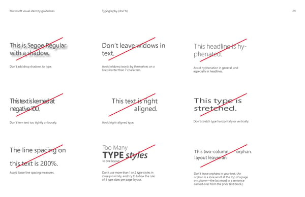
MicrMicrosoosofft visual identity guidelinest visual identity guidelines Typography (don’ts) 29 This is Segoe Regular Don’t leave widows in This headline is hy- with a shadow. text. phenated. Don’t add drop shadows to type. Avoid widows (words by themselves on a Avoid hyphenation in general, and line) shorter than 7 characters. especially in headlines. This text is kerned at This text is right This type is negative 100. aligned. stretched. Don’t kern text too tightly or loosely. Avoid right-aligned type. Don’t stretch type horizontally or vertically. The line spacing on Too Many This two-column orphan. TYPE styles layout leaves an this text is 200%. in one layout Avoid loose line spacing measures. Don’t use more than 1 or 2 type styles in Don’t leave orphans in your text. (An close proximity, and try to follow the rule orphan is a lone word at the top of a page of 3 type sizes per page layout. or column—the last word in a sentence carried over from the prior text block.)
 Microsoft Brand Book Page 31 Page 33