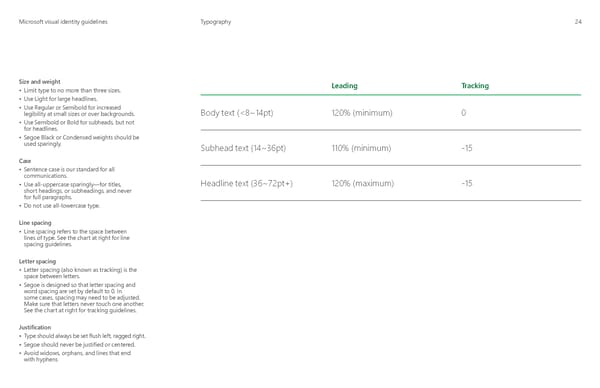
MicrMicrosoosofft visual identity guidelinest visual identity guidelines Typography 24 Size and weight Leading Tracking • Limit type to no more than three sizes. • Use Light for large headlines. • Use Regular or Semibold for increased Body text (<8~14pt) 120% (minimum) 0 legibility at small sizes or over backgrounds. • Use Semibold or Bold for subheads, but not for headlines. • Segoe Black or Condensed weights should be used sparingly. Subhead text (14~36pt) 110% (minimum) -15 Case • Sentence case is our standard for all communications. Headline text (36~72pt+) 120% (maximum) -15 • Use all-uppercase sparingly—for titles, short headings, or subheadings, and never for full paragraphs. • Do not use all-lowercase type. Line spacing • Line spacing refers to the space between lines of type. See the chart at right for line spacing guidelines. Letter spacing • Letter spacing (also known as tracking) is the space between letters. • Segoe is designed so that letter spacing and word spacing are set by default to 0. In some cases, spacing may need to be adjusted. Make sure that letters never touch one another. See the chart at right for tracking guidelines. Justification • Type should always be set flush left, ragged right. • Segoe should never be justified or centered. • Avoid widows, orphans, and lines that end with hyphens
 Microsoft Brand Book Page 26 Page 28