Netflix Brand Book
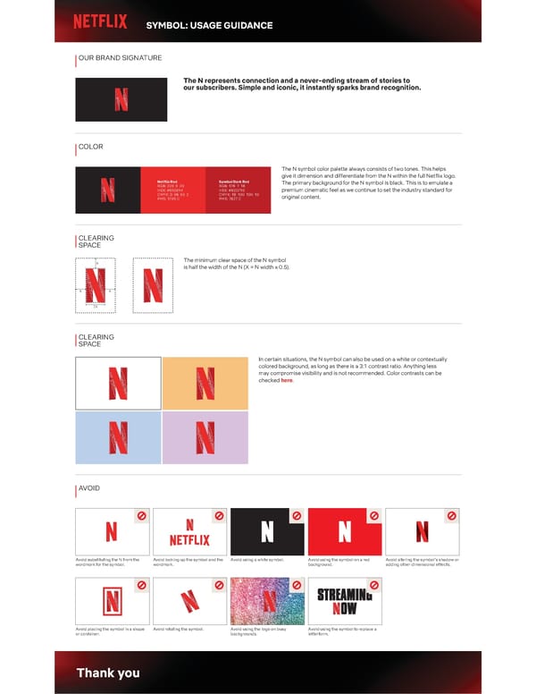
The document provides guidance on the usage of the Netflix 'N' symbol, detailing brand signature representation, color codes, clear space requirements, and incorrect usages to maintain brand recognition and consistency.
SYMBOL: USAGE GUIDANCE OUR BRAND SIGNATURE The N represents connection and a never-ending stream of stories to our subscribers. Simple and iconic, it instantly sparks brand recognition. COLOR The N symbol color palette always consists of two tones. This helps give it dimension and differentiate from the N within the full Netflix logo. Netflix Red Symbol Dark Red The primary background for the N symbol is black. This is to emulate a RGB: 229 9 20 RGB: 178 7 16 HEX: #E50914 HEX: #B20710 premium cinematic feel as we continue to set the industry standard for CMYK: 0 96 93 2 CMYK: 18 100 100 10 original content. PMS: 1795 C PMS: 7627 C CLEARING SPACE X The minimum clear space of the N symbol is half the width of the N (X = N width x 0.5). X X 2X CLEARING SPACE In certain situations, the N symbol can also be used on a white or contextually colored background, as long as there is a 3:1 contrast ratio. Anything less may compromise visibility and is not recommended. Color contrasts can be checked here. AVOID Avoid substituting the N from the Avoid locking up the symbol and the Avoid using a white symbol. Avoid using the symbol on a red Avoid altering the symbol9s shadow or wordmark for the symbol. wordmark. background. adding other dimensional effects. Avoid placing the symbol in a shape Avoid rotating the symbol. Avoid using the logo on busy Avoid using the symbol to replace a or container. backgrounds. letterform. Thank you
 Netflix Brand Book Page 2