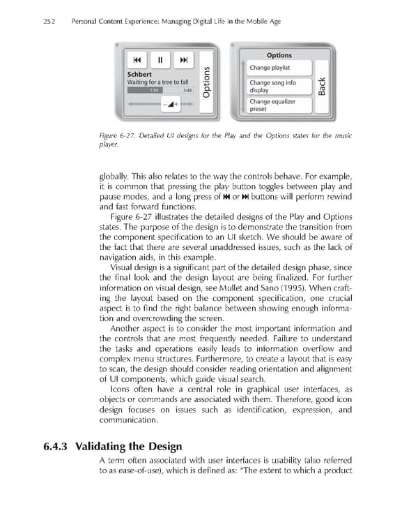
252 Personal Content Experience: Managing Digital Life in the Mobile Age Figure 6-27. Detailed UI designs for the Play and the Options states for the music player. globally. This also relates to the way the controls behave. For example, it is common that pressing the play button toggles between play and pause modes, and a long press of or buttons will perform rewind and fast forward functions. Figure 6-27 illustrates the detailed designs of the Play and Options states. The purpose of the design is to demonstrate the transition from the component specifi cation to an UI sketch. We should be aware of the fact that there are several unaddressed issues, such as the lack of navigation aids, in this example. Visual design is a signifi cant part of the detailed design phase, since the fi nal look and the design layout are being fi nalized. For further information on visual design, see Mullet and Sano (1995). When craft- ing the layout based on the component specifi cation, one crucial aspect is to fi nd the right balance between showing enough informa- tion and overcrowding the screen. Another aspect is to consider the most important information and the controls that are most frequently needed. Failure to understand the tasks and operations easily leads to information overfl ow and complex menu structures. Furthermore, to create a layout that is easy to scan, the design should consider reading orientation and alignment of UI components, which guide visual search. Icons often have a central role in graphical user interfaces, as objects or commands are associated with them. Therefore, good icon design focuses on issues such as identifi cation, expression, and communication. 6.4.3 Validating the Design A term often associated with user interfaces is usability (also referred to as ease-of-use), which is defi ned as: “The extent to which a product
 Personal Content Experience Page 275 Page 277