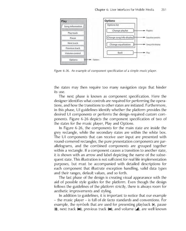
Chapter 6: User Interfaces for Mobile Media 251 Figure 6-26. An example of component specifi cation of a simple music player. the states may then require too many navigation steps that hinder its use. The next phase is known as component specifi cation. Here the designer identifi es what controls are required for performing the opera- tions, and how the transitions to other states are initiated. Furthermore, in this phase, UI guidelines identify whether the platform provides the desired UI components or performs the design-required custom com- ponents. Figure 6-26 depicts the component specifi cation of two of the states for the music player, Play and Options. In Figure 6-26, the components for the main state are inside the grey rectangle, while the secondary states are within the white box. The UI components that can receive user input are presented with round-cornered rectangles, the pure presentation components are par- allelograms, and the combined components are grouped together within a rectangle. If a component causes a transition to another state, it is shown with an arrow and label depicting the name of the subse- quent state. This illustration is not suffi cient for real life implementation purposes, but must be accompanied with detailed descriptions for each component that illustrate exception handling, valid data types and their ranges, default values, and so forth. The last phase of the design is creating visual appearance with the aid of possible style guides for the platform. Even though the design follows the guidelines of the platform strictly, there is always room for aesthetic improvements and styling. In addition to guidelines, it is important to notice that our example – the music player – is full of de facto standards and conventions. For example, the symbols that are used for presenting playback ( ), pause ( ), next track ( ), previous track ( ), and volume ( ), are well known
 Personal Content Experience Page 274 Page 276