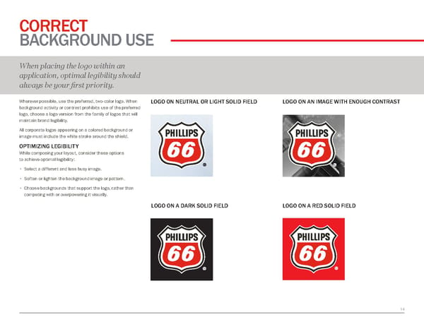
1 4 CORRECT BACKGROUND USE When placing the logo within an application, optimal legibility should always be your first priority. Wherever possible, use the preferred, two-color logo. When background activity or contrast prohibits use of the preferred logo, choose a logo version from the family of logos that will maintain brand legibility. All corporate logos appearing on a colored background or image must include the white stroke around the shield. OPTIMIZING LEGIBILITY While composing your layout, consider these options to achieve optimal legibility: • S elect a different and less busy image. • S often or lighten the background image or pattern. • C hoose backgrounds that support the logo, rather than competing with or overpowering it visually. LOGO ON NEUTRAL OR LIGHT SOLID FIELD LOGO ON AN IMAGE WITH ENOUGH CONTRAST LOGO ON A DARK SOLID FIELD LOGO ON A RED SOLID FIELD
 Phillips66 Brand Book Page 13 Page 15