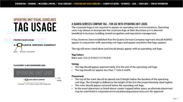
INTRODUCTION / BRANDING / MESSAGING & WRITING / VISUAL GUIDELINES / OPERATING UNIT VISUAL GUIDELINES / ELEMENTS OF DESIGN / RESOURCES / LEGAL / QUICK LINKS / CONTACT INFORMATION OPERATING UNIT VISUAL GUIDELINES A QUANTA SERVICES COMPANY TAG – FOR USE WITH OPERATING UNIT LOGOS. The corporate logo is not required to appear on operating unit communications. Operating TAG USAGE units may choose to incorporate the corporate logo at their discretion as it is deemed beneficial to business building, brand recognition and reputation management. PROPER COLOR USAGE: It has, however, been established that the Quanta Services Company tag/mark should ALWAYS appear in conjunction with operating unit logos and appear anywhere that logo appears. The tag will never stand alone and should always appear with an operating unit logo. Black Pantone® 1235 yellow Tag Colors Black and 1235 (C/0 M/27.5 Y/76 K/0) PLACEMENT & RECOMMENDED SIZE: Sizing • The tag should appear approximately 35% the size of the operating unit logo. OPERATING UNIT LOGO • The tag should not appear less than 1” inch in width. Placement 1 “Q” • The top of the mark should be placed one Q height below the baseline of the operating Height unit logo. The Q height is defined as the height of the Q in the proportionately sized tagline. Centered, 1 1/2” inches, at least 35% of logo size • The mark should appear centered below the operating unit logo. • In the event placement as listed above creates trapped white space, an alternate placement may be submitted to corporatecommunications@quantaservices.com for approval. PAGE 17
 Quanta Services Brand Book Page 16 Page 18