RELAYTO/ Call-to-Action Best Practices
Guide | 9 pages
RELAYTO/ Best Practices for Call-to-Actions EXPLORE A guide on how to best incorporate call-to-actions for your RELAYTO experiences to increase engagement with your content.
CONTENTS Call-to-Actions Adding Animations 1 5 Ideas & Examples Embeds & Popups 2 6 Adding to Navigation Internal Navigation 3 7 Personalized Call-to-Actions 4
Call-to-Actions Call-to-actions are valuable assets because they provide more opportunities for viewers to engage with your content. Instead of having your audience glaze over information on static PDFs & PowerPoints, include call-to-actions to prompt interaction & increase engagement.
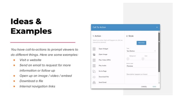
Ideas & Examples You have call-to-actions to prompt viewers to do different things. Here are some examples: ● Visit a website ● Send an email to request for more information or follow up ● Open up an image / video / embed ● Download a file ● Internal navigation links
Watch Video Tutorial Adding to Navigation A good place to put a call-to-action is in your RELAYTO document’s navigation. The navigation is easily accessible, so your call-to-action will not be missed & will likely be clicked on. You are able to include a call-to-action in different navigation layouts, including top menu & sidebar outline.
Wrong Default shares, fonts, no highlight Personalized CONTACT US LEARN MORE Call-to-Actions EXPLORE Another way to incorporate call-to-actions is adding them directly onto the pages of your Right content as images. When creating your own Rounded corners, Gradients, Shadows call-to-actions, make them feel like Web buttons, rather than an average PowerPoint shape. They need whitespace, color & size LEARN MORE CONTACT US contrast to generate desired behaviors. EXPLORE
Wrong Lack of contrast, low legibility Creating visual engagement As a graphical equivalent to the closing line, well designed CTA can have a huge impact Right on the engagement. To make them stand Contrasting colours, rounded corners out, use contrasting colours that will fit within the colour scheme. Clickability can be suggested through the use of elongated shapes with round corners- a shape that is associated to be a ‘’button’’.
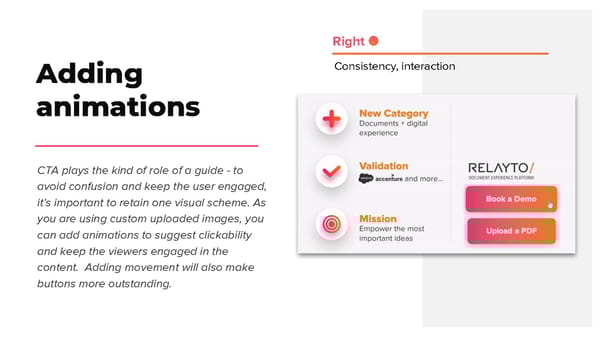
Right Consistency, interaction Adding animations CTA plays the kind of role of a guide - to avoid confusion and keep the user engaged, it’s important to retain one visual scheme. As you are using custom uploaded images, you can add animations to suggest clickability and keep the viewers engaged in the content. Adding movement will also make buttons more outstanding.
Embeds & Popups Call-to-actions can be used to include additional information & content without making your page more dense. In other words, you can creating a digestible page of heavy information. For example, you can place an icon that will show a popup with text on hover or open an embed (i.e YouTube video, image, article) on click.
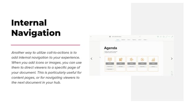
Internal Navigation Another way to utilize call-to-actions is to add internal navigation to your experience. When you add icons or images, you can use them to direct viewers to a specific page of your document. This is particularly useful for content pages, or for navigating viewers to the next document in your hub.