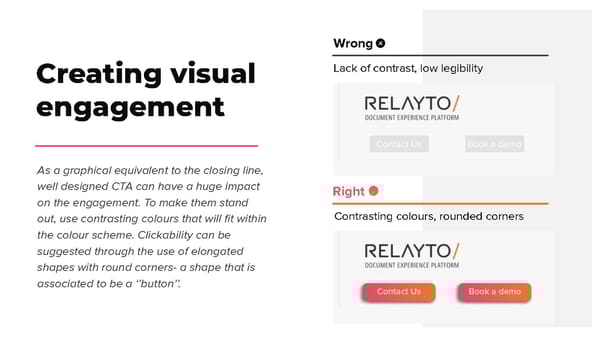
Wrong Lack of contrast, low legibility Creating visual engagement As a graphical equivalent to the closing line, well designed CTA can have a huge impact Right on the engagement. To make them stand Contrasting colours, rounded corners out, use contrasting colours that will fit within the colour scheme. Clickability can be suggested through the use of elongated shapes with round corners- a shape that is associated to be a ‘’button’’.
 RELAYTO/ Call-to-Action Best Practices Page 6 Page 8