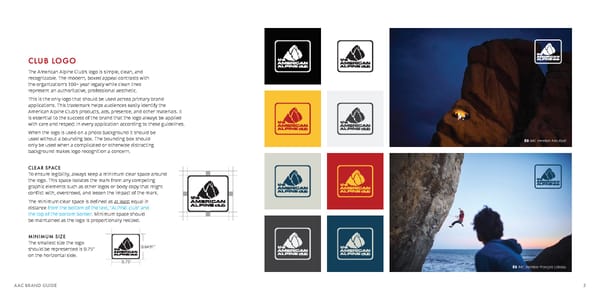
CLUB LOGO The American Alpine Club’s logo is simple, clean, and recognizable. The modern, boxed appeal contrasts with the organization’s 100+ year legacy while clean lines represent an authoritative, professional aesthetic. This is the only logo that should be used across primary brand applications. This trademark helps audiences easily identify the American Alpine Club’s products, ads, presence, and other materials. It is essential to the success of the brand that the logo always be applied with care and respect in every application according to these guidelines. When the logo is used on a photo background it should be used without a bounding box. The bounding box should a AAC member Ken Etzel only be used when a complicated or otherwise distracting background makes logo recognition a concern. CLEAR SPACE To ensure legibility, always keep a minimum clear space around the logo. This space isolates the mark from any competing graphic elements such as other logos or body copy that might conflict with, overcrowd, and lessen the impact of the mark. The minimum clear space is defined as at least equal in distance from the bottom of the text, “ALPINE club” and the top of the bottom border. Minimum space should be maintained as the logo is proportionally resized. MINIMUM SIZE The smallest size the logo 0.6491” should be represented is 0.75” on the horizontal side. 0.75” a AAC member François Lebeau AAC BRAND GUIDE 3
 The American Alpine Club Brand Book Page 3 Page 5