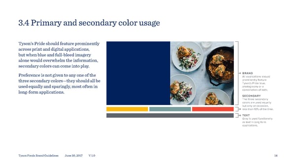
3.4 Primary and secondary color usage Tyson’s Pride should feature prominently across print and digital applications, but when blue and full-bleed imagery alone would overwhelm the information, secondary colors can come into play. Preference is not given to any one of the BRAND All applications should three secondary colors—they should all be prominently feature Tyson’s Pride blue, used equally and sparingly, most often in photography or a long-form applications. combination of both. SECONDARY The three secondary colors are used equally but only on occasion, less than 10% of the time. TEXT Gray is used functionally as text in long form applications. Tyson Foods Brand Guidelines June 30, 2017 V 1.0 14
 Tyson Foods Brand Book Page 13 Page 15