Uber Brand Book
Uber Technologies, Inc. is an American mobility as a service provider, allowing users to book a car and driver to transport them in a way similar to a taxi.
Uber Brand Guidelines
Brand system quick guide October 2018
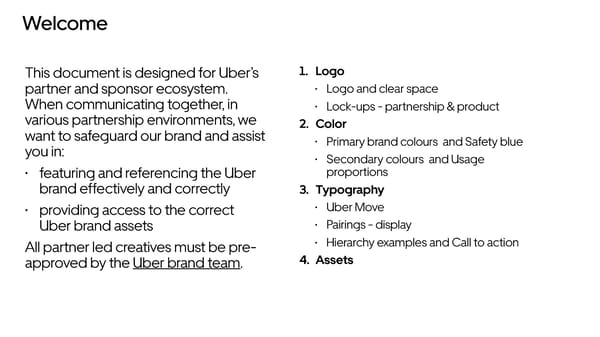
Welcome This document is designed for Uber’s 1. Logo partner and sponsor ecosystem. • Logo and clear space When communicating together, in • Lock-ups - partnership & product various partnership environments, we 2. Color want to safeguard our brand and assist • Primary brand colours and Safety blue you in: • Secondary colours and Usage • featuring and referencing the Uber proportions brand effectively and correctly 3. Typography • providing access to the correct • Uber Move Uber brand assets • Pairings - display All partner led creatives must be pre- • Hierarchy examples and Call to action approved by the Uber brand team. 4. Assets
Logo Logo Logo should be white on darker backgrounds and black on lighter backgrounds. Clearspace Clearspace around the logo is equal to the cap height of the U.
Logo Vertical lockup Horizontal lockup Product lockup Spacing and alignment guidance for aligning product names with the logo. Partnership lockup Horizontal Lockup Aligning partnership logos should follow clear space rules. The separating line between logos can be created either by the vertical line glyph in the Uber Move Display Light at the same size as the logo.
Color White Black RGB — 255 255 255 RGB — 0 0 0 CMYK — 0 0 0 0 CMYK — 70 35 40 100 HEX — FFFFFF HEX — 000000 PMS — White PMS — Black 6 C Primary brand colors Our primary brand colors are white and black. They are used to provide accessibility, simplicity, and consistency throughout all brand communications. Safety Blue Safety blue is an important color that is unique to Uber and should be used sparingly for moments of support, assurance, and delight at moments of interaction between a user and the brand. Safety Blue RGB — 39 110 241 CMYK — 84 54 0 0 HEX — 276EF1 PMS — 2174 C
Color Uber Green Uber Yellow Uber Red Uber Brown Uber Orange Uber Purple RGB — 71 179 117 RGB — 255 192 67 RGB — 230 76 53 RGB — 153 100 77 RGB — 255 125 73 RGB — 115 86 191 CMYK — 93 0 63 0 CMYK — 0 21 76 0 CMYK — 0 82 80 0 CMYK — 13 56 61 32 CMYK — 79 59 0 0 CMYK — 80 74 0 0 HEX — 47B275 HEX — FFC043 HEX — F25138 HEX — 99644C HEX — FF7D49 HEX — 7356BF PMS — 2416 C PMS — 135 C PMS — 7417 C PMS — 7525 C PMS — 164 C PMS — 2102 C Secondary colors Our secondary colors pull from the colors of transportation. They should be used sparingly throughout illustration, photography, and product in order to maintain meaning and potency. The secondary colors are only used reasonably for illustrations and within product. Usage proportions Primary colors It is important to follow the rules of these proportions when creating any brand communication in order to maintain brand consistency and remain accessible for all people. White plays a very important role in all Safety color brand communications and should provide balance with black. Safety Blue is only used for critical Secondary colors moments that warrant care between Uber and the user.
Typography Uber Move Display Uber Move Text Uber Move Light Light Uber Move is a key element in our brand. Regular Regular It works to maintain consistency, create clarity, and provide equity to the brand as a global leader in multi-modal Medium Medium transportation. We have Uber Move Display used for Bold Bold headlines and sub headlines and Uber Move Text used for body copy. Pairings – Display Option 1 Option 2 It is important to maintain these type pairings. This allows for clarity, consistency, and a strong hierarchy Medium Bold for all communications. Medium weight should be paired with Header Header Light weight, and Bold weight should be paired with Regular weight. Light Regular Subhead Subhead
Typography Headline Uber Move Display Medium This headline is two 6 words or more 1.5x logo point size (minimum) 1.0 leading Hierarchy example 0 tracking lines set in medium It is important to organize typography Subhead This subhead is 1/2 the point size in a hierarchical system according to Uber Move Display Light relative importance or inclusiveness ½ headline of the headline and set to light through scale and function depending 1.2 leading on communication. 0 tracking Logo Logo height = composition margin width Calls to action There are 2 ways to create and Action Button identify call-to-actions for brand communications. Use Uber Move Text Bold for Action and Uber Inactive Move Display Bold for Buttons. Hover/Active
Assets Logo Assets https://drive.google.com/drive/u/1/folders/14J25RrgKwMqToxhd9AhlU-bd3V7f64jg Logo Product Lockups https://drive.google.com/open?id=1j6kZFsOMZ2WJBBxLT9ia2f0fJJpHIwLR Logo Partnership Lockups https://drive.google.com/open?id=1eiIw-EBtCsRZIoBR22BWGWlC8hp5wlQL Color Assets https://drive.google.com/open?id=1MAytoi_UW_YX24RgeyZKcLTIeYurCBY4 Typography Assets https://drive.google.com/open?id=1oKKGpzCmQUyuEVao_Hx4GsZS6TLs94hT
Thank you.