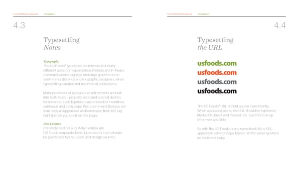
US FOODS® BRAND GUIDELINES TYPOGRAPHY US FOODS® BRAND GUIDELINES TYPOGRAPHY 4.3 4.4 Typesetting Typesetting Notes the URL Typography usfoods.com ® The US Foods typefaces are intended for many different uses: correspondence, memos and in-house usfoods.com communications; signage and large graphics to be seen from a distance and for graphic designers, when usfoods.com typesetting external and key internal publications. usfoods.com Many professional typographic refinements are built into both faces – properly sized and spaced dashes, for instance. Each typeface can be used for headlines, ® subheads and body copy. We recommend that you set The US Foods URL should appear consistently. your copy as uppercase and lowercase, flush left, rag When appearing alone, the URL should be typeset in right (just as you see it on this page). Myriad Pro Black and tracked -50. Use this lock-up Font Licenses whenever possible. Chronicle Text G1 and Aktiv Grotesk are As with the US Foods brand name itself, if the URL US Foods corporate fonts. Licenses for both should appears in a line of copy, typeset in the same typeface be purchased by US Foods and design partners. as the line of copy.
 US Foods Brand Book Page 17 Page 19