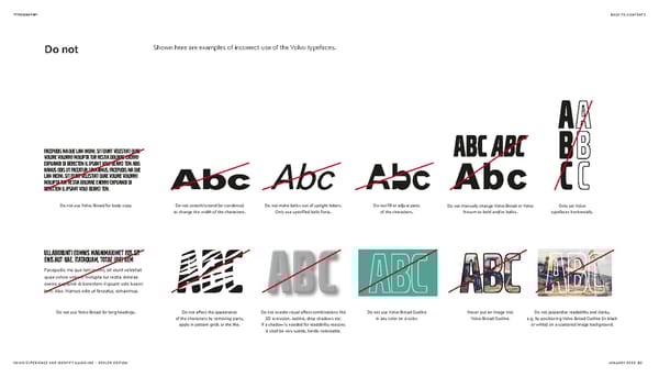
TYPOGRAPHY BACK TO CONTENTS Do not Shown here are examples of incorrect use of the Volvo typefaces. Facepudis ma que lam incimi, sit eiunt velestiat quae volore volorro molupta tur restia dolorae exerro expliandi di berectem il ipsant volo bearci tem. Abo. Namus odis ut faceatur, simaximus. Facepudis ma que lam incimi, sit eiunt velestiat quae volore volorro molupta tur restia dolorae exerro expliandi di berectem il ipsant volo bearci tem. Do not use Volvo Broad for body copy. Do not stretch/extend (or condense) Do not make italics out of upright letters. Do not fill or adjust parts Do not manually change Volvo Broad or Volvo Only set Volvo to change the width of the characters. Only use specified italic fonts. of the characters. Novum to bold and/or italics. typefaces horizontally. Ullaborunti comnis magnimaximet eos sit enis aut rae. Itataquam, totae ipici rem Facepudis ma que lam incimi, sit eiunt velestiat quae volore volorro molupta tur restia dolorae exerro expliandi di berectem il ipsant volo bearci tem. Abo. Namus odis ut faceatur, simaximus. Do not use Volvo Broad for long headings. Do not affect the appearance Do not overdo visual effect combinations like Do not use Volvo Broad Outline Never put an image into Do not jeopardize readability and clarity, of the characters by removing parts, 3D extrusion, outline, drop shadows etc. in any color on a color. Volvo Broad Outline. e.g. by positioning Volvo Broad Outline (in black apply in pattern grids or the like. If a shadow is needed for readability reasons or white) on a scattered image background. it shall be very subtle, hardly noticeable. VOLVO EXPERIENCE AND IDENTITY GUIDELINE – DEALER EDITION JANUARY 2022 20
 Volvo Brand Book Page 19 Page 21