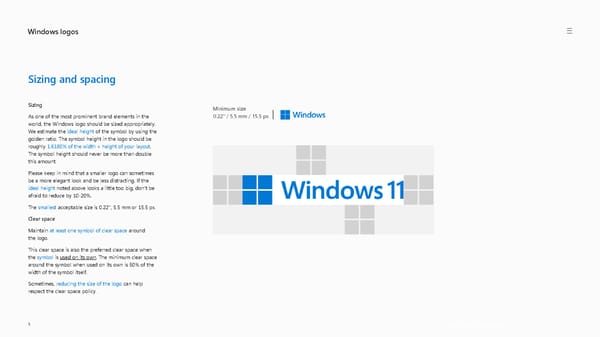
Windows logos Get the Windows logo > 5 Sizing and spacing Sizing As one of the most prominent brand elements in the world, the Windows logo should be sized appropriately. We estimate the ideal height of the symbol by using the golden ratio. The symbol height in the logo should be roughly 1.6180% of the width + height of your layout . The symbol height should never be more than double this amount. Please keep in mind that a smaller logo can sometimes be a more elegant look and be less distracting. If the ideal height noted above looks a little too big, don’t be afraid to reduce by 10 -20%. The smallest acceptable size is 0.22’’, 5.5 mm or 15.5 px . Clear space Maintain at least one symbol of clear space around the logo. This clear space is also the preferred clear space when the symbol is used on its own . The minimum clear space around the symbol when used on its own is 50% of the width of the symbol itself. Sometimes, reducing the size of the logo can help respect the clear space policy. Minimum size 0.22’’ / 5.5 mm / 15.5 px
 Windows Brand Book Page 4 Page 6