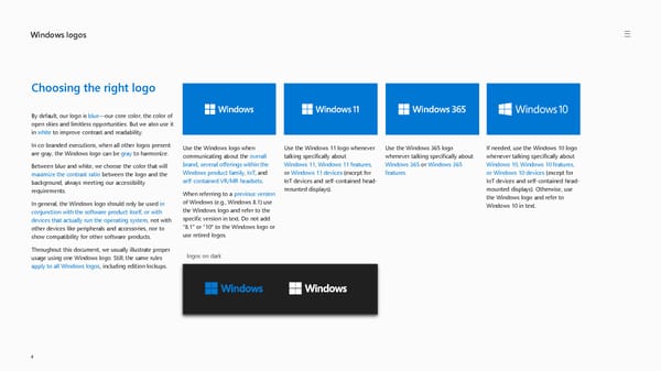
Windows logos 4 logos on dark Choosing the right logo By default, our logo is blue —our core color, the color of open skies and limitless opportunities. But we also use it in white to improve contrast and readability. In co-branded executions, when all other logos present are gray, the Windows logo can be gray to harmonize. Between blue and white, we choose the color that will maximize the contrast ratio between the logo and the background, always meeting our accessibility requirements. In general, the Windows logo should only be used in conjunction with the software product itself, or with devices that actually run the operating system , not with other devices like peripherals and accessories, nor to show compatibility for other software products. Throughout this document, we usually illustrate proper usage using one Windows logo. Still, the same rules apply to all Windows logos , including edition lockups. Use the Windows logo when communicating about the overall brand , several offerings within the Windows product family , IoT , and self -contained VR/MR headsets . When referring to a previous version of Windows (e.g., Windows 8.1) use the Windows logo and refer to the specific version in text. Do not add “8.1” or “10” to the Windows logo or use retired logos. Use the Windows 11 logo whenever talking specifically about Windows 11 , Windows 11 features , or Windows 11 devices (except for IoT devices and self -contained head - mounted displays). Use the Windows 365 logo whenever talking specifically about Windows 365 or Windows 365 features . If needed, use the Windows 10 logo whenever talking specifically about Windows 10, Windows 10 features, or Windows 10 devices (except for IoT devices and self -contained head - mounted displays). Otherwise, use the Windows logo and refer to Windows 10 in text.
 Windows Brand Book Page 3 Page 5