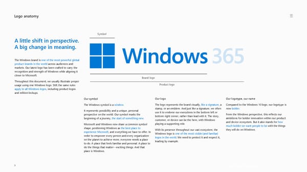
Logo anatomy Get the Windows logo > Symbol Brand logo 3 Our logo The logo represents the brand visually, like a signature , a stamp, or an emblem. And just like a signature, we often use it to endorse our executions in the bottom left or bottom right corner, rather than lead with it. The story, customer, or device can be the hero, with Windows playing a supporting role. With its presence throughout our vast ecosystem, the Windows logo is one of the most visible (and familiar) logos in the world . We need to protect it and respect it, leading by example. Our symbol The Windows symbol is a window . It represents possibility and a unique, personal perspective on the world. Our symbol marks the beginning of a journey, the start of something new . Microsoft and Windows now share a common symbol shape, positioning Windows as the best place to experience Microsoft , and everything we have to offer. In order to empower every person and every organization on the planet to achieve more, everyone needs a place to do. A place that feels familiar and personal. A place to do the things that matter —exciting things. And that place is Windows. Our logotype, our name Compared to the Windows 10 logo, our logotype is now bolder . From the Windows perspective, this reflects our ambitions for bolder innovation within our product and device ecosystem. But it also stands for how much bolder we want people to be with the things they will do on Windows. A little shift in perspective. A big change in meaning. The Windows brand is one of the most powerful global product brands in the world across audiences and markets. Our latest logo has been crafted to carry the recognition and strength of Windows while aligning it closer to Microsoft. Throughout this document, we usually illustrate proper usage using one Windows logo. Still, the same rules apply to all Windows logos , including product logos and edition lockups. Product logo
 Windows Brand Book Page 2 Page 4