4. Time = Quantity Over Quality
Content quality and audience engagement is reflected in the amount of time viewers spend on a page, not by the pageview metrics.
The web has changed in a lot of ways over the years, but pageviews and impressions predominantly remain as the metrics by which many publishers and advertisers measure the so-called success of their content and campaigns. It's time for a change. It's time for the Attention Web, which puts a premium on high-quality content-where publishers are rewarded for feats of journalistic strength, and where advertisers can buy an audience's collective attention. Why does it matter? What does it mean? Who's leading the charge? Check out our infographic, which we think is pretty damn awesome. Because rocket ships.
CHECK OUT THE FULL INFOGRAPHIC ▻

Upworthy wants to be known as the company that shares a massive amount of socially conscious content across the web. What Upworthy is widely known for, however, is perfecting the art of the clickbait, curiosity gap headline. (On the front page now: "The Perfect Reply A Girl Can Give To The Question 'What's Your Favorite Position?'" "What If Everyone Who Reacted Negatively To A Super Bowl Ad Knew The Facts? They'd Learn This." "A 16-Year-Old Explains Why Everything You Thought You Knew About Beauty May Be Wrong. With Math.")
The company denies that they're the main culprit, and some initial research by The Atlantic's Robinson Meyer suggests that may be true. But now, they're taking steps toward measuring their performance through something deeper than clicks.
This morning, Upworthy announced it would be using a new metric - "attention minutes" - as its primary tool to determine how they're doing. The goal is to blend traditional eyeball-counting metrics with figures that more accurately measure engagement or how much the audience actually likes the content that they're making. And they'll be releasing their source code so other publishers can use it.
We love thinking this way because it rewards us for sharing content that people really enjoy and find valuable - not just stuff they click on a lot. It may mean that we don't do quite as well on uniques or pageviews, but that's a tradeoff we're happy to make because this is a metric focused on real user satisfaction.
Upworthy says they decided to build attention minutes in the fall out of frustration with available analytics, either because they measure the wrong things or because they measured them poorly. For example, while Google Analytics' time-on-site metric seems like it should provide something like what Upworthy was looking for, it was often misrepresentative, calculating at one point that the average Upworthy user spent 21 minutes on site. ("We're good, but we know we're not that good," they write.)
Of course, Upworthy isn't the only publisher feeling disatisfied with the mighty pageview and its many successors. Former Knight-Mozilla OpenNews fellow Brian Abelson, who now works at Enigma, spent part of his fellowship at The New York Times working on " pageviews above replacement," a method of looking at basic traffic results without the confounding factor of internal promotion. James Robinson, director of news analytics at the Times, had this to say about metrics in his Nieman Lab prediction for news in 2014:
But for all types of newsrooms, developing a more qualitative understanding of audiences will be increasingly important. As publishers continue to invest in longform journalism and experiment with new types of storytelling, questions will naturally arise about the ways in which people actually read and engage with these pieces, beyond the feel-good tally of how many visitors they attract.
As Upworthy acknowledges, other media companies have also begun to make moves towards more meaningful metrics. "There are definitely others looking at how to improve metrics," writes Upworthy CEO Eli Pariser in an email, citing YouTube's "Time Watched," Medium's "Total Time Reading," and Chartbeat's "Average Engaged Time." (Chartbeat responded to Upworthy's announcement on their own blog, calling the metric "another big win.")
"They all have a similar hunch," Pariser said. "As we've been building it out it's been nice to see additional traction on this front. It gives us a sense we're not way out in left field."
Attention minutes are calculated using an assemblage of what Upworthy calls "signals." Pariser says they started out by asking, "What are the ways you can know if it's a sad, lonely, ignored tab or if someone is watching intently?"
Some of these signals include the length of time a browser tab has been open, how long a video player has been running, and the movement of the mouse on screen. "This method doesn't store raw information - it follows a stream of events and every few seconds asks, 'Is this person still paying attention?'" Pariser said. "If they are, that sends a signal to a data warehouse that says, 'Chalk up a few more attention seconds for this post.'" Together with other information, including pageviews, Upworthy hopes to get a sense of what content is most delighting and engrossing viewers, not just briefly capturing their attention.
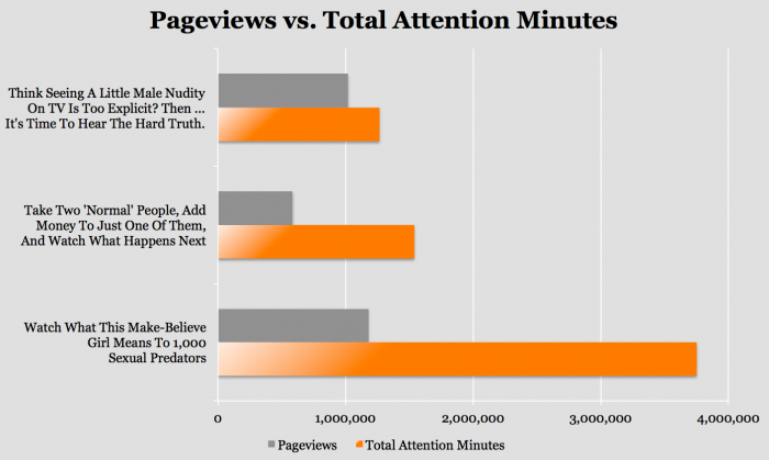
This chart is meant to illustrate how the signals that make up attention minutes present a significantly different portrait of a story than pageviews do:
Upworthy plans to release the source code "in the coming months." Pariser says Upworthy has already begun to gather valuable information about how people consume content - like that "the relationship between the length of a video and how much people watch isn't what we though it would be," he says. They'll be publishing more of that information in 2014, too.
The overarching hope is that by improving the quality of your metrics, you can improve the quality of your work. Campbell's Law puts it well, if academically:
The more any quantitative social indicator (or even some qualitative indicator) is used for social decision-making, the more subject it will be to corruption pressures and the more apt it will be to distort and corrupt the social processes it is intended to monitor.
If you measure performance in pageviews, you encourage slideshows. If you measure performance by social shares, you encourage clickbait headlines and giant Like buttons. Finding a metric that lines up with a publisher's goals is one of the most important things it can do to encourage better work, and Upworthy thinks this is a step closer to that alignment for their needs.
"The reason that we're focused on this metric is not just because we think it's good for us, but because we think it would serve everybody better if we moved away from some of the metrics that people have been using," Pariser says. "Pageviews can be bought, but this...is a truer measure of whether you're delivering something meaningful and valuable."
A recent study shows that the average human attention span has rapidly declined over the past decade. While in 2001 people could stay focused for 12 seconds, marketers now only have eight seconds to grab their audience's attention. Fortunately, we are now in a position to take advantage of recent technology advancements, which offer a variety of fresh ways to catch the eyes of consumers. Another study states that humans process visuals 60,000 times faster than text, which is astonishing! Here are our top 3 ways of grabbing your audience's attention in that time and ensuring that they digest the information you want.
TwitterIf you're a twitter user, you've probably noticed that Twitter has been getting more of a visual focus recently. It announced in March 2014 that it allow its users to share up to four photos per tweet as well as tag up to 10 other users in a single photo.  We seized the opportunity to be early adopters of the feature and trialled it recently as a visual way of communicating our new strapline, opting for four strong images reflecting our brand colours, showing our key message and including an accompanying powerful quote. Within a few hours, we'd received lots of engagement. Our twitter network were sharing and interacting telling us they thought it was great. A definite success.
We all know how powerful an image can be for connecting with people. The internet is saturated with photographs, so why not consider posting a short video snapshot on your Instagram account instead? The visual aspect attracts the eye, while the motion keeps the attention span engaged. If done well, this will drive traffic to your website and YouTube account, igniting interesting in your products and services!
Youtube 3 Second IntrosYoutube has recently added a brand new feature for content creators, allowing them to add a 3-second intro to all their videos. The intro will automatically start on videos on their channel. To set it up, you'll need to upload the 3-second introductory video as an unlisted video, and then select "add a channel branding intro" on your channel's InVideo programming page. Then you can choose which videos the intro will appear on. This provides a good opportunity to build your brand awareness and make your videos instantly recognisable to your audiences, portraying a consistent message. It can be applied to videos old and new and can be changed if required - we think it's a great idea and something worth paying attention to!
"Great, consuming content is all about using a 'mix' of styles, platforms and methods to put your messages across; it shouldn't be limited to just one. It's all about keeping people interested and engaged, with each method offering a strength of its own. The trick is the combination of written text and multimedia visual content. The eight second challenge of grabbing attention is manageable if you offer fresh and exciting formats" - Lloyd Morgan, Managing Director of Rockadove.
What are your top tips for consuming your audiences within eight seconds? Would you use any of the tips mentioned above?

Ch. 4: Spread Your Message ►