Burger king Brand Book
Burger King (BK) is an American-based multinational chain of hamburger fast food restaurants. Headquartered in Miami-Dade County, Florida, the company was founded in 1953 as Insta-Burger King, a Jacksonville, Florida–based restaurant chain.
Burger King® Brand Identity Guidelines ® BURGER KING BRAND PARTNERS GUIDELINES TM & © 2020 Burger King Corporation. All Rights Reserved. This document is provided solely for informational purposes for the internal use of authorized recipients only Confidential and Proprietary Information of The Burger King Corporation and may not be distributed externally or reproduced for external distribution in any form.
Burger King® Brand Identity Guidelines Burger King Corporation 002 Terms & Conditions Burger King Corporation The concepts contained herein are for the exclusive marketing and advertising materials should be Terms & Conditions use of employees and franchisees of Burger King submitted to your local BKC Legal Team for review. Corporation (“BKC”) and such other individuals and The creative concepts and scripts included on entities authorized in writing by BKC (“Authorized the toolkit are provided as guidance, but must Important Notice Users”). Misuse of the materials contained herein be reviewed and revised by each market taking is strictly prohibited. The trademarks, logos and into consideration current product offerings and service marks (collectively the “Trademarks”) featured applicable local laws and regulations. Use of these assets and claims are in this publication are registered and unregistered subject to the following terms and Trademarks of BKC. Nothing contained in this By accepting and keeping your copy of this conditions (“Terms and Conditions”) publication should be construed as granting any publication, you shall be deemed to have accepted, license or right to use any Trademark featured in without limitation or qualification, the foregoing and all applicable laws. this publication without express written permission Terms and Conditions. of BKC. If the foregoing Terms and Conditions are not The ® trademark symbol may only be used in acceptable to you, please immediately return territories where BKC has registered such trademarks. the entire publication to: BKC’s Trademarks may not be registered or available in all countries. Before you produce materials based Burger King Corporation, 5707 Blue Lagoon Drive, upon these assets, please contact your local BKC Miami, Florida 33126, Attn: Legal Department Legal Team for proper treatment of the trademarks for your market. Use of trademarks, logos, and/or copy varies by country. BKC Global Brand Management and BKC Legal must approve prior to release. In case certain visuals cannot be used in a specific market or region, please reach out to the Global Management team. All marketing and advertising materials used by local markets must be reviewed and approved by BK® in writing prior to any commercial use. Each Franchisee and BK® Marketing Teams, as applicable must follow the BK® review process, currently known as the Digital Merchandising Advertising Approval Form (“MAAF”) process and must comply with all BK® policies and guidelines relating to marketing, advertising and Guest insights then in effect. Each market is responsible for ensuring compliance with local advertising laws and regulations and conducting and obtaining trademark clearances as necessary for all creative assets. Any other legal claims, such as nutritional attributes, included on TM & © 2020 Burger King Corporation. All Rights Reserved. Confidential and Proprietary Information of The Burger King Corporation
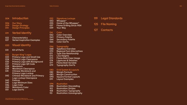
Burger King® Brand Identity Guidelines Table of Contents 003 004 Introduction 052 Signature Lockups 119 Legal Standards 053 Whopper® 006 Our Story 055 Home of the Whopper® 125 File Naming 009 Design Strategy 057 Flame Grilling Since 1954 014 Design Principles 059 Your Way 127 Contacts 019 Verbal Identity 061 Color 062 Color Overview 022 Characteristics 063 Primary Palette 027 Verbal Inspiration Examples 064 Secondary Palette 065 Color Don’ts 030 Visual Identity 066 Typography 031 Kit-of-Parts 068 Typeface Overview 070 Regional Font Alternatives 032 Burger King® Logos 071 Type Size Relationship 033 Primary Logo and Small Use 072 Line Heights 034 Primary Logo Clearspace 073 Flame Bold Caps Usage 035 Primary Logo with Background 074 Ligatures & Swashes 037 Primary Logo QR Code 077 Flame Bold Variable 038 Wordmark 079 Typography Don’ts 039 Wordmark Clearspace 080 Grid System & Layouts 041 Chinese W ordmark and 082 Margin Formula Primary Logo Lockup 083 Margin Construction 042 Chinese W ordmark and Primary 090 Square Format Layouts Logo Lockup Clearspace 091 Layout Examples 043 Favicon 045 Logo Minimum Sizes 094 Illustration 046 Logo Color 095 Illustration: Storytelling 050 Wordmark Color 102 Illustration: Stripes 051 Logo Don’ts 108 Illustration: Typography 113 Illustration: Iconongraphy TM & © 2020 Burger King Corporation. All Rights Reserved. Confidential and Proprietary Information of The Burger King Corporation
Burger King® Brand Identity Guidelines Introduction 004 INTRODUCTION TM & © 2020 Burger King Corporation. All Rights Reserved. Confidential and Proprietary Information of The Burger King Corporation
Burger King® Brand Identity Guidelines Introduction 005 Introduction ® This is the Burger King Brand Identity Guide. It sets out who we are, what we stand for, how we talk and how we look, ® whenever and wherever BK shows up in the world. It’s both a practical guide to help ensure brand materials and communications are developed consistently and cohesively as well as a document for on-boarding people who are new to the brand. So welcome — please dive right on in. TM & © 2020 Burger King Corporation. All Rights Reserved. Confidential and Proprietary Information of The Burger King Corporation
Burger King® Brand Identity Guidelines Introduction 006 Our Story OUR STORY TM & © 2020 Burger King Corporation. All Rights Reserved. Confidential and Proprietary Information of The Burger King Corporation
Burger King® Brand Identity Guidelines Introduction 007 Our Story Our Story Since we first opened in 1954, two things have always been true: 1. We want to give people the very best flame-grilled burgers. ® 2. We want people to Have It Your Way. Today, we have a bold new commitment to our food as we seek to give people products that taste better than ever and are better for them and the planet. That commitment is reflected in every aspect of the guest experience: in our visual design, our restaurant design and across the entire digital experience. TM & © 2020 Burger King Corporation. All Rights Reserved. Confidential and Proprietary Information of The Burger King Corporation
Burger King® Brand Identity Guidelines Introduction 008 Our Story Our Story ® The idea of Have It Your Way is no longer just an invitation to customize your food, but an encouragement to live your life, whatever and however that may be. Being an individual, always authentically ® true to yourself — that’s the BK way. TM & © 2020 Burger King Corporation. All Rights Reserved. Confidential and Proprietary Information of The Burger King Corporation
Burger King® Brand Identity Guidelines Introduction 009 Design Strategy DESIGN STRATEGY Our existing brand positioning and personality is maintained throughout the Visual Identity Design. TM & © 2020 Burger King Corporation. All Rights Reserved. Confidential and Proprietary Information of The Burger King Corporation
Burger King® Brand Identity Guidelines Introduction Brand Positioning 010 Design Strategy Brand Positioning Authenticity of food & people This is what lies at the heart of the brand and its promise of “Your Way”: in a world of standardization, inauthenticity and fakeness, we are a place where you can be exactly who you are and enjoy food that is real, honest and truly delicious. TM & © 2020 Burger King Corporation. All Rights Reserved. Confidential and Proprietary Information of The Burger King Corporation
Burger King® Brand Identity Guidelines Introduction Design Approach 011 Design Strategy Design Approach Design is one of the most essential tools we have for communicating who we are and what we value. But it also plays a vital role in creating desire for our food and maximizing the experience. So as we approached the new design identity, we wanted it to communicate not just our individual, authentic character but our love of, and commitment to our food. We wanted to use design to get people to crave our food; to communicate its freshness, its flame-grilling perfection and above all, its taste. We don’t know if it’s possible to eat design, but if it is, we hope people will want to devour ours. TM & © 2020 Burger King Corporation. All Rights Reserved. Confidential and Proprietary Information of The Burger King Corporation
Burger King® Brand Identity Guidelines Introduction Design Approach 012 Design Strategy Design Approach Make our brand and our food even more craveable Put simply, we want everything we do to evoke the great taste of our food; whether that’s the way we use color, how we photograph products, the shapes and forms of our fonts or the style of illustration we’ve created. We’ve also been inspired by our heritage, the iconic status of the brand and its original logo. We have carried some of that era through to our designs today. It’s a mix of our authentic past and our new exciting future. TM & © 2020 Burger King Corporation. All Rights Reserved. Confidential and Proprietary Information of The Burger King Corporation
Burger King® Brand Identity Guidelines Introduction Creative Idea 013 Design Strategy Creative Idea Your Way, Way Better Our creative approach reflects what we're doing with our food. We want to use design help close the gap between the negative perceptions a lot of people have of fast food, and the positive reality of our food story by making the brand feel less synthetic, artificial and cheap, and more real, crave-able and tasty. Substantiated by our fresh-cut ingredients, no artificial additives or preservatives, plant-based offerings and more, we want to use design to help drive reappraisal of our food, and help people see that BK is making a big leap forward. TM & © 2020 Burger King Corporation. All Rights Reserved. Confidential and Proprietary Information of The Burger King Corporation
Burger King® Brand Identity Guidelines Introduction 014 Design Principles Design Principles Actionable principles that guide how we look and feel across everything we do. 1. Mouthwatering These four principles capture the unique characteristics of the Burger King® brand that differentiates us from anyone else. 2. Big & Bold 3. Playfully Irreverent 4. Proudly True TM & © 2020 Burger King Corporation. All Rights Reserved. Confidential and Proprietary Information of The Burger King Corporation
Burger King® Brand Identity Guidelines Introduction Mouthwatering 015 Design Principles 1. Mouthwatering We’re proud of our food and it looks good enough to eat. Our brand elements burst with taste and flavor. TM & © 2020 Burger King Corporation. All Rights Reserved. Confidential and Proprietary Information of The Burger King Corporation
Burger King® Brand Identity Guidelines Introduction Big & Bold 016 Design Principles 2. Big & Bold Confident and direct: we play with scale using macro photography and a focus on details. Colors are unapologetically full and rich. TM & © 2020 Burger King Corporation. All Rights Reserved. Confidential and Proprietary Information of The Burger King Corporation
Burger King® Brand Identity Guidelines Introduction Playfully Irreverent 017 Design Principles 3. Playfully Irreverent Full of personality, we’re witty, warm and fun and don’t take ourselves too seriously. But we’re nobody’s fool—we’re provocative, disruptive and unafraid to shake up the norm. TM & © 2020 Burger King Corporation. All Rights Reserved. Confidential and Proprietary Information of The Burger King Corporation
Burger King® Brand Identity Guidelines Introduction Proudly True 018 Design Principles 4. Proudly True Always authentic and true to ourselves, our heritage, our people and the food. We’re not ashamed of imperfections and never rigid or overly-crafted. TM & © 2020 Burger King Corporation. All Rights Reserved. Confidential and Proprietary Information of The Burger King Corporation
Burger King® Brand Identity Guidelines Verbal Identity 019 VERBAL IDENTITY TM & © 2020 Burger King Corporation. All Rights Reserved. Confidential and Proprietary Information of The Burger King Corporation
Burger King® Brand Identity Guidelines Verbal Identity 020 Verbal Identity They say you should always think of brands like people, and so if that’s true, then what we say and how we say it is as important in shaping how people think of us as what we do and how we look. So think of this as a guide that helps us maintain a consistent voice everywhere we speak: from social media to merchandising to communications. TM & © 2020 Burger King Corporation. All Rights Reserved. Confidential and Proprietary Information of The Burger King Corporation
Burger King® Brand Identity Guidelines Verbal Identity 021 Verbal Identity Of course, it is just that: a guide — not a long list of rules. Because, like people, we know that we’ll need to flex our voice a little for different situations: a little wittier here, a little more direct there. And so we hope this arms you with just the right amount of information to go off into the world and be truly, authentically ® BK, wherever that may be. TM & © 2020 Burger King Corporation. All Rights Reserved. Confidential and Proprietary Information of The Burger King Corporation
Burger King® Brand Identity Guidelines Verbal Identity 022 Characteristics Characteristics From our Design Principles, our Tone of Voice is born. 1. Enthusiastic These four characteristics define how we talk, wherever we are, with the degree to which they do so changing based on platform and audience. 2. Confident 3. Witty 4. Approachable TM & © 2020 Burger King Corporation. All Rights Reserved. Confidential and Proprietary Information of The Burger King Corporation
Burger King® Brand Identity Guidelines Verbal Identity Enthusiastic 023 Characteristics 1. Enthusiastic Examples: Do Ooey gooey melty cheese We sound excited. We unashamedly revel in our food Don’t Cheese!!! Cheese!!! Cheese!!! and its deliciousness with bold, Now we sound a little unhinged. upbeat adjectives that describe Do Tastier. Juicier. Flame-licked. the taste, look and texture. Celebrating what makes us better than others with spirit and attitude. Don’t ® The delicious Whopper. We can be energetic but not manic This is boring and doesn’t revel in ingredients or taste. Do Piping hot and golden brown. We can be excited but not naive Takes pleasure in closely describing an everyday item, like a French Fry. We can be spirited but not childish Don’t Tots that are hots. This is a little too juvenile and cheesy. TM & © 2020 Burger King Corporation. All Rights Reserved. Taglines and examples included on this slide must be reviewed by BK® legal team for trademark Confidential and Proprietary Information of The Burger King Corporation clearance, and local legal counsel for compliance with applicable laws and regulations.
Burger King® Brand Identity Guidelines Verbal Identity Confident 024 Characteristics 2. Confident Examples: Do Have It Your Way® ® Celebrates the confidence of Burger King and our customers. We are Burger King, Home of the Don’t ® The King reigns supreme Whopper. Flame-grilled since 1954 Nice, but a little too showy, don’t you think? Do and damn proud of it. We do not hide ® Home of the Whopper behind the status quo- we are bold A claim of which we are forever proud. Don’t and unafraid. The best burger on the planet True though this is, we sound a bit too full ourselves just saying it like that Do Eat Loud We can be bold but not flashy Go ahead - eat it however you like it Don’t We can be proud but not vain ® Don’t mess with the Whopper or else! We can be challenging but OK ok, we are not looking to start a fight with our customers here not in-your-face TM & © 2020 Burger King Corporation. All Rights Reserved. Taglines and examples included on this slide must be reviewed by BK® legal team for trademark Confidential and Proprietary Information of The Burger King Corporation clearance, and local legal counsel for compliance with applicable laws and regulations.
Burger King® Brand Identity Guidelines Verbal Identity Witty 025 Characteristics 3. Witty Examples: Do “Explains a lot” Our famous reply to a famous guy We’re smart and quick. We poke a little Don’t “That explains why you’re so dumb” fun at ourselves and others. We know If we’d been this rude and cruel, we would have looked like the dumb ones—being what’s going on in culture and reference respectful is key Do it without seeming too try-hard. Social distance with your friends, but not our food An ironic nod to the times we’re living Don’t Please follow all state safety regulations We can be sarcastic but not cruel when picking up food. Thank you very much. We can’t wait for 2020 to be over, but we should be a positive force, not We can be ironic but not jaded a negative one Do We can be smart but not highbrow The only burger that plays with fire and never gets burned. A smart riddle-like phrase that only BK® can say. Don’t Our burgers rise from the flames, as the Phoenix once did in ancient times Dude, we sell burgers, not ancient Greek literature TM & © 2020 Burger King Corporation. All Rights Reserved. Taglines and examples included on this slide must be reviewed by BK® legal team for trademark Confidential and Proprietary Information of The Burger King Corporation clearance, and local legal counsel for compliance with applicable laws and regulations.
Burger King® Brand Identity Guidelines Verbal Identity Approachable 026 Characteristics 4. Approachable Examples: Do Order in with pickup or free delivery! Clear and to the point We’re comfortable in our skin and talk Don’t Orders available for pickup or delivery only to people at eye level, keeping the Same information but you sound like someone’s teacher language simple, conversational and Do Flame-grilled beef and fresh-cut tomatoes authentic. What you see is what you get: Talking like a real person would Don’t our ingredients are real and so are we. Made with premium hand-cooked beef and sun-kissed, fresh-from-the-ground tomatoes Talking like someone who works in marketing (sorry marketing folks!) Do We are clear, not terse Come on in! We are real, not pretentious A simple, friendly way to greet our customers Don’t We are friendly, not false Come to the place where every Guest is treated like royalty This goes too far - no one would believe this. TM & © 2020 Burger King Corporation. All Rights Reserved. Taglines and examples included on this slide must be reviewed by BK® legal team for trademark Confidential and Proprietary Information of The Burger King Corporation clearance, and local legal counsel for compliance with applicable laws and regulations.
Burger King® Brand Identity Guidelines Verbal Identity 027 Verbal Inspiration Examples VERBAL INSPIRATION EXAMPLES TM & © 2020 Burger King Corporation. All Rights Reserved. Taglines and examples included on this slide must be reviewed by BK® legal team for trademark Confidential and Proprietary Information of The Burger King Corporation clearance, and local legal counsel for compliance with applicable laws and regulations.
Burger King® Brand Identity Guidelines Verbal Identity 028 Verbal Inspiration Examples Verbal Inspiration Examples Talk About Ingredients 100% Real — Juicy The love for our food shines through — Sliced 24/7 — Real Deal — Cheesy in all we say, with the brand speaking — Sliced seven days a week — Flavor that’s for real — Melty to you with an easy, knowing familiarity — Sliced today. Gone today. — Taste what’s real — Sizzling of an old friend, rather than a large — Sliced on the daily — The real taste — Seared corporation. — Sliced to serve — 100% Real. 100% Melty. — Tasty Here is a taster of examples where — Freshly sliced in our kitchen 100% Delicious. — Mouthwatering we focus messaging on anything from — Onions on deck — Not faking it — Oozing with flavor our fresh ingredients to flame-grilling — Freshly cut with the tears — Goddamn it’s good and more. to prove it — This is what a 5-star These examples are not taglines but — That crunch Talk About Product review tastes like messages and claims. — Crunch, crunch, crunch — The one. The only. — Crunchy. Leafy. Freshest. — All other burgers bow down Fire is Better — Crispy and leafy — 100% Flame-seared, Big Time — Tastier. Juicier. Flame-licked. ® — Stay lush — Double the Whopper. — Flavor Flame-Grilled — Melty gooey cheese Double the hands. — Flaming Hot! — So damn cheesy! — Clean, green, burger- — Made with flames — Ooozy and melty topping machine — Fired on the spot — Magic between buns — Fries by the fistful — Flame-broiled to order — Real buns taste better — Golden Treasure — No secrets in our sauce — Salted to perfection — Burger Support Squad — Juicy and delicious TM & © 2020 Burger King Corporation. All Rights Reserved. Taglines and examples included on this slide must be reviewed by BK® legal team for trademark Confidential and Proprietary Information of The Burger King Corporation clearance, and local legal counsel for compliance with applicable laws and regulations.
Burger King® Brand Identity Guidelines Verbal Identity 029 Verbal Inspiration Examples Verbal Inspiration Examples Editorial / Lifestyle Your Way Cont. — Eat loud — Have It Your Way® The love for our food shines through — Unwrap and Open Wide — Your Order Your Way in all we say, with the brand speaking — Two Hands — Just How You Like It to you with an easy, knowing familiarity — Dive in with both hands — Bigger Better Burger King of an old friend, rather than a large — Handfuls and Mouthfuls corporation. — Thank your mouth Here is a taster of examples where — Handle with flavor we focus messaging on anything — For You and Yours from our fresh ingredients to flame- — Moment of truth grilling and more. — That first bite has everything you want — Inappropriately good — Hello, mouth. — Burning for you — Designed to be devoured — Bring napkins. Get messy. — You’ll need napkins — Mmmmm juicy — Lip-smacking — Suck it up — Guilty Pleasure — Long live the king TM & © 2020 Burger King Corporation. All Rights Reserved. Taglines and examples included on this slide must be reviewed by BK® legal team for trademark Confidential and Proprietary Information of The Burger King Corporation clearance, and local legal counsel for compliance with applicable laws and regulations.
Burger King® Brand Identity Guidelines VVisual Idenisual Identittityy 030 VISUAL IDENTITY TM & © 2020 Burger King Corporation. All Rights Reserved. Confidential and Proprietary Information of The Burger King Corporation
Burger King® Brand Identity Guidelines Visual Identity 031 Kit-of-Parts Kit-of-Parts This is our kit-of-parts—built with all the elements we have created to bring the Burger King® visual identity to life. Logo Wordmark Color Typography Iconography Signature Lockups ABCDEFGHI JKLMNOPQRS TUVWXYZ Illustration Illustrated Typography Photography TM & © 2020 Burger King Corporation. All Rights Reserved. Confidential and Proprietary Information of The Burger King Corporation
Burger King® Brand Identity Guidelines Visual Identity 032 Burger King® Logos ® BURGER KING LOGOS Usage of the following Burger King® trademarks and logos varies by country. The following guidelines are for illustration only. The BKC Regional and Global Marketing Team, and BKC Legal Team must approve proposed usage of any trademark or logo prior to its release. TM & © 2020 Burger King Corporation. All Rights Reserved. Confidential and Proprietary Information of The Burger King Corporation
Burger King® Brand Identity Guidelines Visual Identity Primary Logo 033 Burger King® Logos Primary Logo for Small Use Primary Logo In order to bring our design principles to life, we have created a custom logo that pays homage to the brand’s heritage with a design that’s bold, simple and fun. Being the primary logo, it will be used across all of our touchpoints. Primary Logo for Small Use Our small-use logo has been simplified for ease of reproduction on smaller formats. This logo is used when a logo of .75 inch wide or less is needed. See page 44 for minimum size usage for more information. .75 inch TM & © 2020 Burger King Corporation. All Rights Reserved. Usage of the Burger King® trademarks and logos varies by country. The BKC Regional and Global Marketing Team, Confidential and Proprietary Information of The Burger King Corporation and BKC Legal Team must approve proposed usage of any trademark or logo prior to its release.
Burger King® Brand Identity Guidelines Visual Identity Primary Logo Clearspace 034 Burger King® Logos Primary Logo Clearspace Clearspace is the minimum distance between the logo and other visual and verbal elements. The width of our Burger “U” defines the minimum clearspace surrounding the logo. TM & © 2020 Burger King Corporation. All Rights Reserved. Usage of the Burger King® trademarks and logos varies by country. The BKC Regional and Global Marketing Team, Confidential and Proprietary Information of The Burger King Corporation and BKC Legal Team must approve proposed usage of any trademark or logo prior to its release.
Burger King® Brand Identity Guidelines Visual Identity Primary Logo with Background 035 Burger King® Logos Primary Logo with Background Film/Photography (with Registration) Restaurant Signage only (with no Registration) We have created a special Primary Logo with a background to use in film and on photography, and for signage. In film or on photography, it uses a mayo egg white background and should be used only when the logo is placed over an image to help retain legibility. In restaurant signage, it uses a white background to appear brighter when fabricated out of acrylic or plastic. Contact your BKC marketing or legal team to determine whether you restaurant signage should contain a registration mark. TM & © 2020 Burger King Corporation. All Rights Reserved. Usage of the Burger King® trademarks and logos varies by country. The BKC Regional and Global Marketing Team, Confidential and Proprietary Information of The Burger King Corporation and BKC Legal Team must approve proposed usage of any trademark or logo prior to its release.
BurBurger King® Brger King® Brand Idenand Identittity Guidelinesy Guidelines Visual Identity Primary Logo with Background 036 Burger King® Logos TM & © 2020 Burger King Corporation. All Rights Reserved. TM & © 2020 Burger King® Corporation. All Rights Reserved. CoConnfidenfidential and Ptial and Prorporieprietary Intary Informatioformation of The Burn of The Burger King® Coger King Corporatiorpon ration
Burger King® Brand Identity Guidelines Visual Identity Primary Logo QR Code 037 Burger King® Logos Primary Logo QR Code QR Code Minimum Size Our QR code directs users to our digital presence. The unique design combines our branding with functional elements and brings personality to an otherwise impersonal element. QR Code Clearspace Clearspace is the minimum distance between the outer edge of the QR code Print: 1 inch (width) Digital: 96 pixels and other visual and verbal elements. The diameter of our QR code circle defines the minimum clearspace surrounding the QR code. QR Code Clearspace QR Code Minimum Size Maintaining the minimum size for our QR code is essential to its functionality. The minimum recommended size of the QR code is 1 inch wide for print and 96 pixels wide on screen. TM & © 2020 Burger King Corporation. All Rights Reserved. Confidential and Proprietary Information of The Burger King Corporation
Burger King® Brand Identity Guidelines Visual Identity Wordmark 038 Burger King® Logos Wordmark Wordmark (with Registration) While our Primary Logo should be used more often, we do have a Wordmark to be used as additional branding for horizontal formats. It should not be used alone i.e. without other branding elements. Contact your BKC marketing or legal team to determine whether you restaurant signage should contain a registration mark. Wordmark Restaurant Signage only (with no Registration) TM & © 2020 Burger King Corporation. All Rights Reserved. Usage of the Burger King® trademarks and logos varies by country. The BKC Regional and Global Marketing Team, Confidential and Proprietary Information of The Burger King Corporation and BKC Legal Team must approve proposed usage of any trademark or logo prior to its release.
Burger King® Brand Identity Guidelines Visual Identity Wordmark Clearspace 039 Burger King® Logos Wordmark Clearspace Clearspace is the minimum distance between the wordmark and other visual and verbal elements. The width of our Burger “U” defines the minimum clearspace surrounding the logo. TM & © 2020 Burger King Corporation. All Rights Reserved. Usage of the Burger King® trademarks and logos varies by country. The BKC Regional and Global Marketing Team, Confidential and Proprietary Information of The Burger King Corporation and BKC Legal Team must approve proposed usage of any trademark or logo prior to its release.
Burger King® Brand Identity Guidelines Visual Identity Primary Logo with Background and Wordmark 040 Burger King® Logos TM & © 2020 Burger King Corporation. All Rights Reserved. Confidential and Proprietary Information of The Burger King Corporation
Burger King® Brand Identity Guidelines Visual Identity Chinese Wordmark and 041 Burger King® Logos Primary Logo Lockup Chinese Wordmark and Chinese Wordmark Primary Logo Lockup A custom Chinese wordmark has been created for the local market, inspired by the Burger King® wordmark. The proportions of the Chinese wordmark to the Primary Logo has been determined, as well as the distance between the elements are fixed, and may not be altered. Chinese Wordmark and Primary Logo Lockup TM & © 2020 Burger King Corporation. All Rights Reserved. Confidential and Proprietary Information of The Burger King Corporation
Burger King® Brand Identity Guidelines Visual Identity Chinese Wordmark and Primary 042 Burger King® Logos Logo Lockup Clearspace Chinese Wordmark and Primary Logo Lockup Clearspace Clearspace is the minimum distance between the primary logo lockup and wordmark and other visual and verbal elements. The width of our Chinese character defines the minimum clearspace surrounding the logo lockup and wordmark. Note that clearspace on the top and bottom of our Chinese logo lockup is measured from the edges of the logo element in the lockup. TM & © 2020 Burger King Corporation. All Rights Reserved. Confidential and Proprietary Information of The Burger King Corporation
Burger King® Brand Identity Guidelines Visual Identity Favicon 043 Burger King® Logos Favicon Favicon Favicon Clearspace Our favicon was designed to read “BK” and created as our icon for social media. This design has the unique ability to be legible at small sizes. It should not be used where the full logo would be legible. Note: Favicon should NEVER be used in an alternate colorway. The combination of the two primary colors are essential for the legibility of the ‘B’ and ‘K’. The vertical clearspace is determined by the distance ‘X’, which is the top of the ‘K’ counter to the top of the bottom bun. Favicon to be used once the new visual identity is further established. Contact your Regional Marketing Communication Lead to discuss when the favicon can be launched in your market. TM & © 2020 Burger King Corporation. All Rights Reserved. Usage of the Burger King® trademarks and logos varies by country. The BKC Regional and Global Marketing Team, Confidential and Proprietary Information of The Burger King Corporation and BKC Legal Team must approve proposed usage of any trademark or logo prior to its release.
Burger King® Brand Identity Guidelines Visual Identity Favicon 044 Burger King® Logos TM & © 2020 Burger King Corporation. All Rights Reserved. Confidential and Proprietary Information of The Burger King Corporation
Burger King® Brand Identity Guidelines Visual Identity Logo Minimum Size 045 Burger King® Logos Logo Minimum Sizes Primary Logo for Small Use Wordmark Favicon Establishing a minimum size ensures that the impact and legibility of the logos are not compromised in application. The minimum recommended size of the Print: 0.5 inch (width) Print: 1.25 inch (width) Print: 0.1875 inch (width) Digital: 40 pixels Digital: 90 pixels Digital: 17.5 pixels logo is 0.5 inch wide for print and 40 pixels on screen. For the wordmark 1.25 inch wide and 90 pixels for digital. And for the favicon 0.1875 inch wide and 17.5 pixels for digital. Because the registration mark is too small for legibility when the primary logo or wordmark are used at the minimum size, the registration mark should be removed. TM & © 2020 Burger King Corporation. All Rights Reserved. Usage of the Burger King® trademarks and logos varies by country. The BKC Regional and Global Marketing Team, Confidential and Proprietary Information of The Burger King Corporation and BKC Legal Team must approve proposed usage of any trademark or logo prior to its release.
Burger King® Brand Identity Guidelines Visual Identity Logo Color 046 Burger King® Logos Logo Color Our color palette (see page 60 for the full color chapter) is flexible and allows for unique and ownable color combinations, but color pairings need to be regulated to maintain a consistent brand impression. Our logo primarily appears in our two core colors, and reversed in our Mayo Egg White when used on a colored background. TM & © 2020 Burger King Corporation. All Rights Reserved. Usage of the Burger King® trademarks and logos varies by country. The BKC Regional and Global Marketing Team, Confidential and Proprietary Information of The Burger King Corporation and BKC Legal Team must approve proposed usage of any trademark or logo prior to its release.
Burger King® Brand Identity Guidelines Visual Identity Logo Color Usage 047 Burger King Logos Logo Color Usage Primary Colorway Our color palette (see page 60 for Our primary colorway is most common, and appears on the full color chapter) is flexible and most applications using a Mayo Egg White or BBQ Brown background. If a four color photo is selected we can use allows for unique and ownable color the primary color logo with background. combinations, but color pairings need to be regulated to maintain a consistent brand impression. Our logo primarily appears in our two core colors, and reversed in our Mayo Egg White when used on a colored background. Our colors are split into three groups: Primary, Secondary and Limited Colorways. TM & © 2020 Burger King Corporation. All Rights Reserved. Usage of the Burger King® trademarks and logos varies by country. The BKC Regional and Global Marketing Team, Confidential and Proprietary Information of The Burger King Corporation and BKC Legal Team must approve proposed usage of any trademark or logo prior to its release.
Burger King® Brand Identity Guidelines Visual Identity Logo Color Usage 048 Burger King® Logos Logo Color Usage Secondary Colorway Limited Colorway Our color palette (see page 60 for Our secondary colorway is used in applications and Our limited colorway is used most rarely and only within the full color chapter) is flexible and packaging where a single color logo would work more out of home marketing and swag. There is lower contrast harmoniously with our typography or images. between certain colors and should be used sparingly. allows for unique and ownable color combinations, but color pairings need to be regulated to maintain a consistent brand impression. Our logo primarily appears in our two core colors, and reversed in our Mayo Egg White when used on a colored background. TM & © 2020 Burger King Corporation. All Rights Reserved. Usage of the Burger King® trademarks and logos varies by country. The BKC Regional and Global Marketing Team, Confidential and Proprietary Information of The Burger King Corporation and BKC Legal Team must approve proposed usage of any trademark or logo prior to its release.
Burger King® Brand Identity Guidelines Visual Identity Logo Color Usage 049 Burger King® Logos TM & © 2020 Burger King® Corporation. All Rights Reserved. Confidential and Proprietary Information of The Burger King® Corporation
Burger King® Brand Identity Guidelines Visual Identity Wordmark Color Usage 050 Burger King® Logos Wordmark Color Usage Our wordmark can be used in the primary palette colors only, see page 62. The Fiery Red, Flaming Orange, BBQ Brown. You can also reverse it out of a primary color using the Mayo Egg White. Note: Signage version uses a white background when fabricated out of acrylic or plastic and instead uses softer lighting to emulate the Mayo Egg White. Restaurant Signage Only TM & © 2020 Burger King Corporation. All Rights Reserved. Usage of the Burger King® trademarks and logos varies by country. The BKC Regional and Global Marketing Team, Confidential and Proprietary Information of The Burger King Corporation and BKC Legal Team must approve proposed usage of any trademark or logo prior to its release.
Burger King® Brand Identity Guidelines Visual Identity Logo Don’ts 051 Burger King® Logos Logo Don’ts The Logo should not be misinterpreted, modified, or added to. No attempt should be made to alter the Logo in any way. Its orientation, color and composition should remain as indicated in this document — there are no exceptions. To illustrate this point, some of the more Do not distort or warp the Logo in any way. Do not outline the Logo. Do not add any effects to the Logo. likely mistakes are shown on this page. These rules apply to all elements of the Logo including but not limited to the Wordmark and the Favicon. This list is meant for illustrative purposes, KING and should not be considered an exhaustive list of mistakes Do not change the tone, tint, or opacity of the Logo. Do not rotate the Logo. Do not change the typeface of the Logo. Do not remove “Burger King®” from the Logo. Do not remove the buns from the Logo. Do not use the logo from our previous visual brand identity. TM & © 2020 Burger King Corporation. All Rights Reserved. Usage of the Burger King® trademarks and logos varies by country. The BKC Regional and Global Marketing Team, Confidential and Proprietary Information of The Burger King Corporation and BKC Legal Team must approve proposed usage of any trademark or logo prior to its release.
Burger King® Brand Identity Guidelines Visual Identity 052 Signature Lockups SIGNATURE LOCKUPS TM & © 2020 Burger King Corporation. All Rights Reserved. Confidential and Proprietary Information of The Burger King Corporation
Burger King® Brand Identity Guidelines Visual Identity Whopper® 053 Signature Lockups ® Whopper Whopper® (with Registration) Whopper® is one of our signature lockups, and should always appear in this configuration to differentiate from our other product offerings, except when used inside a paragraph of copy. See page 140 for more information on our Product Architecture. Example application: packaging, merchandising, menuboards. Whopper Restaurant Signage only (with no Registration) Contact your BKC marketing or legal team to determine whether you restaurant signage should contain a trademark symbol. TM & © 2020 Burger King Corporation. All Rights Reserved. Usage of the Burger King® trademarks and logos varies by country. The BKC Regional and Global Marketing Team, Confidential and Proprietary Information of The Burger King Corporation and BKC Legal Team must approve proposed usage of any trademark or logo prior to its release.
Burger King® Brand Identity Guidelines Visual Identity Whopper® 054 Signature Lockups TM & © 2020 Burger King® Corporation. All Rights Reserved. Confidential and Proprietary Information of The Burger King® Corporation
Burger King® Brand Identity Guidelines Visual Identity Home of the Whopper® 055 Signature Lockups ® Home of the Whopper Home of the Whopper® (with Registration) Home of the Whopper® is one of our signature lockups, and should always appear in this configuration, except when used inside a paragraph of copy. Example application: in-store signage. Contact your BKC marketing or legal team to determine whether you restaurant signage should contain a trademark symbol. Home of the Whopper® Restaurant Signage only (with no Registration) TM & © 2020 Burger King Corporation. All Rights Reserved. Usage of the Burger King® trademarks and logos varies by country. The BKC Regional and Global Marketing Team, Confidential and Proprietary Information of The Burger King Corporation and BKC Legal Team must approve proposed usage of any trademark or logo prior to its release.
Burger King® Brand Identity Guidelines Visual Identity Home of the Whopper® 056 Signature Lockups TM & © 2020 Burger King Corporation. All Rights Reserved. Confidential and Proprietary Information of The Burger King Corporation
Burger King® Brand Identity Guidelines Visual Identity Flame Grilling Since 1954 057 Signature Lockups Flame Grilling Since 1954 Flame Grilling Since 1954 Restaurant Signage only (with no Registration) Flame Grilling Since 1954 is one of our signature lockups, and should always appear in this configuration, except when used inside a paragraph of copy. Example application: restaurant signage. TM & © 2020 Burger King Corporation. All Rights Reserved. Usage of the Burger King® trademarks and logos varies by country. The BKC Regional and Global Marketing Team, Confidential and Proprietary Information of The Burger King Corporation and BKC Legal Team must approve proposed usage of any trademark or logo prior to its release.
BurBurger King® Brger King® Brand Idenand Identittity Guidelinesy Guidelines Visual Identity Flame Grilling Since 1954 058 Signature Lockups TM & © 2020 Burger King Corporation. All Rights Reserved. Confidential and Proprietary Information of The Burger King Corporation
Burger King® Brand Identity Guidelines Visual Identity Your Way 059 Signature Lockups Your Way Your Way (with no Registration) Your Way is one of our signature lockups, and should always appear in this configuration. Your Way should only be used locked up with the logo at the end of television commercials in our Mayo Egg White color. Your Way (Logo Lockup) TM & © 2020 Burger King Corporation. All Rights Reserved. Usage of the Burger King® trademarks and logos varies by country. The BKC Regional and Global Marketing Team, Confidential and Proprietary Information of The Burger King Corporation and BKC Legal Team must approve proposed usage of any trademark or logo prior to its release.
Burger King® Brand Identity Guidelines Visual Identity Your Way 060 Signature Lockups Logo Lockup Clearspace Your Way Logo Lockup Clearspace Clearspace is the minimum distance between the logo lockup and other visual and verbal elements. The height of the Your Way “W” defines the minimum clearspace surrounding the logo lockup. The width of the Burger “G” defines the distance between the Burger King® logo and the Your Way wordmark. Note that clearspace on the top and bottom of our logo lockup is measured from the edges of the logo element in the lockup. TM & © 2020 Burger King Corporation. All Rights Reserved. Confidential and Proprietary Information of The Burger King Corporation
Burger King® Brand Identity Guidelines Visual Identity 061 Color COLOR TM & © 2020 Burger King Corporation. All Rights Reserved. Confidential and Proprietary Information of The Burger King Corporation
Burger King® Brand Identity Guidelines Visual Identity Color Overview 062 Color Color Overview This is our full Burger King® color palette, weighted in order of importance. Colors on packaging, marketing and interiors bring to life the vibrant, fresh ingredients of the Whopper® and the brand’s trademark flame-grilling method of cooking its burgers. Crunchy Green PMS C: 2426 PMS U: 355 HEX: #198737 R25 G135 B55 C90 M0 Y100 K10 Fiery Red Flaming Orange BBQ Brown Mayo Egg White Melty Yellow PMS C: 2347 PMS C: 2018 PMS C: 4695 PMS C: 9226 PMS C: 7549 PMS U: 2347 PMS U: 2018 PMS U: 4695 PMS U: 9226 PMS U: 116 HEX: #D62300 HEX: #FF8732 HEX: #502314 HEX: #F5EBDC HEX: #FFAA00 R215 G35 B0 R255 G135 B50 R80 G35 B20 R245 G235 B220 R255 G170 B0 C0 M95 Y100 K0 C0 M60 Y90 K0 C20 M80 Y80 K70 C0 M3 Y13 K4 C0 M30 Y100 K0 TM & © 2020 Burger King Corporation. All Rights Reserved. Confidential and Proprietary Information of The Burger King Corporation
Burger King® Brand Identity Guidelines Visual Identity Primary Palette 063 Color Primary Palette This is our primary palette, inspired by our trademark flame-grilling method of cooking our burgers. These primary colors hold our equity and differentiate us. At least one of these colors always appear in any given Burger King® branded application. Plant based products can sometimes be an exception to this. Fiery Red Flaming Orange BBQ Brown PMS C: 2347 PMS C: 2018 PMS C: 4695 PMS U: 2347 PMS U: 2018 PMS U: 4695 HEX: #D62300 HEX: #FF8732 HEX: #502314 R215 G35 B0 R255 G135 B50 R80 G35 B20 C0 M95 Y100 K0 C0 M60 Y90 K0 C20 M80 Y80 K70 TM & © 2020 Burger King Corporation. All Rights Reserved. Confidential and Proprietary Information of The Burger King Corporation
Burger King® Brand Identity Guidelines Visual Identity Secondary Palette 064 Color Secondary Palette This is our secondary palette and it is used to enhance applications under limited circumstances. While proprietary, our secondary colors are less ownable than our primary palette, and cannot be used on their own. These colors are primarily used within illustration or only in certain applications when combined with colors from our primary palette. Mayo Egg White Crunchy Green Melty Yellow PMS C: 9226 PMS C: 2426 PMS C: 7549 PMS U: 9226 PMS U: 355 PMS U: 116 HEX: #F5EBDC HEX: #198737 HEX: #FFAA00 R245 G235 B220 R25 G135 B55 R255 G170 B0 C0 M3 Y13 K4 C90 M0 Y100 K10 C0 M30 Y100 K0 TM & © 2020 Burger King Corporation. All Rights Reserved. Confidential and Proprietary Information of The Burger King Corporation
Burger King® Brand Identity Guidelines Visual Identity Color Don’ts 065 Color Color Don’ts Our color palette should not be misinterpreted, modified, or added to. No attempt should be made to alter the colors in any way. To illustrate this point, some of the more likely mistakes are shown on this page. Do not create a gradient out of our colors. Do not modify brand colors. Do not use our previous visual brand identity colors. Do not add distressing effects to the brand colors. TM & © 2020 Burger King Corporation. All Rights Reserved. Confidential and Proprietary Information of The Burger King Corporation
Burger King® Brand Identity Guidelines Visual Identity 066 Typography TYPOGRAPHY TM & © 2020 Burger King Corporation. All Rights Reserved. Confidential and Proprietary Information of The Burger King Corporation
Burger King® Brand Identity Guidelines Visual Identity 067 Typography Typography Our irreverent typography evokes the natural, organic shapes of food and looks so mouthwateringly delicious, you can almost taste it. TM & © 2020 Burger King Corporation. All Rights Reserved. Confidential and Proprietary Information of The Burger King Corporation
Burger King® Brand Identity Guidelines Visual Identity Typeface Overview 068 Typography Typeface Overview Headlines We worked with Colophon Foundry Flame to develop a bespoke, modern typeface family inspired by Burger King® that has Bold Eat Loud a colorful history and irreverent personality. The Burger King® Flame font has been custom created exclusively for Burger King®. You can download this font, free Subheads of charge, for use. Flame Order in with pickup Our proprietary typeface family comes in three styles; a flavorful Bold weight, Regular a confident Regular weight, and a utility or free delivery! Sans weight. This allows us to flex our voice across a wide range of communications while ® keeping a singular and consistent Body Copy Burger King is proud to be fun, proud to be unconventional, brand impression. Flame and proud to be loved for it. We have a rich history of breaking Modification or adaptation of the Flame the rules, marching to the beat of our own drum and carving font is not allowed without the approval Sans out a spot in the world that is wholly our own. Burger King® of BKC’s legal team. creates burgers that are like them: hard to contain. TM & © 2020 Burger King Corporation. All Rights Reserved. Taglines and examples included on this slide must be reviewed by BK® legal team for trademark Confidential and Proprietary Information of The Burger King Corporation clearance, and local legal counsel for compliance with applicable laws and regulations.
Burger King® Brand Identity Guidelines Visual Identity Typeface Overview 069 Typography Typeface Overview Headlines ABCDEFGHIJKLMNOPQRSTUVWXYZ Our proprietary typeface comes in Flame three styles; a flavorful Display weight, a confident Primary weight, and a utility Bold abcdefghijklmnopqrstuvwxyz Secondary weight. This allows us to flex our voice across 0123456789!@#$%^&*()[]?+ a wide range of communications while keeping a singular and consistent brand impression. Modification or adaptation of the Flame Subheads font is not allowed without the approval Flame ABCDEFGHIJKLMNOPQRSTUVWXYZ of BKC’s legal team Regular abcdefghijklmnopqrstuvwxyz 0123456789!@#$%^&*()[]?+ Body Copy ABCDEFGHIJKLMNOPQRSTUVWXYZ Flame Sans abcdefghijklmnopqrstuvwxyz 0123456789!@#$%^&*()[]?+ TM & © 2020 Burger King Corporation. All Rights Reserved. Confidential and Proprietary Information of The Burger King Corporation
Burger King® Brand Identity Guidelines Visual Identity Regional Font Alternatives 070 Typography Regional Font Alternatives Headlines If your country’s language is not Fang supported by Flame (see previous page), contact your local agency for a Zheng recommendation of an alternative font in a similar style. The BKC Global Brand Pang Wa Management Team and the BKC Legal Team must approve proposed usage of Jian Ti any font prior to it’s release. Also ensure compliance with any associated laws and regulations. Subheads Example: Chinese Typeface. Fang Zheng Cu Yuan Song Jian Ti Body Copy Fang Zheng Lan Ting Yuan Jian Ti Zhong TM & © 2020 Burger King Corporation. All Rights Reserved. Taglines and examples included on this slide must be reviewed by BK® legal team for trademark Confidential and Proprietary Information of The Burger King Corporation clearance, and local legal counsel for compliance with applicable laws and regulations.
Burger King® Brand Identity Guidelines Visual Identity Type Size Relationship 071 Typography Type Size Relationship When creating layouts using all three typefaces, clear hierarchy can be established by making sure subheadlines are no larger than 50% of the ascender height of the headline, and body copy is no larger than 50% of the cap height of subheadlines. Headline Flame Bold Flame Regular Flame Sans TM & © 2020 Burger King Corporation. All Rights Reserved. Confidential and Proprietary Information of The Burger King Corporation
Burger King® Brand Identity Guidelines Visual Identity Line Heights 072 Typography Line Heights 1 Type across our entire system is set Headlines are set in square, meaning the line height is always equal to the point size, 1:1, except in specific use cases. When the point size is below 12 pt you can increase the leading (e.g. 10 pt/12 pt) and when you use Flame Flame Bold with line Bold in caps you can decrease the leading (e.g. 204 pt/168 pt). spacing equal to the type size. 2 3 Subheads are set in Flame Body copy is set in Flame Sans with line spacing 1 120 / 120 Regular with line spacing equal to the type size. 2 72 / 72 equal to the type size. 3 36 / 36 TM & © 2020 Burger King Corporation. All Rights Reserved. Confidential and Proprietary Information of The Burger King Corporation
Burger King® Brand Identity Guidelines Visual Identity Flame Bold Caps Usage 073 Typography Flame Bold Caps Usage In some cases, our Flame Bold typeface can be used in all-caps for specific layouts when using only three words or less. Leading for all caps headlines is set at 75% of the pt size. ALL CAPS HEADLINE TM & © 2020 Burger King Corporation. All Rights Reserved. Confidential and Proprietary Information of The Burger King Corporation
Burger King® Brand Identity Guidelines Visual Identity Ligatures & Swashes 074 Typography Ligatures & Swashes Flame Bold and Regular contains ligatures for a select number of characters. Flame bold only contains stylistic alternates and discretionary swashes. The swashes should be used sparingly and not within longer lines of copy, and only at the beginning or end of words. Quality TM & © 20TM & © 2020 Bur20 Burger King Coger King Corrpoporratioation. All Righn. All Rightts Rs Reserveserved. ed. Taglines and examples included on this slide must be reviewed by BK® legal team for trademark CoConnfidenfidential and Ptial and Prroopprieriettary Inary Inffoorrmatiomation on of The Burf The Burger King Coger King Corrpoporratioationn clearance, and local legal counsel for compliance with applicable laws and regulations. King W
Burger King® Brand Identity Guidelines Visual Identity Ligatures & Swashes 075 Typography Ligatures & Swashes Ligatures ct fb ff ffb ffh Swashes Flame Bold and Regular contains ligatures Flame Flame A K M for a select number of characters. Flame bold only contains stylistic alternates Bold ffi ffk ffl fft Bold and discretionary swashes. The swashes should be used sparingly and not within Q R r longer lines of copy. fh fi fk fl ft Make sure your ligatures are turned on whenever using Flame Bold: gi Ki ky st wi W Y InDesign: Edit your Basic Character Formats panel in your Basic Paragraph style Ligatures (or any other Flame character style) ct fb ff ffb ffh and check the Regular “Ligatures” box. ffi ffk ffl fft Illustrator: Select the ligatures icon in the Open fh fi fk fl ft Type panel. gi Ki ky st wi TM & © 2020 Burger King Corporation. All Rights Reserved. Taglines and examples included on this slide must be reviewed by BK® legal team for trademark Confidential and Proprietary Information of The Burger King Corporation clearance, and local legal counsel for compliance with applicable laws and regulations.
Burger King® Brand Identity Guidelines Visual Identity Ligature & Swashes Usage 076 Typography Ligature & Swashes Usage The following is an overview of “How-To” use swashes and ligatures in Burger King® applications. King coffee Swashes create interest and add balance to a composition. They are best used at the beginning at end of sentences, but that is not a hard rule. Less is more with swashes—do not go overboard; one or two are sufficient. Take care not to use swashes if it causes overlapping (see Don’ts for examples). crafty smoky Use ligatures when available because they were designed, not only for visual interest but, to increase legibility and reduce space. Note that swashes and ligatures are independent of a specific language and can be used in any translation. perfect fire patty flame. TM & © 2020 Burger King Corporation. All Rights Reserved. Taglines and examples included on this slide must be reviewed by BK® legal team for trademark Confidential and Proprietary Information of The Burger King Corporation clearance, and local legal counsel for compliance with applicable laws and regulations.
Burger King® Brand Identity Guidelines Visual Identity Flame Bold Variable 077 Typography Flame Bold Variable In the Flame Bold weight, when you use caps, we have created variable letters to use when appropriate. The different variable options are Super- Condensed, Regular, and Super-Wide. The variable type is to only be used in applications with a full-page of type. See the layout section page 79 for more guidance. TM & © 2020 Burger King Corporation. All Rights Reserved. Taglines and examples included on this slide must be reviewed by BK® legal team for trademark Confidential and Proprietary Information of The Burger King Corporation clearance, and local legal counsel for compliance with applicable laws and regulations.
Burger King® Brand Identity Guidelines Visual Identity Flame Bold Variable Usage 078 Typography Flame Bold Variable Usage Variable fonts use a slider in-lieu of traditional separate weights to allow for a wider range of widths available in a single typeface. 298 300 This slider can be accessed near the font selection menu in Adobe InDesign and Adobe Illustrator. See below reference: 300 286 270 300 TM & © 2020 Burger King Corporation. All Rights Reserved. Taglines and examples included on this slide must be reviewed by BK® legal team for trademark Confidential and Proprietary Information of The Burger King Corporation clearance, and local legal counsel for compliance with applicable laws and regulations.
Burger King® Brand Identity Guidelines Visual Identity Typography Don’ts 079 Typography Typography Don’ts Taste It is important that we are consistent with Taste our typography throughout our visual Taste identity, and that we do not modify them What’s What’s or use them in off-brand ways. What’s To illustrate this point, some of the more Real Real Real likely mistakes are shown on this page. Do not replace our typefaces or use unapproved fonts. Do not allow the tracking to be too wide. Do not allow the leading to be too large. Taste What’s $6 Real Do not add any effects to the type. Do not use different typeface for pricing. Do not use all caps for more than three words, see typesetting page 72 for rules. TASTE WHAT'S REAL Do not use a typeface from our previous visual brand identity. TM & © 2020 Burger King Corporation. All Rights Reserved. Taglines and examples included on this slide must be reviewed by BK® legal team for trademark Confidential and Proprietary Information of The Burger King Corporation clearance, and local legal counsel for compliance with applicable laws and regulations.
Burger King® Brand Identity Guidelines Visual Identity 080 Grid System & Layouts GRID SYSTEM & LAYOUTS TM & © 2020 Burger King Corporation. All Rights Reserved. Confidential and Proprietary Information of The Burger King Corporation
Burger King® Brand Identity Guidelines Visual Identity 081 Grid System & Layouts Overview Grid System & Layouts These pages will take you through a step- Overview by-step construction of our grid and some primary layouts used in our visual system. TM & © 2020 Burger King Corporation. All Rights Reserved. Confidential and Proprietary Information of The Burger King Corporation
Burger King® Brand Identity Guidelines Visual Identity Margin Formula 082 Grid System & Layouts Margin Formula Longest Side / 25 = Margin TM & © 2020 Burger King Corporation. All Rights Reserved. Confidential and Proprietary Information of The Burger King Corporation
Burger King® Brand Identity Guidelines Visual Identity Margin Construction 083 Grid System & Layouts Margin Construction 1 3 27 27 30 30 To create our margins, we take the longest side of the application and 674 px divide by 25. This gives us a modular margin that scales proportionately 27 27 across all application formats and sizes. 27 27 Note: In some extreme cases (very 2 wide or very tall) applications, your margins may need to be adjusted manually for optical correctness. 756 px 674 px 1 674 px horizontal / 25 = 27 px Margin 2 674 px horizontal / 25 = 27 px Margin 3 756 px vertical / 25 = 30 px Margin 27 27 30 30 TM & © 2020 Burger King Corporation. All Rights Reserved. Confidential and Proprietary Information of The Burger King Corporation
Burger King® Brand Identity Guidelines Visual Identity Applying Headlines 084 Grid System & Layouts Applying Headlines 1 3 Headlines are applied to documents This is a headline relative to the margins, format size, and line length. Use these examples This is as a reference for setting headlines across various application formats. Note: The cap-height of headlines 2 touches the top margin. The ascenders This is a headline are allowed to protrude above it. a headline 1 For wide banners, headlines should be scaled to fit the vertical height of the banner. 2 For formats where the headline would take up too much vertical real-estate were it to span the entire format, the page can be divided into proportional columns for the headline to size to. 3 For vertical formats, the longest line of the headline should span margin to margin. TM & © 2020 Burger King Corporation. All Rights Reserved. Confidential and Proprietary Information of The Burger King Corporation
Burger King® Brand Identity Guidelines Visual Identity Applying Body Copy 085 Grid System & Layouts Applying Subheads 1 3 Subheadlines are applied relative This is a headline to the headline. As stated on page 70, This is a subhead, subheadlines should be at maximum next to the headline. This is body copy, potentially used to provide This is 50% of the typesize of the headline more information into the offer being illustrated. to ensure proper hierarchy. X 2 This is a headline X X X X a headline X This is a subhead, X smaller than the headline. X This is a subhead, same width of the headline. 1 This subhead is set to take up the vertical space of the headline’s second line. 2 This subhead is set to occupy the same column width as the headline. This is body copy, potentially used to provide This is body copy, potentially used to provide more information into the offer being illustrated. more information into the offer being illustrated. 3 This subhead spans the first two columns of this page, if it were divided into 3 even columns. TM & © 2020 Burger King Corporation. All Rights Reserved. Confidential and Proprietary Information of The Burger King Corporation
Burger King® Brand Identity Guidelines Visual Identity Applying Our Logo 086 Grid System & Layouts Applying Our Logo 1 3 27 27 30 30 Our logo is generally applied in the This is a headline bottom right corner. The width of This is a subhead, the logo should be 2x the margin next to the headline. This is body copy, potentially used to provide This is size. This ensures our logo scales more information into the offer being illustrated. 27 54 27 proportionally with each application. For billboard use, the logo size can 27 27 be increased for visibility at the 2 discretion at the designer, using this This is a headline page as an optical reference. a headline This is a subhead, smaller than the headline. This is a subhead, same width of the headline. 1 27 x 2 = 54 px 2 27 x 2 = 54 px This is body copy, potentially used to provide This is body copy, potentially used to provide more information into the offer being illustrated. more information into the offer being illustrated. 3 30x 2 = 60 px 27 54 27 30 60 30 TM & © 2020 Burger King Corporation. All Rights Reserved. Confidential and Proprietary Information of The Burger King Corporation
Burger King® Brand Identity Guidelines Visual Identity Applying Half-Frame Photography 087 Grid System & Layouts Applying Half-Frame Photography When the dimensions of the application permits, edge to edge photography can This is be added. Ensure that the proper margin is still left between the text frame and the photo. a headline This is a subhead, smaller than the headline. This is body copy, potentially used to provide more information into the offer being illustrated. TM & © 2020 Burger King Corporation. All Rights Reserved. Confidential and Proprietary Information of The Burger King Corporation
Burger King® Brand Identity Guidelines Visual Identity Applying Half-Frame Photography 088 Grid System & Layouts Applying Half-Frame Photography Full-frame photography can be applied above the typography, using the same rules established on the previous page. This is This is a headline This is a subhead, a headline smaller than the headline. This is a subhead, This is body copy, potentially used to provide more smaller than the headline. information into the offer being illustrated. TM & © 2020 Burger King Corporation. All Rights Reserved. Confidential and Proprietary Information of The Burger King Corporation
Burger King® Brand Identity Guidelines Visual Identity Applying Full-Frame Photography 089 Grid System & Layouts Applying Full-Frame Photography Full-Frame photography can be used to span all four corners of the This is application, as long as the type-system is maintained and there is sufficient enough contrast. a headline This is a subhead, smaller than the headline. This is body copy, potentially used to provide more information into the offer being illustrated. TM & © 2020 Burger King Corporation. All Rights Reserved. Confidential and Proprietary Information of The Burger King Corporation
Burger King® Brand Identity Guidelines Visual Identity Square Format Layouts 090 Grid System & Layouts Square Format Layouts Instagram posts follow the same layout as our previous grids, but can use centered type if needed. The pt size of the headline and subhead should be adjusted based on the length of copy used, but should always appear proportionately sized. Vertical margins should be adjusted to keep typography optically centered. This is This headline a headline is a little longer This is a subhead, This is a subhead, smaller than the headline. smaller than the headline. TM & © 2020 Burger King Corporation. All Rights Reserved. Confidential and Proprietary Information of The Burger King Corporation
Burger King® Brand Identity Guidelines Visual Identity Full-Frame Logo Photography 091 Grid System & Layouts Full-Frame Logo Photography Layouts using only our logo on top of photography can be used as long as sufficient clearspace is applied and there is enough contrast between the logo and photo. TM & © 2020 Burger King Corporation. All Rights Reserved. Confidential and Proprietary Information of The Burger King Corporation
Burger King® Brand Identity Guidelines Visual Identity Layouts Using Single Words 092 Grid System & Layouts Layouts Using Single Words Although our typography primarily CRUNCHY appears in Sentence case, when creating layouts that use 3 or less words, feel LEAFY JUICY free to use all-caps. This is generally for evocative Out of Home applications, and will be covered in the application section of this document. Freshly picked Freshly sliced Freshly sliced in our kitchen in our kitchen in our kitchen TM & © 2020 Burger King Corporation. All Rights Reserved. Taglines and examples included on this slide must be reviewed by BK® legal team for trademark Confidential and Proprietary Information of The Burger King Corporation clearance, and local legal counsel for compliance with applicable laws and regulations.
Burger King® Brand Identity Guidelines Visual Identity Layouts with Variable Type 093 Grid System & Layouts Layouts with Variable Type Our variable type is used to make large, graphic patterns, either out of single words or sequences of repeating words. This is generally for evocative Out of Home applications, and will be covered in the application section of this document. TM & © 2020 Burger King Corporation. All Rights Reserved. Taglines and examples included on this slide must be reviewed by BK® legal team for trademark Confidential and Proprietary Information of The Burger King Corporation clearance, and local legal counsel for compliance with applicable laws and regulations.
Burger King® Brand Identity Guidelines Visual Identity 094 Illustration ILLUSTRATION TM & © 2020 Burger King Corporation. All Rights Reserved. Confidential and Proprietary Information of The Burger King Corporation
Burger King® Brand Identity Guidelines Visual Identity 095 Illustration: Storytelling ILLUSTRATION: STORYTELLING TM & © 2020 Burger King Corporation. All Rights Reserved. Confidential and Proprietary Information of The Burger King Corporation
Burger King® Brand Identity Guidelines Visual Identity Illustration Overview 096 Illustration: Storytelling Illustration Overview Ingredients Products Storytelling A unique hand drawn illustration style for BK® that is full of color, energy, humor and irony. Focused on our fresh ingredients, heroic products and playful storytelling. These can be brought to life across packaging, in-store artwork and social. Our illustration should never be re-colored or cropped. They should be used as a whole image and where possible should be big and bold in line with our Design Principles. New simple illustrations may be created in this style but should be consulted with the Burger King® Global Design Team. We have developed in partnership with Cachetejack a library of illustrations across fresh ingredients, heroic food and playful storytelling. If you’d like to expand your illustration library further, please contact the BK Global Design Team. TM & © 2020 Burger King® Corporation. All Rights Reserved. Confidential and Proprietary Information of The Burger King® Corporation
Burger King® Brand Identity Guidelines Visual Identity Illustration Library 097 Illustration: Storytelling Illustration Library Ingredients Lettuce Leaves Tomatoes: whole, on the vine, sliced Tomatoes: in a hand We have developed in partnership with Cachetejack an initial library of illustrations across our fresh ingredients, heroic food and playful storytelling. No colors should be amended. Onions: whole, half and rings Pickles: whole and slices Burger Bun Top Burger Patty: with grill markings Products Whopper®: with and without a napkin Whopper® in Two Hands Whopper® Sequence Whopper® Deconstructed TM & © 2020 Burger King Corporation. All Rights Reserved. Confidential and Proprietary Information of The Burger King Corporation
Burger King® Brand Identity Guidelines Visual Identity Illustration Library (Cont.) 098 Illustration: Storytelling Illustration Library Cont. Products Cont. Fries: individual and a pile Fries in a Pod Ketchup Sachet Burst Soda Cup We have developed in partnership with Cachetejack an initial library of illustrations across our fresh ingredients, heroic food and playful storytelling. No colors should be amended. Storytelling Pickle Eye Mask French Fry Mustache: Down and Up Onion Ringers on a Finger Ice Cream Melting Fistful of Fries Dipping Fry in Ketchup Mouthful of Fries Flames TM & © 2020 Burger King® Corporation. All Rights Reserved. Confidential and Proprietary Information of The Burger King® Corporation
Burger King® Brand Identity Guidelines Visual Identity Illustration Color 099 Illustration: Storytelling Illustration Color Our illustrations should be placed on a background of one of the colors from our full color palette. As a general rule, the illustration should be placed on a background color that creates enough contrast with the illustration. No colors should be amended. TM & © 2020 Burger King Corporation. All Rights Reserved. Confidential and Proprietary Information of The Burger King Corporation
BurBurger King® Brger King® Brand Idenand Guidelinestity Guidelines Visual Identity 100100 Illustration: Storytelling TM & © 2020 Burger King® Corporation. All Rights Reserved. TM & © 2020 Burger King® Corporation. All Rights Reserved. CoConnfidenfidential and Ptial and Prorporieprietary Intary Informatioformation of The Burn of The Burger King® Coger King® Corporatiorpon ration
BurBurger King® Brger King® Brand Idenand Guidelinestity Guidelines Visual Identity 110101 Illustration: Storytelling TM & © 2020 Burger King® Corporation. All Rights Reserved. TM & © 2020 Burger King® Corporation. All Rights Reserved. CoConnfidenfidential and Ptial and Prorporieprietary Intary Informatioformation of The Burn of The Burger King® Coger King® Corporatiorpon ration
Burger King® Brand Identity Guidelines Visual Identity 102 Illustration: Stripes ILLUSTRATION: STRIPES TM & © 2020 Burger King Corporation. All Rights Reserved. Confidential and Proprietary Information of The Burger King Corporation
BurBurger King® Brger King® Brand Idenand Guidelinestity Guidelines Visual Identity 110303 Illustration: Stripes TM & © 2020 Burger King® Corporation. All Rights Reserved. TM & © 2020 Burger King® Corporation. All Rights Reserved. CoConnfidenfidential and Ptial and Prorporieprietary Intary Informatioformation of The Burn of The Burger King® Coger King® Corporatiorpon ration
Burger King® Brand Identity Guidelines Visual Identity 104 Illustration: Stripes Illustration: Primary Stripes Bun: Crown Inspired by the food and taken directly from our most iconic asset, the Whopper®. Our primary graphic illustration stripes are made up of a cross-section referencing the layers of our ingredients: Lettuce Leaves the bun, lettuce, tomato slices, mayo, pickles and the flame-grilled patty. Tomato Slices Onion Rings Pickle Slices Whopper® Patty Bun: Heel TM & © 2020 Burger King Corporation. All Rights Reserved. Confidential and Proprietary Information of The Burger King Corporation
Burger King® Brand Identity Guidelines Visual Identity Stripe Usage 105 Illustration: Stripes Primary Stripe Usage When applying the primary illustration stripes, try to retain the cross section of the Whopper®. You can only zoom in so far before you lose recognition. Minimum Maximum TM & © 2020 Burger King Corporation. All Rights Reserved. Confidential and Proprietary Information of The Burger King Corporation
Burger King® Brand Identity Guidelines Visual Identity Applying the Stripes 106 Illustration: Stripes Applying the Primary Stripes Be thoughtful about the applications of the primary illustration stripes to avoid overuse. TM & © 2020 Burger King Corporation. All Rights Reserved. Confidential and Proprietary Information of The Burger King Corporation
Burger King® Brand Identity Guidelines Visual Identity Masterbrand Color Alternate Stripes 107 Illustration: Stripes Illustration: Masterbrand Color Alternate Stripes In certain instances where simplicity is required, such as uniforms and directional stripes, we utilize our alternate stripes. The alternate stripes reduce the number of colors to four of our masterbrand colors in the following order: Mayo Egg White, Flaming Orange, Fiery Red, and BBQ Brown. Masterbrand Color Alternate Stripes Examples TM & © 2020 Burger King Corporation. All Rights Reserved. Confidential and Proprietary Information of The Burger King Corporation
Burger King® Brand Identity Guidelines Visual Identity 108 Illustration: Typography ILLUSTRATION: TYPOGRAPHY TM & © 2020 Burger King Corporation. All Rights Reserved. Confidential and Proprietary Information of The Burger King Corporation Local versions of illustrative typography should be approved by the BK Global Design Team.
Burger King® Brand Identity Guidelines Visual Identity 109 Illustration: Typography TM & © 2020 Burger King® Corporation. All Rights Reserved. Confidential and Proprietary Information of The Burger King® Corporation
Burger King® Brand Identity Guidelines Visual Identity 110 Illustration: Typography Illustrated Typography Cheesy Bacony Melty Juicy Flaky Tasty Plant Based Golden Crunchy Our illustrated typography is created Bacon Cheeseburger Wrap Hamburger and Cheeseburger Wrap Croissan’wich® Wrap Plant Based Croissan’wich Wrap Chicken Jr. + Fish Wrap using our Flame bold caps as the base font. On packaging, illustrated type should do two things: 3.5˝ 1. L everage on the descriptive words for visual cues. 2. F ill the space of different packaging shapes. Hearty Melty Tasty Eggy Tender Crispy Bacon King Wrap Egg-Normous Burrito Wrap Original Chicken Wrap 6.5 x 3˝ 2.5 x 6˝ 4˝ TM & © 2020 Burger King Corporation. All Rights Reserved. Confidential and Proprietary Information of The Burger King Corporation
Burger King® Brand Identity Guidelines Visual Identity 111 Illustration: Typography Creating Illustrated Round Square Rectangular Typography 1. Use the Warp effect with the Arc Upper style for your upper word, 1. Use the Distort & Transform effect with the Free Distort style for your 1. Use the Distort & Transform effect with the Free Distort style for and Arc Lower for your lower word along the horizontal axis. Adjust upper and lower words, pulling the endpoints until you create an even your upper and lower words, pulling the endpoints until you create the bend to fit the curves of your circle. horizontal line through the square shape. an even horizontal line through the rectangular shape. Our illustrated typography is created with a combination of Adobe Illustrator effects and hand lettering. It should illustrate the descriptive words that its communicating (i.e. “Melty” should look like its melting). On this page we give examples of the technical process used to create illustrated 2. Add some dimension to the type using the Warp effect with the 2. Use the Warp effect with the Twist style to add a very slight amount typography that fits round, square, and Inflate style on both upper and lower words. This will provide of movement to your upper and lower words along the horizontal axis rectangular shapes. Below are additional a better fit to the edge of the circle. (adding too much movement will cause legibility issues). guidelines to use for layout and hand lettering: 2. Use the Warp effect with the Wave style to add a very slight amount of movement to your upper and lower words along the horizontal — No more than two words per format. axis (adding too much movement will cause legibility issues). — All letterforms must be legible. — Only use one color per word. — Only use one flourish or ligature per format. 3. Adjust letterforms by hand to maximize legibility, fit the 3. Adjust letterforms by hand to maximize legibility, fit the space, — Typography should fit the space. space, and add a flourish or ligature to the letterforms. and add a flourish or ligature to the letterforms. 3. Adjust letterforms by hand to maximize legibility, fit the space, 1 2 2 and add a flourish or ligature to the letterforms. 1 Adjust letterforms by hand to maximize legibility. 2 2 Adjust letterforms by hand to fit the space. 1 3 3 3 Add a flourish or ligature. 1 3 TM & © 2020 Burger King Corporation. All Rights Reserved. Confidential and Proprietary Information of The Burger King Corporation Local versions of illustrative typography should be approved by the BK Global Design Team.
Burger King® Brand Identity Guidelines Visual Identity 112 Illustration: Typography TM & © 2020 Burger King® Corporation. All Rights Reserved. Confidential and Proprietary Information of The Burger King® Corporation
Burger King® Brand Identity Guidelines Visual Identity 113 Illustration: Iconography ILLUSTRATION: ICONOGRAPHY TM & © 2020 Burger King Corporation. All Rights Reserved. Confidential and Proprietary Information of The Burger King Corporation
Burger King® Brand Identity Guidelines Visual Identity Operational Icons 114 Illustration: Iconography Operational Icons We have updated our icons to be inspired by our unique illustration style. Making them bolder, simpler, and instantly identifiable. Cheese Bacon Double Patty Triple Patty Mayo Lettuce Operational icons should never be used larger than 84 pt and no smaller than 24 pt, which is the size that they appear on packaging wraps. All ops icons remain at a consistent height. On white packaging backgrounds, icon Tomato Onion Spicy Ketchup Tartar Sauce Mustard color takes on the primary color of the Product Category. For example, a chicken product will have Flaming Orange Icons. Ham Sausage Pickle Bottle Jar Hash Browns EC S Egg Egg & Cheese Sausage TM & © 2020 Burger King Corporation. All Rights Reserved. Confidential and Proprietary Information of The Burger King Corporation
Burger King® Brand Identity Guidelines Visual Identity Operational Icons 115 Illustration: Iconography Operational Icons on Color Backgrounds On all color packaging backgrounds, the icon color reverses to white. For example, if a chicken product has an orange Cheese Bacon Double Patty Triple Patty Mayo Lettuce background, the icons will be white. For additional distinction, Cheese and Spicy icons are highlighted on a white circle while the icon itself is in color. Please use the Highlighted Cheese Tomato Onion Spicy Ketchup Tartar Sauce Mustard in Flaming Orange for all Whopper Sandwiches with Cheese. For all other wraps with color backgrounds, use the Highlighted Cheese in Melty Yellow. The spicy icon stays red on all packaging color backgrounds. Operational icons should never be used Ham Sausage Pickle Bottle Jar Hash Browns larger than 84 pt and no smaller than 24 pt, which is the size that they appear on packaging wraps. All ops icons remain at a consistent height. EC S Egg Egg & Cheese Sausage Highlighted Cheese Highlighted Cheese Highlighted Spicy in Flaming Orange in Melty Yellow in Fiery Red TM & © 2020 Burger King Corporation. All Rights Reserved. Confidential and Proprietary Information of The Burger King Corporation
Burger King® Brand Identity Guidelines Visual Identity Digital Icons 116 Illustration: Iconography Digital Icons We have updated our digital icons to be inspired by our unique illustration style. Making them bolder, simpler, and instantly identifiable. Curbside Pickup Dine-In Takeout Takeout Drive-Thru Sign-In Digital icons appear no larger than 20 x 20 px on digital applications such as website and phone app. The primary color for Digital Icons is BBQ Brown with the exception of our Small, Medium, and Large icons. Our S/M/L Icons Order Reorder More Profile Home Offers follow the same Ops Color Specifications established in our packaging system. Ops Color Specifications: S M L Value = No color Small = Fiery Red Medium = Flaming Orange Small Medium Large Large = BBQ Brown TM & © 2020 Burger King Corporation. All Rights Reserved. Confidential and Proprietary Information of The Burger King Corporation
Burger King® Brand Identity Guidelines Visual Identity Digital Button 117 Illustration: Iconography Digital Button Our digital buttons, for call to actions, ORDER NOW use slightly rounded corners to give them a more tactile appearance. To keep corner rounding consistent, the radius of the corner should always be 25% of the vertical height of the button. Do not fully round the corners into “capsule” shapes. TM & © 2020 Burger King Corporation. All Rights Reserved. Confidential and Proprietary Information of The Burger King Corporation Image for inspiration only.
Burger King® Brand Identity Guidelines Visual Identity Iconography Don’ts 118 Illustration: Iconography Illustration and Iconography Don’ts It is important that we are consistent with our illustration and iconography throughout our visual identity, and that we do not mix elements from our past visual brand identity in with the new. To illustrate this point, some of the elements from our previous visual brand identity are shown on this page as examples of what not to use. Do not use the product icons from our previous visual brand identity. Do not use the claims icons from our previous visual brand identity. Do not use the stripes from our previous visual brand identity. Do not use the promotional icons from our previous visual brand identity. TM & © 2020 Burger King Corporation. All Rights Reserved. Confidential and Proprietary Information of The Burger King Corporation
Burger King® Brand Identity Guidelines Legal Standards 119 LEGAL STANDARDS TM & © 2020 Burger King Corporation. All Rights Reserved. Confidential and Proprietary Information of The Burger King Corporation
Burger King® Brand Identity Guidelines Legal Standards 120 Terms & Conditions Legal Standards In order to ensure the feasibility of the new Brand Identity Terms & Conditions Guidelines work, preliminary trademark searches were conducted in a few select markets in each region and necessary revisions were made. That said, each country still needs to work with its local Legal representatives to ensure usability of all brand content, including trademark clearance of icons and claim validation of stamps. This step is required before a market can use the new brand elements. Please allow sufficient time to search and clear these elements, which can vary by country. TM & © 2020 Burger King Corporation. All Rights Reserved. Confidential and Proprietary Information of The Burger King Corporation
Burger King® Brand Identity Guidelines Legal Standards 121 Terms & Conditions Legal Standards Q What is a trademark? mark has become generic or that it is merely Are franchisees of Burger King Q Terms & Conditions descriptive of the product or services. Most people Corporation restricted in any way from A An y word, symbol, design or combination thereof that do not know that the following names were once using the Company’s trademarks? identifies and distinguishes the goods or services of trademarks: Escalator, Linoleum, Kerosene, Milk of One of the goals of Burger King a company from those manufactured, sold or offered Magnesia, Lanolin, Cellophane, Thermos, Aspirin, A F ranchisees are licensed to use all authorized Corporation is to build its brand names by others. In other words, the BURGER KING® name Super Glue, Yo Yo and Bikini. trademarks in connection with the operation of their and Logos so that they are not only famous and the BURGER KING Bun Halves and Crescent Logo, BURGER KING® restaurants, but are not permitted to are trademarks. Do not confuse a trademark with How do I know if a new mark, claim ownership. Franchisees, however, cannot use worldwide, but also synonymous with a trade name. A trade name is the name under which Q any of the Company’s authorized trademarks without quality goods and services at the best a business operates. For example, our Company’s trade illustration or tagline is available obtaining prior approval from the Company. In addition, price. The BURGER KING® name, Logos and name in the United States is Burger King Corporation. for use as a trademark? franchisees are not permitted to claim ownership of Note the following examples: any of the Company’s trademarks. Franchisees should related trademarks are the primary visual T rademark: BURGER KING® A It is essen tial that all newly proposed marks, logos, never apply for registration of any trademark or representations our customers recognize. Trade Name: Burger King Corporation (U.S.) taglines and slogans are cleared for their intended domain name associated with the Company. They represent who we are as a Company. Incorrect: Burger King® Corporation use through the Legal Department to avoid any risk Franchisees are required to adhere to the guidelines It is therefore important that you use the Incorrect: BURGER KING® Corporation of trademark infringement. contained herein for all use of the Company’s Company’s trademarks and Logos correctly trademarks and domain names. at all times to preserve their strength and Ex amples of Trade Names outside the United States: What is trademark infringement? Burger King Restaurants of Canada Inc. (Canada) Q Q How do I know when to use a trademark identity and to protect Burger King Burger King Ltd. (United Kingdom) symbol (for example, TM vs ®)? Corporation’s exclusive right to use them. Burger King Europe GmbH (EMEA) A T rademark law protects consumers from confusion, BK AsiaPac, PTE. LTD. (APAC) mistake or deception as to the source of the goods, and protects the investment the owner of a mark has A The tr ademark designations vary from country to Refer to these guidelines whenever using If y ou are unsure of the Company s trade name made in developing the goodwill symbolized by the country. For example, in the United States, if the any of the Company’s trademarks. in your country, contact the Communications mark. It is an infringement of a Burger King Corporation trademark has been officially registered with the or Legal Departments of Burger King Corporation. mark if another company uses the same or similar United States Patent and Trademark Office, use the ® mark without Burger King Corporation’s authorization symbol. If the trademark has NOT yet been registered, for the same or similar goods or services so as to be use the TM symbol. Outside the United States, use Q Why is correct trademark use important? likely to cause consumers to be confused, mistaken the appropriate designation in the country in which or deceived in believing that the other company’s use is claimed. A T rademark rights, unlike patent and copyright rights, goods or services are those of Burger King Corporation can last forever, provided the mark is not abandoned or in some way connected to Burger King Corporation Ex amples of trademark designations in other and is properly used. If a mark is not properly used, (by endorsement, sponsorship, licensing or in some countries include: it may become generic; that is, the name has come other way). Infringement may also occur if another to mean the product, rather than a certain brand of company uses a mark of Burger King Corporation Australia: “Registered Trademark” or ® product. A trademark which has become generic is in such a way as to dilute the value and goodwill TM or SM for an unregistered not enforceable against infringement. Any competitor associated with that mark (for example, (a) a non- trademark or service mark can use the term for its goods or services. The competitive company uses a Burger King Corporation Canada: “Registered Trademark” or MD importance of correct trademark use in our own mark to symbolize its goods or services; or (b) a third or “Marque Deposee” or ® publications cannot be overstated. Misuse of a mark party uses a Burger King Corporation mark in an Unregistered Marks: TM/MC by an owner is often persuasive to a court that the unwholesome manner). If you become aware of any “Marque de Commerce infringements or potential infringements, contact the Germany: “Eingetragenes Warenzeichen” Legal Department of Burger King Corporation. or ® TM & © 2020 Burger King Corporation. All Rights Reserved. Confidential and Proprietary Information of The Burger King Corporation
Burger King® Brand Identity Guidelines Legal Standards 122 Terms & Conditions Cont. Legal Standards Mexico: “Registered Trademark” (“Marca Q When should I use a trademark Q What is a legal line and when should Terms & Conditions Cont. Registrada,” “Marc. Reg.”, “M.R.”) or in a local language? I use it? ®. TM for unregistered trademarks United Kingdom: “Registered Trademark” or ® A Y ou may wish to use a trademark in a local language A The legal line indicat es ownership of trademarks TM or SM for an unregistered to appeal to the local consumer base. Prior to doing and copyrights. All of the Burger King Corporation trademark or service mark so please check with the Legal Department to ensure trademarks are owned by Burger King Corporation China: “Registered Trademark” that the local language equivalent is available for use and reference of that ownership should be made in the (in Chinese characters) and that trademark protection has been applied for. legal line, at the bottom of the page, sized as specified Generally recognized trademarks like the BURGER herein. Use the legal line whenever an authorized No te, it may be illegal to use a ® symbol in connection KING® Bun Halves and Crescent Logo may appear on trademark (word(s) or Logo design) is used. An example with a mark that is not registered, and can expose product packaging and signage in English if the proper of the approved legal line where the BURGER KING the Company to substantial administrative fines. clearances and protection have been completed. Bun Halves is used in the U.S. is as follows: TM & © 2020 If unsure, always verify with the Legal Department However, in certain regions like Quebec, Canada, Burger King Corporation. the registration status of a mark prior to use. if a French language trademark is already registered Please contact the Legal Department to obtain the Company must use the French mark. Check with the appropriate designations for countries outside the Legal Department for guidance. All righ ts reserved. An example of the approved legal the United States and for registration updates. line outside the U.S. depends on where the artwork was What is a copyright? created. If the art was created in the U.S. for another How do I know where to position the Q country, the proper legal line is: TM & © 20__ Burger Q King Corporation. All rights reserved. TM or the ®? A. A co pyright or © seeks to promote legal protection to authors of original works of authorship including If the art work was created in the country in which A The tr ademark notice requirements differ from literary, dramatic, musical, artistic and certain other the artwork will appear, then please use the following country to country. For all trademarks in the United intellectual works, available to both published and legal lines: States, use the TM, SM (for service marks) or the ® to unpublished works. Upon creation a copyright the upper right of a wordmark and to the bottom right automatically covers all of these expressions and For EMEA TM Burger King Corporation. of a design mark such as the BURGER KING Bun Halves grants exclusive rights to the author of an original © [year] Burger King Europe GmbH. and Crescent Logo, unless otherwise instructed by the work, including the right to copy, distribute, adapt the All rights reserved. Legal Department For all trademarks outside of the work and create derivative works. Copyrights last for United States, contact the Legal Department for a certain time after which they pass into the public For AsiaPac TM Burger King Corporation. guidance on markings. domain. All printed materials must carry the following © [year] BK AsiaPac, PTE. LTD. All legend: Example: © (first year of publication), Burger rights reserved. King Corporation. All rights reserved. Q How do I know if a trademark For LATAM TM & © [year] Burger King is registered? If the © has been used for a number of years, the Corporation. All rights reserved. legend should include the first year of publication and A Contact the Legal Department. the current year. Example: © 1999, 2004, 2007, 2011 For Canada TM/MC & © [year] Burger King Burger King Corporation. All rights reserved. Corporation. All rights reserved TM & © 2020 Burger King Corporation. All Rights Reserved. Confidential and Proprietary Information of The Burger King Corporation
Burger King® Brand Identity Guidelines Legal Standards 123 Disclaimers and Other Fine Print Legal Standards While the legal requirements for disclaimers (conditions, Disclaimers & Other restrictions, informational legal lines) will vary from country to country, generally disclaimers on printed Fine Print materials should be bolded to distinguish them from sales copy and to enhance readability. Preferred typesetting specifications for disclaimers on printed materials in the United States are 8 point type and printed trademark and copyright legal lines in the United States should be 5 point type. Disclaimers on television commercials in the United States should be as follows: Disclaimers appearing on a black background should be at a minimum of 22 scan lines with 100% white. In other instances (such as over food footage, live-action or a light background), disclaimers should have a drop-shadow to accentuate the letters and enhance readability. For treatment of disclaimers outside the United States, contact the Legal Department of Burger King Corporation. TM & © 2020 Burger King Corporation. All Rights Reserved. Confidential and Proprietary Information of The Burger King Corporation
Burger King® Brand Identity Guidelines Legal Standards 124 Guidelines for Trademark Usage Legal Standards 1. Distinguish the trademark from 3. Copy specifications Guidelines for the rest of the text. When referring to the Company’s trade names, such as Trademark Usage Trademarks should always be used in a manner that Burger King Corporation in the United States, capitalize will distinguish them from the surrounding text. At the only the initial letter of each word. However, when using very least, they should be written in all capital letters. the trademarks, you must distinguish them from the They may also be set in quotation marks, italics or bold surrounding text. At the very least, they should be written font. This rule would apply everywhere and every time in all capital letters (e.g., “BURGER KING®”). They may a mark is used in any piece of written material. also be set in quotation marks or italics. This rule applies everywhere and every time a mark is used in any written Correct: At participating BURGER KING® restaurants material. in the United States. Use the trademark notation TM or SM next to the Incorrect: At participating Burger King’s in the United trademarks each time they are used. States. Do not break the Company’s trademarks from line to line, 2. Use the generic name associated with e.g., always place “BURGER KING®” on the same line. the trademark. A trademark is an adjective which modifies a noun. In printed matter of all types, and particularly in advertising copy, the generic name (noun) should be used immediately after the first or most prominent use of the trademark on each page. Thereafter, the generic name need not be used every time the trademark appears, but it should be used often enough to make it obvious that the trademark is not the generic name. For example, “at participating BURGER KING® restaurants in the United States”. To determine whether you are using a trademark properly, ask yourself the following question: “Would a complete thought be expressed if the trademark were omitted”? If the answer is “Yes”, then the trademark has been correctly used as an adjective. The generic name should not be in all caps, nor should it be the same size as the trademark. Correct: Visit your participating BURGER KING® restaurant and try a Whopper® Sandwich. Incorrect: Visit your participating BURGER KING® RESTAURANT and try a Whopper® SANDWICH. TM & © 2020 Burger King Corporation. All Rights Reserved. Confidential and Proprietary Information of The Burger King Corporation
Burger King® Brand Identity Guidelines File Naming 125 FILE NAMING TM & © 2020 Burger King Corporation. All Rights Reserved. Confidential and Proprietary Information of The Burger King Corporation
Burger King® Brand Identity Guidelines File Naming 126 File Naming Guide Please refer to the following BK_Logo_Primary_ST_PMS_C.ai naming convention to easily find the correct Burger King® Logo file to use. Abbreviations are used in our asset file naming so the names are Name Asset Type Asset Name Asset Format Color Space File Format concise. The various attributes of each file follow in order of importance, BK Logo Primary ST CMYK ai separated by an underscore. Standard Lockup Signature Lockup Wordmark RGB png SU Illustration Favicon Small Usage PMS_C jpg Pantone Coated Photography Type LU Large Usage PMS_U Icons Pantone Uncoated TM & © 2020 Burger King Corporation. All Rights Reserved. Confidential and Proprietary Information of The Burger King Corporation
Burger King® Brand Identity Guidelines Contacts 127 CONTACTS TM & © 2020 Burger King Corporation. All Rights Reserved. Confidential and Proprietary Information of The Burger King Corporation
Burger King® Brand Identity Guidelines Contacts 128 Brand Team Contacts Questions, concerns, thoughts Our Regional and Global Marketing team are available to discuss branding issues and to review your communications. or need more information? We can add the most value if feedback is sought during the development phase, when there is still time to incorporate changes. This is especially true if you are working with an outside vendor. Contact your Regional and Global Marketing team. TM & © 2020 Burger King Corporation. All Rights Reserved. Confidential and Proprietary Information of The Burger King Corporation
TM & © 2020 Burger King Corporation. All Rights Reserved. Confidential and Proprietary Information of The Burger King Corporation