General Electric Brand Book
GE Power is a world energy leader providing equipment, solutions and services across the energy value chain from generation to consumption.
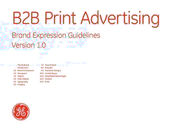
B2B Print Advertising Brand Expression Guidelines Version 1.0 The GE Brand 7.0 Tone of Voice Introduction 8.0 Gray Bar 1.0 Brand Architecture 9.0 Transition Designs 2.0 Monogram 10.0 Limited Space 3.0 Tagline 11.0 Classifieds/Yellow Pages 4.0 Color Palette 12.0 Outdoor 5.0 Typography 13.0 Grids 6.0 Imagery
The GE Brand GE plays a vital role in our modern world, making extraordinary ideas a natural part of everyday life. The GE brand reflects that role as it represents the flexibility, optimism and can-do attitude of the people who fulfill it. Brand attributes and character GE is: Contemporary Innovative Dynamic Trusted Dependable Approachable Global Our brand is the symbol of our heritage, and of the quality and trust we have delivered for more than 126 years. To our customers, it embodies our commitment to anticipate and meet their changing needs. To our organization, it represents the imagination we use to address those needs in a manner that reflects our values. We created these guidelines to ensure that we always remain true to our brand, and the people, products and services it represents. B2B Print Advertising Version 1.0
Introduction to B2B Print Advertising The guidelines in this section will help you to implement the new GE brand expression system in print advertising. They explain the brand essentials of the system, demonstrate their correct use, and provide examples of typical applications for print, billboard, third-party, tombstone and direct response advertising. The brand essentials in advertising are the brand architecture, Monogram, tagline, color palette, typography, imagery style, tone of voice and grid system. They are the keys to creating the brand expression and, when used appropriately and creatively in advertising, will help convey a revitalized image for GE. For information and guidance on proper use of these guidelines, contact your Brand or Marketing Communications Manager, the brand team at [email protected] or visit the new URL for the GE brand expression program, which is www.ge.com/brand B2B Print Advertising Version 1.0
1.0 Brand Architecture 1.01 Introduction 1.02 Overview 1.03 Understanding Brand Architecture 1.04 Proper Use 1.05 Review B2B Print Advertising Version 1.0
1.01 Introduction to Brand Architecture We have evolved the way we do business. We have moved toward a more fluid, broad-based offer designed with our customers in mind. The brand architecture is designed to accommodate this shift. It is simple, flexible and focuses on making GE easier for the outside world to understand. B2B Print Advertising Version 1.0
1.02 Brand Architecture: Overview Our brand architecture organizes our businesses in a way GE Advanced Materials that defines our key offerings, communicates the breadth and depth of GE to our primary audiences, and clarifies how these offerings meet their respective needs. GE Commercial Finance Accordingly, we have reorganized all of our activities into 11 major businesses. Our overarching communications goal is to reinforce our offer: we are a singular, global company providing diverse technology, media and financial services. In GE Consumer & Industrial our brand architecture, “GE” is the dominant brand. Markets and Solution Platforms have names that describe their function. GE Energy Note Of our 11 businesses, only ten may use the GE brand. Do not use any other brand architecture component, sub-business, organization, brand or product name with GE Equipment Services the GE brand. (Rare exceptions exist and must have Corporate approval.) This section describes the “architecture” that reflects the new GE Healthcare structure of our organization. It also illustrates how to use that structure properly across a range of Corporate and marketing communications media. Refer to individual guideline sections for additional information about Brand Essentials, Brand GE Infrastructure Architecture, Stationery, Literature and Merchandising. GE Insurance Solutions GE Money GE Transportation NBC Universal B2B Print Advertising For information on developing appropriate branding solutions, please Version 1.0 contact your Lead Communicator or Chief Marketing Officer.
1.03 Understanding the Brand Architecture There are four levels of the GE brand architecture and they work together to communicate clearly the GE brand and offer. Level 1 Level 1 Level 2 Brand Market Level 1 is the GE brand itself. “GE” must appear in every GE branded application and communication. GE Advanced Materials Level 2 Plastics Level 2 defines the specific Market providing the communication or offer. Level 3 Note There are only ten businesses that may use the GE Solution Platform brand. Do not use any other brand architecture component, sub-business, organization, brand or product name with the GE brand. (Rare exceptions exist and must have Corporate approval.) Market names always appear in English. Do not translate a Market name into a local language. Level 3 Level 3 Solution Platform u Level 3 defines the specific Solution Platform. Level 1 Level 2 Use Levels 3 and 4 depending on the particular Brand Market communication and context. In applications for a specific Market, you must use Level 1 (GE brand) and Level 2 (Market name). Refer to the individual Market names shown in the overview on page 3. When communicating the Solution Platform, you must use T 215 942 3018 F 215 353 2938 Level 1 (GE brand), Level 2 (Market name) and Level 3 (the C 123 345 5678 Level 4 specific Solution Platform name). Solution Platform names [email protected] Elements www.geinfrastructure.com may be translated into a local language. 4636 Somerton Road Level 4 Trevose, PA 19053-6783 USA Level 4, the Elements, defines the specific product, technology, GE Infrastructure geographic region or key customer account. Use as many elements as necessary to convey your message. Level 4 Note Levels 3 and 4 are optional; however, Level 4 may not Elements replace Level 3. imagination at work B2B Print Advertising Version 1.0
1.04 Proper Use of Brand Architecture Components All elements align flush left The brand architecture components appear in a fixed size and position relationship to each other, and this relationship does not change. Position GE Market Prints 40% tint In most instances, position the components of Levels 1, 2 Solution Platform and 3 of the brand architecture in the upper left corner of the particular application. Stationery design is an exception Prints 100% to this rule. (Please refer to Stationery guidelines for additional information.) Clear space Leave sufficient clear space around all text to enhance and reinforce its presentation. The minimum amount of clear space is equal to 25% of the diameter of the size of the Monogram you use in the particular application. Typography All components of the brand architecture are set in GE Inspira, and all text aligns flush left. Color When using only Level 1 (GE brand) and Level 2 (Market), all text prints in 100% of the color you use for the Monogram. Note When using Level 3 (Solution Platform), Level 3 text prints in 100% of the color of the Monogram, and Levels 1 and 2 (Brand and Market) text prints in a tint of 40% of that color. Refer to section 13 of these guidelines for guidance on sizing brand architecture components correctly. Monogram and tagline Lock-up 25% imagination at work B2B Print Advertising Version 1.0
1.05 Brand Architecture: Review Our brand architecture organizes our businesses in a way that defines our key offerings, communicates the breadth Brand Architecture Rules and depth of GE to our primary audiences, and clarifies how these offerings meet their respective needs. The most important brand is GE. When creating new Solution Platform and Element names, limit the number and keep the names short and descriptive. When creating new names, ask individuals outside your own business if they understand the new name and the The only acronym in the brand offer it defines. Note Of our 11 businesses, only ten may use the GE brand. architecture is “GE.” Do not use any other brand architecture component, sub-business, organization, brand or product name with the GE brand. (Rare exceptions exist and must have Corporate approval.) Always spell names in full. The Monogram and brand architecture components always appear in the same color. Our goal is to build a stronger visual and verbal relationship between the Monogram The Monogram and brand and all of the products and services that GE offers the world today. architecture components always appear in the same color. Do not use any other brand architecture component, sub- business, organization, brand or product name with the GE brand. B2B Print Advertising Version 1.0
2.0 Monogram 2.01 Overview 2.02 Proper Use 2.03 Improper Use B2B Print Advertising Version 1.0
2.01 Monogram: Overview The GE Monogram reflects our heritage, and lays a solid foundation for our future. Its consistent look across all applications embraces a wide color palette, and reflects our customer-centric philosophy of being friendly, open, approachable and a part of the world we live in. The Monogram is the key element in the new brand expression system, and consists of two parts: the cursive and historic “GE” letterforms and the stylized circle. These elements always appear in a fixed size and position relationship that does not change. Regardless of region, local language, or language of the application (brochure, advertising, stationery), never translate the “GE” letterforms in the Monogram into another language. Do not recreate it. Artwork for the Monogram is supplied as an encapsulated postscript file (eps), and can be downloaded in black, white and all the colors of our palette. Do not change or modify the Monogram. B2B Print Advertising Version 1.0
2.02 Monogram: Proper Use There is only one version of artwork for the Monogram. Use it for both positive and negative production applications. Whenever possible, apply the Monogram in color on a white background. When this is neither practical nor appropriate, apply the Monogram in white on a solid color background. Note Do not use the Monogram more than once on any application or surface. Clear Space To enhance the presentation of the Monogram, leave sufficient clear space around it. The minimum amount of clear space is equal to 25% of the diameter of the size of the Monogram you use, as shown below. Minimum Size The minimum size of the Monogram in any print application is 0.25" / 6.35mm in diameter. Preferred version (positive application) Alternate version (negative application) Minimum size Monogram Minimum clear space: 25% diameter 0.25" / 6.35mm, shown here at full size Minimum size 25% 25% You may reverse the 25% Monogram in white out of any color in the approved color palette. 25% Refer to the Advertising Color Migration Strategy matrix on page 4.02 to determine color use in your market. B2B Print Advertising Version 1.0
2.03 Monogram: Improper use We encourage you to become familiar with the correct use of the Monogram. Please note that the new GE brand expression does not permit use of the previous versions GEnius of the Monogram. Therefore, do not use any reverse or dynamic versions of the Monogram (shown here as “Don’ts,” in examples 2 and 3). nius The GE Logo font, created for the previous GE Corporate Identity program, is no longer in use. 1. 2. 3. 4. 1. Don’t use the former 3-D Monogram. It is reserved for Corporate television advertising only. 2. Don’t use the “old” version of the Monogram (reverse). 3. Don’t crop the Monogram. 4. Don’t use GE or the Monogram in words or sentences. 5. Don’t use a black Monogram on a color background. 6. Don’t rotate the Monogram. 7. Don’t reverse the Monogram on any color. 5. 6. 7. 8. 8. Don’t use the Monogram in color on a background color. 9. Don’t reverse the Monogram out of white on a color. type 10. Don’t use the Monogram on a photograph. 11. Don’t superimpose the Monogram over type or imagery. 12. Don’t apply any visual effects to the Monogram in print. 13. Don’t add any movement or effects to the Monogram. 14. Don’t add drop shadows to the Monogram. 15. Don’t create any primary or secondary graphic device 9. 10. 11. 12. that simulates the Monogram. 16. Don’t create a multi-colored version of the Monogram. 17. Don't call the GE Monogram the “meatball.” Call it the “Monogram.” 13. 14. 15. 16. B2B Print Advertising Version 1.0
3.0 Tagline 3.01 Overview 3.02 Proper Use 3.03 Markets with Limited Recognition 3.04 Tagline Translation 3.05 Color Use 3.06 Improper Use B2B Print Advertising Version 1.0
3.01 Tagline: Overview The “imagination at work” tagline and campaign symbolize the creative spirit and can-do attitude of GE people. Together we offer technologies and services that make a difference for our customers. For GE employees around the world, “imagination at work” is a rallying cry that declares, “What we imagine, we can make happen.” It reflects our curiosity, relentless drive, hard work and willingness to take risks. The tagline always appears with the Monogram in every advertising application in a fixed size and position “lock-up” relationship. In most cases, this lock-up appears in the lower Monogram and Tagline Lock-Up left corner of any application. Note Refer to the Advertising Color Migration Strategy matrix on page 4.02 to determine color use in your market. imagination at work Monogram and Tagline Lock-Up for Markets with Limited Recognition GE imagination at work *Please refer to the matrix on page 4.02 to determine if you are required to include “GE” in your tagline. B2B Print Advertising Version 1.0
3.02 Tagline: Proper Use Standard Lock-up: One-Line Version The tagline “imagination at work” always accompanies the Monogram in print advertising. This combination of the Monogram and the tagline is called the tagline lock-up. There are two versions of the tagline lockup: the standard, one-line version, and the stacked, two-line version. Use the imagination at work standard version whenever possible. Use the stacked version only in situations where space is limited and the one line version will not “fit.” The tagline lock-up always appears in one color, i.e., the Monogram and tagline text are the same color. Never use the tagline without the Monogram. Construction: Monogram and tagline lock-up is a fixed relationship. In the tagline lock-up, the Monogram and tagline appear in Spacing = 15% Monogram Diameter – 0.1275" / 3.25mm a fixed size and position relationship that does not change. Minimum Clear Space = 25% Artwork for each version of the tagline lock-up is supplied as the diameter of the Monogram an encapsulated postscript file (eps) and can be downloaded 0.125" / 5.45mm in black, white and all the colors of the Advertising palette. Do not change or modify this approved artwork. imagination at work Center on x-height Tagline 18pt GE Inspira Regular Monogram Size = 0.85" / 21.75mm Stacked Lock-up: Use in limited space situations only. Monogram Size = 0.85" / 21.75mm imagination at workk Spacing = 15% Monogram Diameter Tagline 18pt GE Inspira Regular B2B Print Advertising Version 1.0
3.03 Tagline: Markets with Limited Recognition Standard Lock-up: One-Line Version In markets where there is limited recognition of GE, add the brand “GE” to the tagline lock-up, as shown, so that the tagline text reads “GE imagination at work”. Refer to the Advertising Color Migration Strategy matrix on page 4.02 to determine color use in your market. The tagline always GE imagination at work accompanies the Monogram in print advertising. There are two versions of the tagline lockup: the standard, one-line version, and the stacked, two-line version. Use the standard version whenever possible. Use the stacked version only in situations where there is limited space and the one line version will not “fit.” The tagline lock-up always appears in one color, i.e., the Construction: Monogram and tagline lock-up is a fixed relationship. Monogram and tagline text are the same color. Spacing = 15% Monogram Diameter – 0.1275" / 3.25mm Never use the tagline without the Monogram. Minimum Clear Space = 25% In the tagline lock-up, the Monogram and tagline appear in the diameter of the Monogram a fixed size and position relationship that does not change. 0.125" / 5.45mm Artwork for each version of the tagline lock-up is supplied as GE imagination at work Center on x-height an encapsulated postscript file (eps) and can be downloaded in black, white and all the colors of the Advertising palette. Do not change or modify this approved artwork. Tagline 18pt GE Inspira Regular Monogram Size = 0.85" / 21.75mm Stacked Lock-up: Use in limited space situations only. Monogram Size = 0.85" / 21.75mm GE k Spacing = 15% Monogram Diameter Tagline 18pt GE Inspira Regular B2B Print Advertising Version 1.0
3.04 Tagline: Tagline Translation You may translate the tagline into the local language if it is legally required. Obtain the correct translations from the brand team at [email protected]. The tagline must always appear in English. However, you may also include a translation of the tagline in your local language. If it is legally required, or if it will enhance the communication, or if it is preferable in the local business culture to use the local language, In this situation, the Monogram and tagline lock-up appears in English in the correct size and position. Align the first letter of the tagline translation line flush left with the “G” in “GE.” Align the baseline of the tagline translation line with the bottom margin of the page layout. The tagline translation is always set in GE Inspira in the same color as the English version. This example shows the type size for a tagline translation for a US size (8.5 x 11”) format. Translated tagline placement Note Don’t use the Monogram with the tagline translation line. A4 – shown at 80% Align translation flush left with the tagline 21.75mm GE imagination at work L’imagination en action 8mm 11mm GE Inspira Regular, 10pt GE imagination at work L’imagination en action B2B Print Advertising Version 1.0
3.05 Tagline: Color Use The tagline always prints in 100% of the color you use for the Monogram. Refer to the color migration strategy matrix on page 4.02 to determine appropriate colors for your Market. The artwork for the Monogram and tagline lock-up is fixed, and although it can scale in size, the size and position relationship does not change. Level 1 (GE Brand) and Level 2 (Market) When adding a Level 3 (Solution Platform), When using only Level 1 (GE Brand) and Level 2 (Market), all print in 100% of the color of the Monogram. Level 3 prints in 100% of the color and text prints in 100% of the color you use for the Monogram. Levels 1 and 2 become a 40% tint of the color. When adding Level 3 (Solution Platform), Level 3 text prints in 100% of the color of the Monogram and Levels 1 and 2 GE Market Name GE Market Name (Brand and Market) text print in a 40% tint of that color. Solution Platform Regardless of the number of brand architecture levels shown, the lock-up always prints in 100% of the color of the Monogram. imagination at work imagination at work Monogram and/or tagline always print in 100% of the color. All components align flush left. “Bright” Color Palette (B2B Print Advertising) 40% Tint 40% Tint 40% Tint 40% Tint 40% Tint Pantone: 7455 Pantone: 260 Pantone: 485 Process Cyan Pantone: Black 6 B2B Print Advertising Version 1.0
3.06 Tagline: Improper Use We encourage you to become familiar with the correct use of the Monogram and tagline lock-up. Please note imagination at work that the new GE brand expression does not permit use imagination at work of the previous versions of the Monogram and tagline. imagination at work The “imagination at work” campaign replaces all previous campaigns, such as “We bring good things to life.” 1. 2. 3. 1. Don’t use the former 3-D Monogram. It is reserved for Corporate television advertising only. 2. Don’t use the tagline with the reverse Monogram. imagination 3. Don’t position the tagline above the Monogram. at work Imagination At Work i@w 4. Don’t break up the tagline into two or three lines. 5. Don’t use initial caps on the tagline. 6. Don’t abbreviate the tagline. 4. 5. 6. 7. Don’t change the scale relationship between the Monogram and tagline. It is fixed. 8. Don’t use any other font but GE Inspira Regular. 9. Don’t position the tagline to the left of the Monogram. imagination at work imagination at work 10. Don’t align the tagline with the top of the Monogram. 11. Don’t stretch or skew the tagline. 12. Don’t split the tagline with the Monogram. 7. 8. 9. 13. Don’t position the tagline underneath the Monogram as more than one line. 14. Don’t use previous campaign taglines, e.g., “We bring imagination at work good things to life.” imagination at work 15. Don’t use the tagline without the Monogram. 10. 11. 12. We bring good things to life. imagination at work imagination at work 13. 14. 15. B2B Print Advertising Version 1.0
4.0 Color Palette 4.01 White Space 4.02 Advertising Color Migration Strategy 4.03 B2B Print Advertising 4.04 Specifications B2B Print Advertising Version 1.0
4.01 Color Palette: White Space White space White backgrounds and visual open “space” play an integral role in our visual communications. White enhances the crisp presentation of the Monogram. White is the clear canvas against which our lively colors glow and text and imagery stand out. White imparts a clean, inviting and contemporary visual sensibility to our print, electronic and dimensional applications. Historically, GE has not used imagery of people in marketing communications. In our new brand expression, we celebrate individual achievement and show our customers using our products and services. White provides a visual stage for presenting a new and humanistic dimension of our Corporate personality. We encourage our creative teams to incorporate white backgrounds and highlights liberally throughout our visual communications. B2B Print Advertising Version 1.0
4.02 Color Palette: Advertising Color Migration Strategy The full color palette of 14 colors may be used only in markets where aided consumer awareness of the GE brand is 85-100%. Refer to the color matrix to determine the colors you may use, based on the degree of aided consumer awareness in your market. For example, if you have 70-84% consumer awareness in your market, you are able to use four of the 14 colors, Pantone 7455, Pantone 260, Pantone 485 and Process Cyan. All consumer awareness data must be reviewed by the Corporate brand team. The brand team will work with each market to establish the relevant tiers per country. Note Black may be used in all markets for one color applications, e.g., newspaper advertisements. Awareness Approved B2C Advertising Colors Approved B2B Advertising Colors Approved Tagline 0 – 45% “GE imagination at work” 7455 7455 46 – 69% “GE imagination at work” 7455 260 7455 260 70 – 84% “imagination at work” 7455 260 485 Cyan 7455 260 485 Cyan 85 – 100% “imagination at work” 7455 260 485 Cyan 144 376 7455 260 485 Cyan Note The tagline lock-up always appears in one color, i.e., the Monogram and tagline text are the same color. Never use the B2B Print Advertising tagline without the Monogram. Version 1.0
4.03 Color Palette: B2B Print Advertising Our B2B print advertising palette consists of four colors not including black. Refer to the Color Migration Strategy matrix on page 4.02 to determine color use in your market. White is also an integral part of our visual communications and provides a background for our color family and imagery. You may also specify Pantone Black 6 for newspaper or one-color black applications. Refer to the Online Advertising guidelines for information and direction on using color in other advertising applications. “Bright” Color Palette (B2B Print Advertising) Pantone: 7455 Pantone: 260 Pantone: 485 Process Cyan Pantone: Black 6 B2B Print Advertising Version 1.0
4.04 Color Palette: Specifications Print use: Print use: Print use: Print use: Print use: Pantone 7455 Pantone 260 Pantone 485 Process Cyan Pantone Black 6 C 80 C 52 C 0 C 100 C 0 M 53 M 100 M 95 M 0 M 0 Y 0 Y 0 Y 100 Y 0 Y 0 K 0 K 26 K 0 K 0 K 100 TOYO CF0444 TOYO CF0971 TOYO CF0100 TOYO CF0383 TOYO CF0946 Newsprint mix: Newsprint mix: Newsprint mix: Newsprint mix: C 65 C 42 C 0 C 100 M 30 M 70 M 100 M 0 Y 0 Y 0 Y 100 Y 0 K 0 K 15 K 0 K 0 PANTONE® The colors shown throughout these and all GE guidelines have not been evaluated by Pantone, Inc. for accuracy and may not match the PANTONE® Color Standards. Consult current PANTONE® Publications for accurate color. PANTONE® is the property of Pantone, Inc. TOYO 94 COLOR FINDER 1050 The TOYO references should be used as a guide. Where possible use Pantone to match colors. ® 1998,2002 TOYO INK MFG. CO., LTD. All rights reserved. B2B Print Advertising Version 1.0
5.0 Typography 5.01 Introduction 5.02 Overview 5.03 GE Inspira Characters 5.04 Non-Roman Languages 5.05 General Use 5.06 B2B Type Size Relationships 5.07 B2B Type Size: One to Three Words 5.08 B2B Type Size: Four to Six Words 5.09 B2B Type Size: More than Six Words 5.10 Direct Response Options 5.11 URL’s 5.12 Type Only Layouts 5.13 Improper Use B2B Print Advertising Version 1.0
5.01 Typography: Introduction Typography plays an important role in our new brand expression, particularly in advertising. Our system incorporates a new, custom- designed type font called GE Inspira that we will use globally, in all media. It is derived from the curves and the classic, hand-drawn character of the Monogram. GE Inspira comes in four different styles, or weights, which provide visual distinction and differentiation in emphasis for text and headlines. GE Inspira is precise and modern, reflecting our brand attributes. Over time, it will become highly recognizable and contribute to the memorability of our brand. Scale Scaling typography size appropriately will help to clarify communications, provide emphasis and enhance visual effect. Refer to pages 5.06 to 5.09 for guidance on scaled typography. B2B Print Advertising Version 1.0
5.02 Typography: Overview Specifically designed for us, Use GE Inspira Regular for body copy and headlines. GE Inspira is bold, precise and Use GE Inspira Bold for subheads. modern. It is individual and Use GE Inspira Italic to show emphasis. recognizable and brings a new visual distinctiveness to our brand. This is GE Inspira Bold Italic. B2B Print Advertising Version 1.0
5.03 Typography: GE Inspira Characters abcdefghijklmnopqrstuvwxyz123 4567890ABCDEFGHIJKLMNOPQRS TUVWXYZ!"#$%&'()*+,./:;<=>?@[\] ^_`{|}~ÄÅÇÉÑÖÜÂÊÁËÈÍÎÏÌÓÔÒÚÛÙ ÀÃÕŒáàâäãåçéèêëíìîïñóòôöõúùû ü†°¢£§•¶ß®©™´¨ÆØ¥πªºæø¿¡«»… œ“”‘’÷◊ÿŸ⁄€‹›fifl‡·‚„‰ Note All characters are available in each of the four styles of GE Inspira (Regular, Italic, Bold and Bold Italic). B2B Print Advertising Version 1.0
5.04 Typography: Non-Roman Languages GE Inspira and GE Inspira CE fonts have characters that support these languages: Afrikaans, Albanian, Basque, Breton, Catalan, Croation, Czech, Danish, Dutch, English, Esperanto, Estonian, Faroese, Fijian, Finnish, Flemish, French, Frisian, German, Hawaiian, Hungarian, Icelandic, Indonesian, Irish, Italian, Lappish, Classical Latin, Latvian, Lithuanian, Malay, Maltese, Mandarin (Pinyin District), Maori, Moldavian, Norwegian, Polish, Portuguese, Provençal, Romanian, Rumanian, Samoan, Scottish Gælic, Slovak, Slovene, Slovenian, Serbian, Spanish, Swahili, Swedish, Tagalog, Turkish, Vietnamese, Welsh and Wendish. GE Inspira Cyrillic and Greek fonts have characters that support these languages: Belorussian, Bulgarian, Arabic – Akhbar Macedonian, Russian, Serbian, Serbo-Croatian, Ukrainian and Modern Greek. If you are creating GE materials in Arabic, Chinese, Chinese Devanagari, Japanese, Korean or Thai, use the counterpart fonts specified in the list on this page. You may purchase these fonts on-line at www.agfamonotype.com or through Traditional – M Yuen Light/Bold type foundries in your own country. Contact your IT department for details on installation. Simplified – C Yuen Light Devanagari – ITR Mitra Japanese – DF MaruGothic Korean – HY Gothic Thai – Mokkara B2B Print Advertising Version 1.0
5.05 Typography: General Use Most advertising applications will be tailored to a specific publication, size and campaign. These are a few general guidelines that will apply to all situations. Brand architecture components The correct size of the brand architecture components and [Section 1.03] the tagline lock-up will be determined by the size of the advertisement in a particular publication. Ensure that the point size of the brand architecture components and tagline text is the same when scaled. Refer to Section 13.0, Grids, for specific publication sizes and guidance on grid construction and adjustment. Headlines Headlines should always be prominent and set in the largest type size on the page. Headlines are always set in GE Inspira Regular. Do not use GE Inspira Bold for headlines. Body Copy Headline Body copy is always set in GE Inspira Regular. On US Letter [5.06-09] and A4 size documents, 10pt is considered a standard size. Suggested leading sizes: Type size Leading size 9pt and below +2pt – Use black only 9pt-24pt +3pt – Can use color from this point size Over 24pt Use appropriate leading URL The URL address is always set in the same font and point size as the body copy. Refer to page 5.11 for more detail. Body copy [5.06] URL [5.11] Monogram and tagline lock-up [2.0 & 3.0] B2B Print Advertising Version 1.0
5.06 Imagery: B2B Type Size Relationships The following pages demonstrate the relationship between the headline, body copy and the fixed elements on the page. The fixed elements are the Monogram and tagline lock-up and the brand architecture components. Headline rules Headlines should never be smaller than twice the point size of the tagline used. Headlines should never be larger than 124 points on US letter or A4 sized pages. This size will scale proportionately for larger or smaller sized pages. Headlines should not be more than three lines at any point size. Body copy rules Body copy should never be smaller than 10 points on US letter or A4 sized pages. This size will scale proportionately for larger or smaller size pages. The maximum size for body copy should be 2 points smaller than the tagline used. Body copy point size should never be larger than that of the tagline used. B2B Print Advertising Version 1.0
5.07 B2B Type Sizes: One to Three Words In any advertisement, make the primary focus either a headline or an image. These examples demonstrate a range of emphasis in size of the headline type. In general, when the headline is large, the image should be smaller in scale. When the image is large, the headline is smaller. However, the headline does not have to be more than six words to be set in a smaller point size. The length of the headline can also determine the type size; shorter headlines can be set in a large point size. Note Regardless of the size of the headline type and imagery, the brand architecture components and tagline lock-up follow a standard for correct size. Headline and imagery size do not affect their size. Headline 124pt Headline 92pt Headline 84pt/88pt leading Maximum size allowed Fixed Element GE Inspira 18pt GE Market GE Market GE Market Solution Platform Solution Platform Solution Platform loremipsum lorem lorem ipsum dolorsitametco Flexible Lorem ipsum dolor sit amet, consectetuer adipiscing Lorem ipsum dolor sit amet, consectetuer adipiscing Elements Lorem ipsum dolor sit amet, consectetuer adipiscing elit. elit. Sed orci sapien, rutrum eget, hendrerit non, elit. Sed orci sapien, rutrum eget, hendrerit non, Sed orci sapien, rutrum eget, hendrerit nonblandit et, blandit et, massa. Pellen tesque tempor metus sed blandit et, massa. Pellen tesque tempor metus sed massa. Pellen tesque tempor metus sed purus. Quisqueid purus. Quisque id mauris urna hendrerit ipsum purus. Quisque id mauris urna hendrerit ipsum mauris urna hendrerit ipsum molestie. Cum sociis molestie. Cum sociis natoque penatibus et magnis molestie. Cum sociis natoque penatibus et magnis natoque penatibus et magnis disparturient mnascetur disparturient montes, nascetur ridiculus mus. disparturient montes, nascetur ridiculus mus. ridiculus musipsum lorem Visit www.ge.com for more details. Visit www.ge.com for more details. Visit www.ge.com for more details. Fixed Element Monogram imagination at work imagination at work imagination at work Tagline 18pt B2B Print Advertising Version 1.0
5.08 B2B Type Sizes: Four to Six Words In any advertisement, make the primary focus either a headline or an image. These examples demonstrate a range of emphasis in size of the headline type. In general, when the headline is large, the image should be smaller in scale. When the image is large, the headline is smaller. However, the headline does not have to be more than six words to be set in a smaller point size. Note Regardless of the size of the headline type and imagery, the brand architecture components and tagline lock-up follow a standard for correct size. Headline and imagery size do not affect their size. Headline 76pt/80pt leading Headline 68pt/72pt leading Headline 60pt/64pt leading Fixed Element GE Inspira 18pt GE Market GE Market GE Market Solution Platform Solution Platform Solution Platform lorem ipsum Loremipsum dolor Flexible Lorem ipsudolorsit Elements dolor sitamet amet consectetu. sitamet consectetueli adipiscielit nibh. Lorem ipsum dolor sit amet, consectetuer adipiscing elit. Sed orci sapien, Lorem ipsum dolor sit amet, consectetuer adipiscing elit. Sed orci sapien, rutrum eget, rutrum eget, hendrerit non, blandit et, massa. Pellen tesque tempo hendrerit non, blandit et, massa. Pellen tesque tempor metus sed purus. Quisque id mauris sed purus. Quisque id mauris et urna hendrerit molestie. Cum sociis nato et urna hendrerit molestie. Cum sociis natoque penatibus et magnis dis parturient Lorem ipsum dolor sit amet, consectetuer adipiscing elit. Sed orci sapien, rutrum eget, penatibus et magnis dis parturient montes, nascetur ridiculu. montes, nascetur ridiculus mus dolor sit amet, consectetuer adipis. hendrerit non, blandit et, massa. Pellen tesque tempor metus sed purus. Quisque id mauris et urna hendrerit molestie. Cum sociis natoque penatibus et magnis dis parturient Visit www.ge.com for more details. Visit www.ge.com for more details. montes, nascetur ridiculus mus dolor sit amet, consectetuer adipis. Visit www.ge.com for more details. Fixed Element Monogram imagination at work imagination at work imagination at work Tagline 18pt B2B Print Advertising Version 1.0
5.09 B2B Type Sizes: More than Six Words In any advertisement, make the primary focus either a headline or an image. These examples demonstrate a range of emphasis in size of the headline type. In general, when the headline is large, the image should be smaller in scale. When the image is large, the headline is smaller. However, the headline does not have to be more than six words to be set in a smaller point size. Note Regardless of the size of the headline type and imagery, the brand architecture components and tagline lock-up follow a standard for correct size. Headline and imagery size do not affect their size. Headline 52pt/56pt leading Headline 44pt/48pt leading Headline 36pt/40pt leading Minimum size allowed Fixed Element GE Inspira 18pt GE Market GE Market GE Market Solution Platform Solution Platform Solution Platform Flexible Lorem ipsum dolor Elements sitamet consectetuer elit Lorem ipsum dolor sitamet Lorem ipsum dolor amdipiscing sedadipiscielit. consectetuer adipiscing elitsed diam nonummnibh euismod elitsed laoretsum euismod. tincidunt utlaoreet dolor nibh. Lorem ipsum dolor sit amet, consectetuer adipiscing elit. Sed orci sapien, Lorem ipsum dolor sit amet, consectetuer adipiscing elit. Sed orci sapien, rutrum Lorem ipsum dolor sit amet, consectetuer adipiscing elit. Sed orci sapien, rutrum eget, rutrum eget, hendrerit non, blandit et, massa. Pellen tesque tempor eget, hendrerit non, blandit et, massa. Pellen tesque tempor metus sed purus. hendrerit non, blandit et, massa. Pellen tesque tempor metus sed purus. Quisque id mauris sed purus. Quisque id mauris et urna hendrerit molestie. Cum sonatoque Quisque id mauris et urna hendrerit molestie. Cum sociis natoque penatibus et et urna hendrerit molestie. Cum sociis natoque penatibus et magnis dis parturient penatibus et magnis dis parturient montes, nascetur ridiculus mus. magnis dis parturient montes, nascetur ridiculus mus. montes, nascetur ridiculus mus.Sociis natoque penat. Visit www.ge.com for more details. Visit www.ge.com for more details. Visit www.ge.com for more details. Fixed Element Monogram imagination at work imagination at work imagination at work Tagline 18pt B2B Print Advertising Version 1.0
5.10 Typography: Direct Response Options The most important consideration in a direct response communication is a prominent call to action, typically a telephone number, a URL, or sometimes both. This page demonstrates examples of typical direct response advertisements; note that both telephone and URL contacts are given, which is acceptable. Response/Call to Action/Contact Information When including contact information with the primary message, set type in GE Inspira Bold, in the same point size as the headline. Main Information Set the main information of the advertisement in a smaller text size, but one that is larger than the regular body copy. Example 1 Example 2 Example 3 Call to action starts the body copy. It is twice the size Call to action is a separate line after the body copy. Call to action is after the headline and half the of the body copy, GE Inspira Regular. Type size matches body copy, GE Inspira Bold. point size of the headline size, GE Inspira Bold. GE Money GE Money GE Money money now money now money now Get the money you need now. Loans Call 800 123 4567 from $500 to $12,000* with fast Call 800 123 4567 approvals in usually less than a day. Get the money you need now. Loans for more information. Drop by one of our branches today. from $500 to $12,000* with fast Call 800 123 4567 approvals in usually less than a day. Get the money you need now. Loans from Drop by one of our branches today. $500 to $12,000* with fast approvals in www.gemoney.com usually less than a day. Drop by one of www.gemoney.com our branches today. www.gemoney.com imagination at work imagination at work imagination at work *Approved applicants only. Conditions, fees and charges apply. *Approved applicants only. Conditions, fees and charges apply. *Approved applicants only. Conditions, fees and charges apply. Credit provided by GE Finance and Insurance a trading name Credit provided by GE Finance and Insurance a trading name Credit provided by GE Finance and Insurance a trading name of Avco Financial Services Limited (ABN 54 008 443 810). of Avco Financial Services Limited (ABN 54 008 443 810). of Avco Financial Services Limited (ABN 54 008 443 810). B2B Print Advertising Version 1.0
5.11 Typography: URL’s When listing a Market internet address or URL (Universal Resource Locator) in an advertisement, the URL should always appear as a separate line or paragraph. Insert a half line space between the body text and the URL line. The URL address is always set in the same font and point size as the body copy. URL Format The URL may appear as a full sentence: “Visit gemarket.com for more details.” Or it can appear simply as “gemarket.com.” Corporate applications will use “ge.com”. Lorem ipsum d sit amet enim z Body Copy Lorem ipsum dolor sit amet, consectetuer adipiscing elit, sead 10pt GE Inspira Regular nonummy nibh euismod tincidunt ut laoreet dolore magna al erat volutpat. Ut wisi enim ad minim veniam, quis nostrud exe ullamcorper suscipit nisl ut aliquip ex ea commodo consequa Half Line Space 5pt Visit gemarket.com for more details. URL 10pt GE Inspira Regular imagination at work B2B Print Advertising Version 1.0
5.12 Typography: Type Only Layouts In the new GE brand expression, all type is set flush left. Use type to create informative, compelling layouts that are crisp, witty, thought provoking and legible. These layouts may be simple two word headlines or statements telling a story to our customers. Note All type prints in the same color as the brand architecture and Monogram and tagline lock-up. Headline shown is 164pt, GE Inspira Regular Statement shown is 50pt, GE Inspira Regular GE Money Bank GE Consumer & Industrial Lorem ipsum dolor sit amet, consectetuer adipiscing elit. Nunc vitae sapien. Maecenas luctus, nibh ac fermentum pellentesque, “ We are putting sensor nunc enim faucibus ligula, vel porttitor mi metus convallis ligula. Etiam neque nibh, venenatis luctus, condimentum quis, fermentum sed, purus. In nisl dui, dictum a, ultricies at, consectetuer sit amet, turpis. Suspendisse potenti. Integer ut nunc. technology developed for medical devices, aircraft €90,000 engines and electrical systems into refrigerators, ranges and other home now products to give consumers superior control.” imagination at work imagination at work B2B Print Advertising Version 1.0
5.13 Typography: Improper Use Don’t justify, center or set any type flush right. Don’t use more than one font style or weight in a sentence unless it is for special emphasis. Don’t use any other typeface with GE Inspira. Don’t mix type sizes in a sentence or paragraph. Don't use the ITC New Baskerville, Univers or Trade Gothic fonts from the previous GE Corporate Identity programs. Lorem ipsum dolor sit Nam liber amet consectetuer tempor cum adipiscing elit sed diam nonummy nibh Duis autem vel eum iriure dolor in hendrerit in vulputate soluta nobis euismod tincidunt velit esse molestie consequat, vel illum dolore eu feugiat nulla facilisis at vero eros et accumsan et iusto eleifend option laoreet dolore magna odio dignissim qui blandit praesent luptatum zzril delenit augue duis dolore te feugait nulla facilisi. Lorem ipsum dolor sit amet, consectetuer adipiscing elit, sed aliqam volutpat diam nonummy nibh euismod tincidunt ut laoreet congue nihil dolore magna aliquam erat volutpat. Ut wisi enim ad minim veniam, quis nostrud exerci tation ullamcorper suscipit lobortis nisl ut aliquip ex ea commodo imper diet consequat. doming id quod. Lorem ipsum dolor sit amet consectetuer adipiscing elit sed diam nonummy nibh euismod tincidunt ut magna aliquam erat volutpat. B2B Print Advertising Version 1.0
6.0 Imagery 6.01 Introduction 6.02 Overview 6.03 Styles 6.04 Cut-Out Overview 6.05 Cut-Out Rules 6.06 Non-Cut-Out Overview 6.07 Non-Cut-Out Rules 6.08 Illustration Overview 6.09 Illustration Rules 6.10 Inset Imagery 6.11 Image Relationship to Type Size 6.12 Improper Use B2B Print Advertising Version 1.0
6.01 Imagery: Introduction Imagery is a universal medium used to tell stories and make human connections. In our new brand expression, we use imagery to communicate our offer in a compelling and immediate way to make a meaningful connection with all of our audiences. B2B Print Advertising Version 1.0
6.02 Imagery: Overview In the past, we have not used photographs of people in our marketing communications. In our new brand expression, we now want to emphasize our approachable character. We will encourage use of imagery that shows how our customers benefit from using our products and services, and acknowledges the teamwork and achievement of our employees. We are a global organization and although our customers speak many languages, our common language is visual. We encourage you to portray our offer using imaginative and dynamic images that will trigger a response, an emotion or a call to action. When using examples of our products, such as engines or plastics, even if the photo is static, try to find an unusual or innovative way of presenting it, or use text in headlines to reveal something different or new about the product. B2B Print Advertising Version 1.0
6.03 Imagery: Styles In our new brand expression, we encourage use of photographs and illustrations. Using imagery that illustrates our brand attributes will reinforce our personality, show the pride we take in meeting our customers’ needs and show our own imagination at work. Photography Where possible, use cut-out versions of photographs on white backgrounds as shown in example 1. You may also use non cut-out photographs, as shown in example 2. Follow the guidelines for size and position of imagery on the grid, and maintain side and top perimeter clear space. Do not use key lines around any photographs. Use color more often than black and white to attract attention and highlight an advertisement or page. Use white backgrounds when possible to communicate an open, contemporary feeling. Illustrations Use illustrations where photography is neither practical nor appropriate, e.g., in technical manuals. Use illustrations to simplify complex directions or content, as shown in example 3. Example 1: Cut-Out Photographs Example 2: Non-Cut-Out Photographs Example 3: Illustrations B2B Print Advertising Version 1.0
6.04 Imagery: Cut-Out Overview Where possible, use cut-out versions of photographs on white backgrounds. B2B Print Advertising Version 1.0
6.05 Imagery: Cut-Out Rules You may also use full or partially cropped photographs. When cut-outs do not bleed off a page, use the center line as a guide for positioning. Do not use key line art around any photographs. Always maintain the correct clear space around the brand architecture components and Monogram and tagline lock-up. Imagery bleeds off two edges. Imagery bleed and inset image. Imagery uses center line as a guide. GE Transportation GE Consumer & Industrial GE Advanced Materials Plastics cooling unsteel Lorem ipsum dolor sit amet, consectetuer adipiscing elit, sed Lorem ipsum dolor sit amet consectetuer diam nonummy nibh euismod tincidunt ut laoreet dolore magna adipiscing elit sed diam nonummy nibh aliquam erat volutpat. Ut wisi enim ad nibh euismod tincidunt. euismod tincidunt ipsum dolor sit amet Visit geadvancedmaterials.com consectetuer adipiscing elit. Visit getransportation.com crisper Lorem ipsum dolor sit amet consectetuer adipiscing elit sed diam nonummy nibh euismod tincidunt. Visit ge.com for more details. imagination at work imagination at work imagination at work B2B Print Advertising Version 1.0
6.06 Imagery: Non-Cut–Out Overview You may also use non-cut-out imagery if the image cannot be cut-out easily. B2B Print Advertising Version 1.0
6.07 Imagery: Non-Cut-Out Rules You may also use full or partially cropped photographs. When cut-outs do not bleed off a page, use the center line as a guide for positioning. Do not use key line art around any photographs. Always maintain the correct clear space around the brand architecture components and Monogram and tagline lock-up. Maximum image size – 50% of image area. Full width image. Imagery uses center line as a guide. GE Energy GE Consumer & Industrial GE Healthcare extra cold Lorem ipsum dolor sit amet, consectetuer adipiscing elit, sed diam nonummy nibh euismod tincidunt ut laoreet dolore magna aliquam erat volutpat. Ut wisi enim ad minim veniam, quis nostrud exerci tation ullamcorper suscipit lobortis nisl ut aliquip ex ea commodo consequat. Duis autem vel eum iriure dolor in hendrerit in vulputa. engine engine roomroom clear Lorem ipsum dolor sit amet, consectetuer adipiscing elit, sed diam nonummy nibh euismod tincidunt ut laoreet dolore magna aliquam erat Lorem ipsum dolor sit amet, consectetuer adipiscing elit, sed diam nonummy nibh euismod tincidunt volutpat. Ut wisi enim ad minim veniam, quis nostrud exerci tation ut laoreet dolore magna aliquam erat volutpat. Ut wisi enim ad minim veniam, quis nostrud exerci ullamcorper suscipit lobortis nisl ut aliquip ex ea commodo consequat. tation ullamcorper suscipit lobortis nisl ut aliquip ex ea commodo consequat. Duis autem vel eum Duis autem vel eum iriure dolor in hendrerit in vulputa. iriure dolor in hendrerit in vulputa. imagination at work imagination at work imagination at work B2B Print Advertising Version 1.0
6.08 Imagery: Illustration Overview Where photography is neither practical nor appropriate, e.g., in technical advertisements, use illustrations to simplify complex directions or content. Do not use solid color backgrounds in advertising. Backgrounds are always white. B2B Print Advertising Version 1.0
6.09 Imagery: Illustration Rules Treat illustrations in the same manner as photographs. They may be cut-out, positioned in the center of a page, or bleed off the page. Illustration positioned within image area. Imagery uses center line as a guide. GE Consumer & Industrial GE Healthcare Lighting endurance Lorem ipsum dolor sit amet, consectetuer dipscing elit sed diam nonummy nibh euismod tincidunt utlaoret dolore magna aloquam erat volut diam nonu. Elit sed diam nonummy nibh euismod ipsum. Instant insight Lorem ipsum dolor sit amet, consectetuer dipscing elit sed diam nonummy nibh euismod tincidunt utlaoret dolore magna aloquam erat volut diam nonu. Elit sed diam nonummy nibh euismod ipsum. imagination at work imagination at work B2B Print Advertising Version 1.0
6.10 Imagery: Inset Imagery Use an inset image (or images) with a primary image to emphasize the presentation of a product or a message. When using insets, make sure there is sufficient white space, set all text flush left and print the tagline and all text in the same color. Do not use an inset image (or images) as the primary image. Use it to support the primary image. You may use all the types of imagery described in these guidelines for insets. Use more than one inset image if doing so helps to tell the story or explain a benefit more clearly. Cut-out as an inset image Cut-out that is cropped Illustration as an inset image Non-cut-out as an inset image GE Consumer & Industrial GE Energy GE Energy GE Energy Lorem ipsum dolor sit amet, consectetuer dipscing Lorem ipsum dolor sit amet, consectetuer dipscing elit sed diam nonummy nibh euismod tincidunt utlaoret elit sed diam nonummy nibh euismod tincidunt utlaoret dolore magna aloquam erat volut diam nonu. Elit sed dolore magna aloquam erat volut diam nonu. Elit sed diam nonummy nibh euismod ipsum. diam nonummy nibh euismod ipsum. lighty power crisper light What’s behind the numbers? power on Lorem ipsum dolor sit amet, consectetuer dipscing elit sed diam nonummy nibh euismod tincidunt. Lorem ipsum dolor sit amet, consectetuer dipscing power up elit sed diam nonummy nibh euismod tincidunt utlaoret dolore magna aloquam erat volut diam nonu. Elit sed diam nonummy nibh euismod ipsum. imagination at work imagination at work imagination at work imagination at work B2B Print Advertising Version 1.0
6.11 Imagery: Image Relationship to Type Size In any advertisement, make the primary focus either a headline or an image. These examples demonstrate a range of emphasis in size and scale between the image and the headline type. In general, when the headline is large, the image should be smaller in scale. When the image is large, the headline is smaller. Note Regardless of the size of the headline type and imagery, the brand architecture components and tagline lock-up follow a standard for correct size and position. Headline and imagery size do not affect their size. Refer to Typography pages 5.06-5.09 for information on correct headline and body copy relationships. Example 1 Example 2 Example 3 Example 4 Headline is primary focus, image is secondary. Equal focus between headline and image. Image is primary focus, headline is secondary. Image is primary focus, headline is secondary. Short Headline GE Transportation GE Transportation GE Transportation GE Transportation Aviation Aviation Aviation Aviation the most The most powerful powerful Lorem ipsum dolor sit amet, powerful consectetuer adipiscing elit. Sed orci sapien, rutrum eget, hendrerit aircraft non, blandit et, massa. Pellen tesque tempor metus sed purus. Lorem ipsum dolor sit amet, consectetuer adipiscing elit. Sed orci Quisque id mauris et urna sapien, rutrum eget, hendrerit non, blandit et, massa. Pellen tesque hendrerit molestie. Cum sociis tempor metus sed purus. Quisque id mauris et urna hendrerit natoque penatibus et magnis dis molestie. Cum sociis natoque penatibus et magnis dis parturient engine, parturient montes, nascetur montes, nascetur ridiculus mus. ridiculus mus. Visit www.ge.com for more details. so far. Visit www.ge.com for more details. Lorem ipsum dolor sit amet, consectetuer adipiscing elit. Sed orci sapien, rutrum eget, hendrerit power non, blandit et, massa. Pellen tesque tempor metus sed purus. Quisque id mauris et urna hendrerit molestie. Cum sociis natoque penatibus et magnis dis parturient montes, nascetur Lorem ipsum dolor sit amet, consectetuer adipiscing elit. Sed orci ridiculus mus. sapien, rutrum eget, hendrerit non, blandit et, massa. Pellen tesque tempor metus sed purus. Quisque id mauris et urna hendrerit Visit www.ge.com for more details. molestie. Cum sociis natoque penatibus et magnis dis parturient montes, nascetur ridiculus mus. Visit www.ge.com for more details. imagination at work imagination at work imagination at work imagination at work B2B Print Advertising Version 1.0
6.12 Imagery: Improper Use Don’t use solid color backgrounds. Don’t bleed imagery off the top left corner. Maintain the minimum clear space between the brand architecture components and imagery. Don’t bleed images off the bottom of the page. Maintain the minimum clear space between the tagline lock-up and margins. Don’t mask or create shapes to contain imagery. GE Market Name GE Market Name GE Market Name Solution Platform Solution Platform Solution Platform Don’t position imagery at the bottom of the page. Maintain the minimum clear space between the tagline lock-up and margins. Don’t use an image that it is larger than 50% of the page size. imagination at work imagination at work imagination at work GE Market Name GE Market Name GE Market Name Solution Platform Solution Platform Solution Platform GE imagination at work imagination at work imagination at work B2B Print Advertising Version 1.0
7.0 Tone of Voice 7.01 Overview 7.02 Optimistic, Precise and Simple B2B Print Advertising Version 1.0
7.01 Tone of Voice: Overview Our communications should be optimistic, precise and simple. B2B Print Advertising Version 1.0
7.02 Tone of Voice: Optimistic, Precise and Simple optimistic A sense of optimism is central to our brand expression, and that sensibility leads to imaginative and innovative communications. Our media should reflect an optimistic, unpretentious spirit, Headlines and demonstrate that we deliver on what we can imagine. Use headlines that communicate the benefit clearly and specifically, noting product or service capabilities. Make them inventive, using wit to evoke the desired response. precise When possible, let the headline reveal something new or unexpected about GE. Precision is a dimension that reflects our engineering heritage and adherence to the principles of Six Sigma. Throughout our communications, avoid jargon, unsubstantiated claims and verbose descriptions. Use clear, specific language and imagery that are appropriate for the application. simple Simplicity in our communications results in impact. It means presenting complex services and products in the clearest way we can. B2B Print Advertising Version 1.0
8.0 Gray Bar 8.01 Overview 8.02 Proper Use 8.03 Maximum Height 8.04 Improper Use B2B Print Advertising Version 1.0
8.01 Gray Bar: Overview For print advertising, we have created a graphic device to “contain” information that, while necessary, does not need to appear in a prominent way. This graphic device is a gray bar that is positioned along the bottom of any advertisement. Use the gray bar in advertising when you need to include text, identification numerals and/or or symbols relating to legal, mandatory or country specific information, etc. Whenever required information may detract from the primary message, position it in the gray bar at the bottom of the advertisement. If the required text is minimal, do not use the gray bar. Position the text at the bottom of the advertisement and maintain the minimum clear space between the Monogram and tagline lock-up. B2B Print Advertising Version 1.0
8.02 Gray Bar: Proper Use The example shows a US letter size page, 8.5" x 11". Maintain a margin size of 0.45"/11mm. When using the gray bar, align the baseline of the last line of text in the gray bar with the bottom margin of the grid. Color The gray bar always appears as a 10% tint of black. All text, partner names and graphics within the gray bar print 100% Start with the correct size grid. black. The color of the bar is always gray and does not change, regardless of the color of the Monogram, tagline and other text. Size The size of the gray bar depends on the amount of required information and the size of the particular advertisement or application on which it appears. Position of Text inside the Gray Bar Monogram 100% imagination at work All text inside the gray bar is set in GE Inspira. However, set (Fixed) any partner identity/logotype in its proprietary font. 0.45"/11mm The space between the top of the gray bar and the (Fixed) Monogram is 25% of the diameter of the Monogram. 0.45"/11mm (Fixed) The inside margin between the top of the gray bar and the first line of text is 12.5% of the diameter of the Monogram. Do not use the gray bar unless it contains text. The gray bar can be adjusted to fit the amount of required information. imagination at work 25% 12.5% National Restructuring Group Ron Kubrick • Norwalk, CT • 203-852-3618 Michael Scott • Beverly Hills, CA • 310-284-2740 Stuart Armstrong • Managing Director Colleen Palmer • Chicago, IL • 312-441-7255 Craig Reese • Atlanta, GA • 678-320-8942 Norwalk, CT • 203-852-3668 Penny Friedman • Chicago, IL • 312-463-2247 Barry Griffith • Atlanta, GA • 678-320-8923 $200 Million of a $1.3 Billion Jim Hogan • Norwalk, CT • 203-852-3618 Randy Harvey • Dallas, TX • 972-334-1220 Gray Bar Bruce Buchanan • New York, NY • 212-370-8054 Lori Potter • Buffalo, NY • 716-332-4040 Copyright © 2004 GE Corporate Financial Services, Inc. Asset-Based Facility Cyntra Trani • New York, NY • 212-370-8079 Matt Christensen • San Francisco, CA 925-730-6425 All Rights Reserved Flexible Height 0.45"/11mm (Fixed) B2B Print Advertising Version 1.0
8.03 Gray Bar: Maximum Height Determine the height of the gray bar based on the amount of text inside. The size of the text within the gray bar should always be at least two points smaller than the size of the GE Commercial Finance main body copy. Lending Note The gray bar should not exceed one-sixth of the overall page height (top to bottom edges). The example shows a US letter size page, 8.5" x 11". Maintain a margin size of 0.45"/11mm. When using the gray bar, align the baseline of the last line of text in the gray bar with the bottom margin of the grid. Do not use the gray bar unless it contains text. When Goodyear was looking for creative restructuring solutions, we rose to the occasion. “These new agreements, including the new $1.3B ABL facility, will provide Goodyear with additional financial flexibility and liquidity.” Robert J. Keegan, Goodyear’s President & CEO. In March of 2003, GE National Restructuring Group provided The Goodyear Tire & Rubber Company with a $200 Million of a $1.3 Billion Asset-Based Facility. imagination at work National Restructuring Group National Restructuring Group National Restructuring Group Stuart Armstrong • Managing Director Stuart Armstrong • Managing Director Stuart Armstrong • Managing Director Norwalk, CT • 203-852-3668 Norwalk, CT • 203-852-3668 Norwalk, CT • 203-852-3668 Jim Hogan • Norwalk, CT • 203-852-3618 Jim Hogan • Norwalk, CT • 203-852-3618 Jim Hogan • Norwalk, CT • 203-852-3618 Bruce Buchanan • New York, NY • 212-370-8054 Bruce Buchanan • New York, NY • 212-370-8054 Bruce Buchanan • New York, NY • 212-370-8054 Maximum Cyntra Trani • New York, NY • 212-370-8079 Cyntra Trani • New York, NY • 212-370-8079 Cyntra Trani • New York, NY • 212-370-8079 Ron Kubrick • Norwalk, CT • 203-852-3618 Ron Kubrick • Norwalk, CT • 203-852-3618 Ron Kubrick • Norwalk, CT • 203-852-3618 Height of Craig Reese • Atlanta, GA • 678-320-8942 Craig Reese • Atlanta, GA • 678-320-8942 Craig Reese • Atlanta, GA • 678-320-8942 Gray Bar Barry Griffith • Atlanta, GA • 678-320-8923 Barry Griffith • Atlanta, GA • 678-320-8923 Barry Griffith • Atlanta, GA • 678-320-8923 Colleen Palmer • Chicago, IL • 312-441-7255 Colleen Palmer • Chicago, IL • 312-441-7255 Colleen Palmer • Chicago, IL • 312-441-7255 Penny Friedman • Chicago, IL • 312-463-2247 Penny Friedman • Chicago, IL • 312-463-2247 Penny Friedman • Chicago, IL • 312-463-2247 Randy Harvey • Dallas, TX • 972-334-1220 Randy Harvey • Dallas, TX • 972-334-1220 Randy Harvey • Dallas, TX • 972-334-1220 Lori Potter • Buffalo, NY • 716-332-4040 Lori Potter • Buffalo, NY • 716-332-4040 Lori Potter • Buffalo, NY • 716-332-4040 B2B Print Advertising Version 1.0
8.04 Gray Bar: Improper Use These examples demonstrate improper uses of the gray bar. Don’t use large type in the gray bar. Don’t use the gray bar without text. Don’t change the color of the gray bar. Don’t add gradations to the gray bar. GE Commercial Finance GE Commercial Finance GE Commercial Finance GE Commercial Finance Lending Lending Lending Lending When Goodyear was looking When Goodyear was looking When Goodyear was looking for creative restructuring solutions, When Goodyear was looking f g , for creative restructuring solutions, we rose to the occasion. for creative restructuring solutions, or creative restructurin solutions “These new agreements, including the new $1.3B ABL facility, will provide Goodyear we rose to the occasion. we rose to the occasion. with additional financial flexibility and liquidity.” Robert J. Keegan, Goodyear’s President & CEO. “ g g $ y p y r “These new agreements, including the new $1.3B ABL facility, will provide Goodyear In March of 2003, GE National Restructuring Group provided The Goodyear Tire & Rubber we rose to the occasion. These new a reements, includin the new 1.3B ABL facilit , will rovide Good ea ” r’s esde t&C O. with additional financial flexibility and liquidity.” Robert J. Keegan, Goodyear’s President & CEO. Company with a $200 Million of a $1.3 Billion Asset-Based Facility. with additional financial flexibility and liquidity. Robert J. Keegan, Goodyea Pr i n E “These new agreements, including the new $1.3B ABL facility, will provide Goodyear In March of 2003, GE National Restructuring Group provided The Goodyear Tire & Rubber In March of 2003, GE National Restructuring Group provided The Goodyear Tire & Rubber with additional financial flexibility and liquidity.” Robert J. Keegan, Goodyear’s President & CEO. Company with a $200 Million of a $1.3 Billion Asset-Based Facility. Company with a $200 Million of a $1.3 Billion Asset-Based Facility. In March of 2003, GE National Restructuring Group provided The Goodyear Tire & Rubber Company with a $200 Million of a $1.3 Billion Asset-Based Facility. i g k imagination at work imagination at work ma ination at wor imagination at work R bb kk •• Nor Norwwaalklk,, C CTT •• 203-852-361203-852-36188 GE National Restructuring Group Ron Kubrick • Norwalk, CT • 203-852-3618 Michael Scott • Beverly Hills, CA • 310-284-2740 Ron Kon Kuu ricric yy •• 3 31010--28284-4-22747400 gg pp MMichael Scott ichael Scott •• Bever Beverll Hills, CA Hills, CA GE National Restructuring Group GE National RestructurinGE National Restructurin G Grroouu gg •• 3312-441-7212-441-725555 Stuart Armstrong • Managing Director Colleen Palmer • Chicago, IL • 312-441-7255 Craig Reese • Atlanta, GA • 678-320-8942 SStuartuart Armstt Armstrroongng •• Managing Dir Managing Directectoorr CoColllleeeen Pn Paalmlmeerr •• Chic Chicaa o, IL o, IL CCraig Reeseraig Reese •• AAttllantaanta,, GA GA •• 667788-3-32020--89894422 PPenennnyy Frie Frieddman man •• C Chhicicaaggo, ILo, IL •• 331212-4-4663-3-22224477 B •• Atlanta, GA Atlanta, GA •• 667788--332200--89892233 $$200 Million of a200 Million of a $$11..33 BBiilllliioonn AAsssseett--BBaasseedd FFaacciilliittyy Norwalk, CT • 203-852-3668 Penny Friedman • Chicago, IL • 312-463-2247 Barry Griffith • Atlanta, GA • 678-320-8923 $200 Million of a $1.3 Billion Asset-Based Facility •Managing Director NorNorwwalkalk, C, CTT •• 2 20303--85852-2-36636688 Barry Griffitharry Griffith Stuart Armstrong Randy Harvey • Dallas, TX • 972-334-1220 llll ,, •• 972-334-1220 972-334-1220 Jim Hogan • Norwalk, CT • 203-852-3618 Ji gg •• Nor Norwalkwalk, C, CTT •• 20203-3-885522-3-3616188 RRananddy Hary Harvveeyy •• DaDa asas TX TX y Jim Hom Ho anan $200 Million of a $1.3 Billion Asset-Based Facilit 66 3333 00 00 Bruce Buchanan • New York, NY • 212-370-8054 Lori Potter • Buffalo, NY • 716-332-4040 Copyright © 2004 GE Corporate Financial Services, Inc. kk,, •• 212122-3-37700--80805544 LoLorrii P Pottotteerr •• Buffalo, NY Buffalo, NY •• 7 711 -- 2-2-44 44 CCopyrigopyrighhtt ©© 2004 GE Corporate Financia 2004 GE Corporate Financiall SSeerrvices, Inc.vices, Inc. Norwalk, CT • 203-852-3668 Bruce BucBruce Buchhanananan •• New Y New Yoror NY NY M hh •• San FrancSan Franciisco, CA 925-730-642sco, CA 925-730-64255 Cyntra Trani • New York, NY • 212-370-8079 Matt Christensen • San Francisco, CA 925-730-6425 All Rights Reserved 33 00 8080 99 Matt Catt C ristenseristensenn AAll Rights Resell Rights Reserrvveedd Jim Hogan • Norwalk, CT • 203-852-3618 Cyntra TranCyntra Tranii •• New Y New Yorkork, NY , NY •• 212-212- 77 -- 77 Don’t use white text in the gray bar. Don’t make the gray bar too large. Don’t use a Monogram in the gray bar. Don’t change the position of the gray bar. GE Commercial Finance GE Commercial Finance GE Commercial Finance GE Commercial Finance Lending Lending Lending Lending When Goodyear was looking When Goodyear was looking for creative restructuring solutions, for creative restructuring solutions, we rose to the occasion. we rose to the occasion. $200 Million of a $1.3 Billion Asset-Based Facility vices, Inc. 2 “These new agreements, including the new $1.3B ABL facility, will provide Goodyear “These new agreements, including the new $1.3B ABL facility, will provide Goodyear with additional financial flexibility and liquidity.” Robert J. Keegan, Goodyear’s President & CEO. with additional financial flexibility and liquidity.” Robert J. Keegan, Goodyear’s President & CEO. In March of 2003, GE National Restructuring Group provided The Goodyear Tire & Rubber In March of 2003, GE National Restructuring Group provided The Goodyear Tire & Rubber When Goodyear was looking Company with a $200 Million of a $1.3 Billion Asset-Based Facility. Company with a $200 Million of a $1.3 Billion Asset-Based Facility. d e for creative restructuring solutions, v we rose to the occasion. Michael Scott • Beverly Hills, CA • 310-284-2740Craig Reese • Atlanta, GA • 678-320-894Barry Griffith • Atlanta, GA • 678-320-8923Copyright © 2004 GE Corporate Financial SerAll Rights Reser When Goodyear was looking 7 imagination at work “These new agreements, including the new $1.3B ABL facility, will provide Goodyear 0 with additional financial flexibility and liquidity.” Robert J. Keegan, Goodyear’s President & CEO. for creative restructuring solutions, In March of 2003, GE National Restructuring Group provided The Goodyear Tire & Rubber , CT • 203-852-3618 lk Company with a $200 Million of a $1.3 Billion Asset-Based Facility. a we rose to the occasion. w r o N • k vey • Dallas, TX • 972-334-122 c i r b Michael Scott • Beverly Hills, CA • 310-284-2740 “These new agreements, including the new $1.3B ABL facility, will provide Goodyear u K Craig Reese • Atlanta, GA • 678-320-8942 n o Barry Griffith • Atlanta, GA • 678-320-8923 $200 Million of a $1.3 Billion Asset-Based Facility with additional financial flexibility and liquidity.” Robert J. Keegan, Goodyear’s President & CEO. R Colleen Palmer • Chicago, IL • 312-441-7255Penny Friedman • Chicago, IL • 312-463-224Randy HarLori Potter • Buffalo, NY • 716-332-4040Matt Christensen • San Francisco, CA 925-730-6425 In March of 2003, GE National Restructuring Group provided The Goodyear Tire & Rubber Copyright © 2004 GE Corporate Financial Services, Inc. imagination at work All Rights Reserved Company with a $200 Million of a $1.3 Billion Asset-Based Facility. 4 Ron Kubrick • Norwalk, CT • 203-852-3618 imagination at work Colleen Palmer • Chicago, IL • 312-441-7255 r Penny Friedman • Chicago, IL • 312-463-2247 ecto Randy Harvey • Dallas, TX • 972-334-1220 oup , NY • 212-370-805 Lori Potter • Buffalo, NY • 716-332-4040 rk o , NY • 212-370-8079 Matt Christensen • San Francisco, CA 925-730-6425 Y , CT • 203-852-3618ork lk a GE National Restructuring Group GE National Restructuring Group Ron Kubrick • Norwalk, CT • 203-852-3618 Michael Scott • Beverly Hills, CA • 310-284-2740 ng • Managing Dirw l p Ron Kubrick • Norwalk, CT • 203-852-3618 Michael Scott • Beverly Hills, CA • 310-284-2740 o GE Nationa Restructuring Grou Stuart Armstrong • Managing Director Colleen Palmer • Chicago, IL • 312-441-7255 Craig Reese • Atlanta, GA • 678-320-8942 imagination at work r Stuart Armstrong • Managing Director Colleen Palmer • Chicago, IL • 312-441-7255 Craig Reese • Atlanta, GA • 678-320-8942 Norwalk, CT • 203-852-3668 Penny Friedman • Chicago, IL • 312-463-2247 Barry Griffith • Atlanta, GA • 678-320-8923 $200 Million of a $1.3 Billion Asset-Based Facility , CT • 203-852-3668 Norwalk, CT • 203-852-3668 Penny Friedman•Chicago, IL • 312-463-2247 Barry Griffith • Atlanta, GA • 678-320-8923 $200 Million of a $1.3 Billion Asset-Based Facility Jim Hogan • Norwalk, CT • 203-852-3618 Randy Harvey • Dallas, TX • 972-334-1220 t Armst alk Jim Hogan•Norwalk, CT •203-852-3618 Randy Harvey • Dallas, TX • 972-334-1220 w Bruce Buchanan • New York, NY • 212-370-8054 Lori Potter • Buffalo, NY • 716-332-4040 Copyright © 2004 GE Corporate Financial Services, Inc. r Bruce Buchanan • New York, NY • 212-370-8054 Lori Potter • Buffalo, NY • 716-332-4040 Copyright ©2004 GE Corporate Financial Services, Inc. Cyntra Trani • New York, NY • 212-370-8079 Matt Christensen • San Francisco, CA 925-730-6425 All Rights Reserved GE National Restructuring GrStuarNoJim Hogan • NorBruce Buchanan • New Cyntra Trani • New Y Cyntra Trani • New York, NY • 212-370-8079 Matt Christensen • San Francisco, CA 925-730-6425 All Rights Reserved B2B Print Advertising Version 1.0
9.0 Example Designs 9.01 Overview 9.02 Example 1 9.03 Example 2 9.04 Example 3 9.05 Tombstone 9.06 Review B2B Print Advertising Version 1.0
9.01 Example Designs: Overview Advertising will not change immediately. There will be a transition period until January, 1 2005, during which time we will phase in the new brand expression, medium by medium. These examples show the transition from a current advertisement, designed in the style of the previous GE identity, to one that reflects the new brand expression. B2B Print Advertising Version 1.0
9.02 Example Designs: Example 1 This example shows a business to business trade advertisement. Original Design (Magazine) Transition Design GE Energy More than ever, today’s world demands clean, dependable energy. At GE Energy, we provide a wide range of products and services designed to help you deliver improved output and efficiency while meeting increasingly strict environmental requirements. Backed by more than a century of experience and an installed base of power generation equipment in more than 120 countries, we have the flexibility to meet your most challenging applications – so you can breathe little easier. Let us put the power of technology, experience, and innovation to work for you. For us, better science is just second nature. imagination at work Gas, Steam, Hydro, and Wind Turbines / Turbocompressors / Generators / Nuclear Energy / Distributed Power / Controls / Packaging / Installation, Maintenance, Repair, Parts / Plant Optimization Software and Services / T&D and Substation Automation / Air Quality Services / Energy Rentals / Monitoring and Diagnostics B2B Print Advertising Version 1.0
9.03 Example Designs: Example 2 This example shows how to use multiple inset images. Original Design Transition Design GE Healthcare Biosciences GE Healthcare recognizes the need for Let GE Healthcare draw on more than a high-quality laboratory imaging hundred years of imaging leadership to instruments to make today’s research give your research the results it deserves. tomorrow’s clinical reality. For more information, contact us at GE delivers multi-modality imaging 888.725.8285 or visit technologies that provide a bridge gehealthcare.com/preclinical_imaging between pre-clinical research and the clinical needs of today. Begin with GE’s explore series of microCT scanners, which provide high resolution imaging solutions for laboratory research applications. Then add GE's molecular imagers to image functional activity with high sensitivity. Before it’s clinical, it’s pre-clinical. Micro imaging for research MicroCT: in vivo, Vascular structures as small MicroCT: in vivo, respiratory MicroOptical: Fluorescence Cu-64 image produced on respiratory gated, 90µm* as 200 microns may be gated, 90µm, rendered* imaging courtesy of ART GE Discovery LS courtesy of resolved within the lung Advanced Research Fox Chase Cancer Center of a breathing mouse.* Technologies, Inc. imagination at work *Courtesy of Dianna Cody, Ph.D., Small Animal Cancer Imaging Research Facility, Department of Imaging Physics, MD Anderson Cancer Center. © 2003 General Electric Company B2B Print Advertising Version 1.0
9.04 Example Designs: Example 3 This example shows a business to business trade advertisement. Original Design Transition Design GE Advanced Materials Improve processing of light metals and protect valuable refractory components with Boron Nitride powders and coatings. Boron Nitride… • Reduces molten metal and dross attack • Is highly lubricious–not wet by Al and Mg • Has excellent mold release properties • Improves casting surface finishes We also offer solid BN components and composites machined to your specs. Toll Free: 800.822.4322 Tel: 440.878.5700 www.geadvancedmaterials.com ISO 9002 CERTIFIED Please visit us at TMS Booth 706. Powerful powder imagination at work B2B Print Advertising Version 1.0
9.05 Transition Designs: Example – Tombstone This example shows a tombstone advertisement. Original Design Transition Design GE Commercial Finance Healthcare Financial Services We are a premier provider of capital, financial Administrative Agent & Co-Lead Arranger Lead Arranger & Administrative Agent solutions and related services for the global healthcare market. We work with over 40,000 $135,000,000 $100,000,000 customers from hospitals to physician Senior Credit Facility Senior Secured Revolver practices, senior living facilities and outpatient centers, device manufacturers and life sciences companies. With $13 billion in assets, we offer a full range of capabilities to finance: Lead Arranger & Administrative Agent Lead Arranger & Administrative Agent • Medical equipment $225,000,000 $85,000,000 • Information systems Senior Credit Facility • Real estate Senior Credit Facility • Working capital • Acquisitions • Recapitalizations • Turnarounds • Vendor programs • Practice acquisitions $86,000,000 $69,000,000 • Life sciences Float Rate Float Rate For more information, contact us First Mortgage Loan First Mortgage Loan at 1-800-598-6201 or visit us at www.gehealthcare.com. $65,000,000 Tax-exempt Facility Senior Secured Revolver $13 billion invested exclusively in healthcare. GE imagination at work ©2004 General Electric Company B2B Print Advertising Version 1.0
9.06 Example Designs: Review When creating advertising that shows the transition from the current look and feel to the new brand expression: Always use the GE Inspira font family. Choose colors only from the advertising color palette provided in these guidelines. Use images that can be cut-out when possible. Follow the guidelines for use of scale and the relationship between typography and imagery. Remember that our new brand expression reinforces our tone of voice: optimistic, precise, simple, witty and clever. B2B Print Advertising Version 1.0
10.0 Limited Space 10.01 Overview 10.02 Lock-ups 10.03 Example – Banners 10.04 Example – On-line B2B Print Advertising Version 1.0
10.01 Limited Space: Overview Even when space is limited, maintain sufficient white space and observe the clear area guidelines to the degree possible. The size relationship between the Monogram and brand architecture components should be consistent, even when the space is limited. When there is extremely limited space, use the tagline only if it is legible and does not appear to “crowd” the Monogram. B2B Print Advertising Version 1.0
10.02 Limited Space: Lock-ups The tagline “imagination at work” and the “imagination at work” campaign are designed to tap into the creative spirit and can-do attitude of GE people. Together we offer technologies and services that make a difference for our customers. This page shows tagline lock-up versions for use in limited space situations. Use these versions only when the standard, one-line version will not fit in the application. Clear space equals 12.5% of the height of Monogram. In each of these examples, the Monogram and tagline appear in a fixed size and position relationship that does not change. You may scale the art up or down, but do not restage, recreate or split up the elements. When using the Monogram with ge.com, do not use the Monogram in the tagline lock-up. If you use the tagline lock- imagination at work up, use ge.com without the Monogram. Note When using the tagline lock-up, do not use the Monogram anywhere else on the same surface or Clear space equals 12.5% of the height of Monogram. application, i.e., the Monogram appears only once, with the tagline, in the lock-up. imagination at work Clear space equals 12.5% of the height of Monogram. Spacing equals 15% of Monogram diameter Spacing equals 15% Monogram Diameter ge.comxxx The x-height of the text “ge.com” The x height of the text (ge.com) is 25% of the height of Monogram. ge.comxis 50% of the height of Monogram. Preferred size (x height equals 25% of the Monogram size) Extreme Case (x height = is 50% of Monogram size) B2B Print Advertising Version 1.0
10.03 Limited Space: Example – Banners Although these banners are large in scale, the available clear space for presenting the Monogram is limited. In this situation, to enhance the prominence of the Monogram, use it alone, or with ge.com. COMITÉ DES COMITÉ DES COMITÉ DES CHAMPS ELYSÉES CHAMPS ELYSÉES CHAMPS ELYSÉES You may also use ge.com alone. Using the tagline in this situation would make the Monogram appear too small. partenaire officiel partenaire officiel partenaire officiel gge.com B2B Print Advertising Version 1.0
10.04 Limited Space: Example – On-line Where the available space is extremely limited, maintain sufficient clear space around the Monogram. The key considerations are legibility and recognition. Use the Monogram alone, or with ge.com, if there is sufficient clear space to use it in a legible type size. Please refer to the On-line Advertising guidelines for Clear space equal 12.5% of the diameter of Monogram. additional information. ge.comx PGA tour in association with GE The x-height of the text (ge.com) equals 25% of the diameter of Monogram. ge.com PGA tour in association with GE B2B Print Advertising Version 1.0
11.0 Classifieds/ Yellow Pages 11.01 Overview 11.02 Proper Use 11.03 Grid and Clear Space 11.04 Examples 11.05 3rd Party 11.06 Improper Use B2B Print Advertising Version 1.0
11.01 Classifieds/ Yellow Pages: Overview In classified and telephone directory advertisements, immediate recognition and legibility are key considerations, given the typically very dense contents of these publications. It is important to position the advertisement with enough white or “blank” background space so it stands out on a crowded page. Maintain the clear space around the brand architecture components, Monogram and/ or tagline lock-up. The size relationship between the Monogram and brand architecture components should be consistent, even when space is limited. The ideal minimum amount of clear space around the Monogram is equal to 25% of the diameter of the Monogram you use. The minimum size of the Monogram is 0.25"/6.35mm in diameter. When space is extremely limited, use the tagline only if it is legible and does not appear to “crowd” the Monogram. B2B Print Advertising Version 1.0
11.02 Classifieds/ Yellow Pages: Proper Use To display the Monogram as prominently as possible in a limited space, the recommended size is 0.35" diameter. The ideal minimum amount of clear space around the Divide the advertisement into 16 equal parts. Monogram is equal to 25% of the diameter of the Monogram you use, e.g., 0.5" Monogram has a clear space of 0.125". The clear space margin around the advertisement is equal to 50% of the Monogram diameter. Position the brand architecture components in the top left corner, in the same type size as that of the tagline. Use of the tagline is optional. The minimum size of the Monogram is 0.25"/6.35mm in diameter. Scale the Monogram to fit within the width and height of one grid section. Monogram Place the Monogram in the advertisement with correct minimum clear space. Recommended Size: Clear space GE Market Solution Platform is 50% of the 0.35" imagination at work Monogram diameter GE Inspira 7.5pt Monogram imagination at work If the Monogram size is smaller than the recommended size: Minimum Size: increase the size of the Monogram to 0.35", adjust clear space accordingly. 0.25" imagination at work Clear space GE Market is 50% of the Solution Platform GE Inspira 5.25pt Monogram Center Line diameter Monogram imagination at work B2B Print Advertising Version 1.0
11.03 Classifieds/ Yellow Pages: Grid and Clear Space When you require a smaller grid size than those specified in these guidelines, follow these steps. 1. Divide the layout into 16 equal parts. 2. Position the Monogram (and/or tagline) in the bottom left corner of the layout and scale it so the diameter of Monogram ”fits” the sides of one section. This will give you the correct size for the Monogram. 3. The clear space margin around the advertisement is equal to 50% of the Monogram diameter. Position the brand architecture components in the top left corner, in the same type size as that of the tagline. Use of the tagline is optional. Divide the advertisement into 16 equal parts. Scale the Monogram to fit within the Place Monogram in the advertisement width and height of one grid section. with correct minimum clear space. 50% of the Monogram GE Market diameter Solution platform Monogram Monogram B2B Print Advertising Version 1.0
11.04 Classifieds/ Yellow Pages: Examples These examples demonstrate correct horizontal and vertical layouts for classified/Yellow page advertisements. There is sufficient clear space around the Monogram and brand architecture components and all text is legible. GE Money Finance at your fingertips… • Farm, Plant, Transport 1890 200 689 & Industrial Commercial Equipment Finance • Personal Loans 1890 221 500 • Dealer Services 1890 321 111 • Customer Services 1890 521 000 GE Money Need a personal loan? Woodchester House, Golden Lane, Dublin 8. Call: 1 890 22 1500 www.gecapital.ie • Flexible, hassle-free personal loans • Competitive rates • Decisions in an hour* e-mail: [email protected] Woodchester House, Golden Lane, Dublin 8. www.gecapital.ie Terms and conditions apply. A credit search will be carried out on all applicants *Subject to status B2B Print Advertising Version 1.0
11.05 Classifieds/ Yellow Pages: third Party These examples demonstrate third party advertisements and how to construct them. For classified and telephone directory advertisements, we have created a “box” graphic device to “contain” third party Scale the Monogram to fit within Add third party information. company identity and information. This box should appear the width and height of one grid section. Maintain the clear space shown below. in black or, if appropriate, in the color of the third party company brand. Authorized Dealer of GE The third party logo/identity and text reverses out to white. In GE Consumer & Industrial Light Bulbs vertical formats, position the box at the bottom of the layout. In horizontal layouts, position it on the right hand side. Follow these steps to create a third party advertisement: 1. Position and align the third party company identity/ information flush with the left margin. Then position the box graphic. The height of the box graphic varies, depending on the amount of required information and the size of the particular advertisement or application 25% of Monogram on which it appears. 12.5% of Monogram 555 Broadway, Suite 5 Determine the height of the box graphic based on the City Name, State 12345 Monogram 555-555-1234 amount of text inside. Text copy should always be at least 50% of Monogram one point size smaller than the type of the main body copy. Note The box should not exceed more than 25% of the overall 50% of Monogram advertisement /page height (top to bottom edges). 2. Position the brand architecture component text in the top left corner. Type size is twice the point size of the tagline. Authorized Dealer of GE Use of tagline is optional. Whirlpool Admiral GE Consumer & Industrial Light Bulbs Kitchen Aid Sub Zero GE Kelvinator Amana Sears Westinghouse and Others Frigidaire 555 Broadway, Suite 5 Simply use “GE” and not the Monogram City Name, State 12345 555-555-1234 B2B Print Advertising Version 1.0
11.06 Classifieds/ Yellow Pages: Improper Use These examples demonstrate improper use layouts of third party, limited space advertisements. Don’t switch the positions of the Don’t use the Monogram in a size Don’t rotate typography. Don’t “lock up” the Monogram with Monogram and the third party smaller than 0.35" diameter. the third party company’s identity. company’s identity. Authorized Dealer of GE Authorized Dealer of GE GE Consumer & Industrial GE Authorized Dealer of GE Light bulbs of GE Consumer & Industrial r l GE Consumer & Industrial Deale Industria Light bulbs & Light bulbs mer Authorized Consu GE bulbs Lorem ipsum Lorem ipsum Light ipsum Lorem ipsum em Lor 555 Broadway, Suite 5 City Name, State 12345 555-555-1234 5 Suite 555 Broadway, Suite 5 oadway, 12345 555 Broadway, Suite 5 City Name, State 12345 Br tate City Name, State 12345 555 S 555-555-1234 Name, 555-555-1234 City 1234 555-555- B2B Print Advertising Version 1.0
12.0 Outdoor 12.01 Overview 12.02 Proper Use 12.03 Brand Achitecture Examples 12.04 Billboard Example B2B Print Advertising Version 1.0
12.01 Outdoor: Overview Outdoor billboard advertising is a powerful medium. It supports and reinforces communications in our other advertising and direct response media, and helps us reach a wider audience because of its placement and scale. As Out of Home media vary so greatly by market and by medium, please refer to the vendor’s specifications for and requirements e.g., minimum/maximum font sizes, etc. If vendor specifications or government regulations preclude you from adhering to the following guidelines, please obtain Corporate approval before finalizing any advertising materials. Keep these points in mind when creating outdoor advertising: – Billboards should communicate only one message. – Make the primary headline short and direct. – Position secondary text apart from the primary headline. – Use only GE Inspira and colors from the advertising palette. B2B Print Advertising Version 1.0
12.02 Outdoor: Proper Use To create an outdoor billboard advertisement, divide the available area into six horizontal and four vertical sections. Establish an overall margin equal to 18.5% of one horizontal section. The size of the Monogram and tagline lock-up should not be wider than two horizontal sections or one vertical section, as shown below. In outdoor advertising, the point size of the Market name may be up to twice the size of the point size of the tagline. Secondary position if required When possible, position the Market name in the top left Primary position GE Market GE Market corner, unless vendor specifications do not permit that location. In this case, position the Market name in either the top right or bottom right corner. Always position the Monogram tagline lock-up in the lower left corner and set all text in GE Inspira. Monogram and imagination at work GE Market tagline lock-up Margins equal one-sixth of 1 Section 1 2 3 4 5 6 Brand architecture GE Market (Levels 1 and 2 only) 1 Sections imagination at work 2 Sections B2B Print Advertising Version 1.0
12.03 Outdoor: Brand Architecture Examples When possible, position the Market name in the top left corner, unless vendor specifications do not permit that location. In that case, position the Market name in either the top right or bottom right corner. GE Money fast and affordable Get the money you need now. Loans from $5,000 to $120,000 with fast approvals in usually less than a day, 7.2% APR. www.gemoneybank.com/loans imagination at work 7.2% APR Get the money you need now. Loans from €5,000 to €120,000 with fast approvals in usually less than a day. www.gemoneybank.com/loans GE imagination at work GE Money Bank B2B Print Advertising Version 1.0
12.04 Outdoor: Billboard Example You may also use non-cut-out imagery if the image cannot be cut-out easily. Use the margin as the boundaries of the iamge. Do not use key line art around any imagery. Always maintain the correct clear space around the brand architecture components and Monogram and tagline lock-up. Primary position GE Market Imagery does not bleed Stiamo lavorando per i Giochi Olimpici di Torino 2006 Monogram and tagline lock-up GE imagination at work B2B Print Advertising Version 1.0
13.0 Grids 13.01 Introduction 13.13 Tabloid Newspaper 13.02 Overview 13.14 Newspaper 13.03 Construction 13.15 Newspaper Junior 13.04 Construction for Other Sizes 13.16 Newspaper 13.05 US Letter – Portrait 13.17 Half-Page 13.06 A4 Metric – Portrait 13.18 Third Page Column Inside 13.07 Adjustment for Binding 13.19 Third Page Column Outside 13.08 Bleed, Trim and Line Areas 13.20 Barrons US 13.09 Consumer Magazine 13.21 Barrons Europe 13.10 Consumer Magazine 13.22 Double Page 13.11 Tabloid Magazine 13.23 Gatefolds 13.12 Standard Magazine 13.24 Double Page with Gatefold B2B Print Advertising Version 1.0
13.01 Grids: Introduction We have created a flexible grid system to ensure an integrated look and feel in all print advertising. The grid provides an effective way of organizing text and images on a page, and standardizes the size and position of the brand essentials. The examples show how to divide layout areas into a varying number of columns, and assist in determining correct size and position for imagery, text and charts This section outlines the fundamental rules for creating and using grids and provides specifications for the typical publications in which our advertisements appear. B2B Print Advertising Version 1.0
13.02 Grids: Overview Two simple elements make up the our grid. These are: Image/ Clear Space Guide The outer magenta key line indicates the area in which to position images and text. Text Columns and Gutters The vertical cyan rules indicate body text columns with fixed gutters. Most grids use six columns, as shown. When appropriate, use fewer columns. Metric A4 Full Grid, Portrait US Letter Full Grid, Portrait Image /Clear Space Guide Text Columns and Gutters B2B Print Advertising Version 1.0
13.03 Grids: Construction To construct a US letter document in Adobe Indesign or QuarkXPress, use the measurements shown right. This grid is six columns with a gutter of 0.2". All margins are set to 0.45" Use a baseline grid for aligning text within the Adobe InDesign Setup QuarkXPress Setup advertisement. Image/ Clear Space Guide Text Area / Six Columns with Gutters 0.2"/5mm Optional Baseline Grid Full Grid B2B Print Advertising Version 1.0
13.04 Grids: Construction for Other Sizes For sizes smaller or larger than US letter or A4, achieve the correct grid size by scaing the US letter or A4 grid “down” or “up” to the required size. This page demonstrates how to scale the grid “up” to a larger size. Note In step three, the elements are not scaled any further. The text columns are extended vertically to meet the fixed outer margin (0.45"), and the brand architecture components are positioned to align with the outer margin area (0.45"). 2. Scale all elements to the larger size, until one edge 3. Adjust the rest of the grid to fit into new page size. meets the new document size, illustrated here. 0.45" 0.45" GE Market Name Solution Platform GE Market Name GE GE GE Market Market M k NameNNNa Solution Platform Solution Platforma f 1. Start grid with Monogram, tagline and brand architecture components. GE Market Name GE Market Name Solution Platform Solution Platform imagination at work imagination at work imagination at work B2B Print Advertising Version 1.0 Construction (How to scale for larger size) Logo Enlargement and Type Adjustment
13.05 Grids: US Letter – Portrait The Grid (8.5" x 11") uses a 0.45" unit to create the outer margin. This outer margin will be used to align the brand architecture components, the Monogram and tagline lock-up, and all text. The column width is set by the gutter space between 0.45" 0.2" columns, which is set at 0.2". The grid system is six columns wide providing maximum flexibility for text and image 0.45" placement. GE Market Name Solution Platform Monogram Size is 0.85" and the tagline and brand architecture components are 18pt GE Inspira Regular with 19pt leading. imagination at work 0.45" 0.45" 0.45" 0.45" B2B Print Advertising Version 1.0
13.06 Grids: A4 Metric – Portrait The Grid uses a 11mm unit to create the outer margin. This outer margin will be used for alignment of the brand architecture components, the Monogram and tagline lock- up, and all left justified text. 11mm 5mm The column width will be set by the gutter space between 11mm columns which is set at 5mm. The grid system is six columns GE Market Name wide providing maximum flexibility for text and image Solution Platform placement. Monogram Size is 21.75mm and the tagline and brand architecture components are 20pt GE Inspira Regular with 21pt leading. imagination at work 11mm 11mm 11mm 11mm B2B Print Advertising Version 1.0
13.07 Grids: Adjustment for Binding When creating an advertisement for a publication that does not supply bleed, trim and live measurements, adjust the grid. Adjust the inside margin by moving it 0.5" outward from the spine edge. This will adjust the column widths. This measurement will change as required. 0.5" 0.45" 0.19" This is an example of an 8.5" x 11" portrait advertisement with the grid adjusted for right hand placement. This 0.45" provides sufficient room for binding. GE Market Name Solution Platform Spine imagination at work 0.45" 0.45" 0.45" 0.45" B2B Print Advertising Version 1.0
13.08 Grids: Bleed, Trim and Live Areas Bleed The following pages have specific grids for various types Trim of publications. The grid is set within the Live area of page, Live is a measurement supplied by the publication in which the advertisement appears. Each grid and template shown indicates the bleed, trim and live areas. B2B Print Advertising Version 1.0
13.09 Grids: Consumer Magazine National Geographic Magazine Always position the Monogram and tagline lock-up in the lower left corner. The lock-up and brand architecture components always align to the left side of the grid. Grid Template 0.45" 0.15" 7.125" 6.875" 6.125" 0.45" 14.5/15.5pt GE Inspira Regular GE Market Name Solution Platform Bleed Trim Live m e v i 10" BleedTriL 9.25"10.25" Monogram 0.69" imagination at work 0.45" 14.5/15.5pt GE Inspira Regular 0.45" B2B Print Advertising Version 1.0
13.10 Grids: Consumer Magazine Time Magazine Always position the Monogram and tagline lock-up in the lower left corner. The lock-up and brand architecture components always align to the left side of the grid. Grid Template 0.5" 0.17" 8.25" 8" 7" 0.5" 17/18pt GE Inspira Regular GE Market Name Solution Platform Bleed Trim Live me v i 10" BleedTriL 10.5"10.75" Monogram 0.8" imagination at work 0.5" 17/18pt GE Inspira Regular 0.5" B2B Print Advertising Version 1.0
13.11 Grid: Tabloid Magazine Standard Tabloid size, generic Always position the Monogram and tagline lock-up in the lower left corner. The lock-up and brand architecture components always align to the left side of the grid. Grid Template 0.45" 0.22" 9.75" 9.25" 9" 0.45" 20/21pt GE Inspira Regular GE Market Name Solution Platform Bleed Trim Live me v i 11" BleedTriL 11.25"11.75" Monogram 0.95" imagination at work 0.45" 20/21pt GE Inspira Regular 0.45" B2B Print Advertising Version 1.0
13.12 Grid: Standard Magazine Always position the Monogram and tagline lock-up in the lower left corner. The lock-up and brand architecture components always align to the left side of the grid. Grid Template 0.45" 0.17" 9.25" 7.5" 7" 0.45" 15.75/16.75pt GE Inspira Regular GE Market Name Solution Platform Bleed Trim Live m e v i BleedTriL 9.75"10.5"11.125" Monogram 0.75" imagination at work 0.45" 15.75/16.75pt GE Inspira Regular 0.45" B2B Print Advertising Version 1.0
13.13 Grid: Tabloid Newspaper New York Times / Wall Street Journal Always position the Monogram and tagline lock-up in the lower left corner. The lock-up and brand architecture components always align to the left side of the grid. Grid Template 3.3" 13" 30.75/31.75pt GE Inspira Regular GE Market Name Solution Platform Live e v i 21" L Monogram 1.45" imagination at work 30.75/31.75pt GE Inspira Regular B2B Print Advertising Version 1.0
13.14 Newspaper Financial Times (Worldwide) Always position the Monogram and tagline lock-up in the lower left corner. The lock-up and brand architecture components always align to the left side of the grid. Grid Template 0.35" 13.625" 27.25/28.25pt GE Inspira Regular GE Market Name Solution Platform Live e v i 22" L Monogram 1.3" imagination at work 27.25/28.25pt GE Inspira Regular B2B Print Advertising Version 1.0
13.15 Newspaper Junior Financial Times (Worldwide) Always position the Monogram and tagline lock-up in the lower left corner. The lock-up and brand architecture components always align to the left side of the grid. Grid Template .25" 10.125" 24/25pt GE Inspira Regular GE Market Name Solution Platform 14.9375" e v i L Monogram 1.1" imagination at work 24/25pt GE Inspira Regular B2B Print Advertising Version 1.0
13.16 Grids: Newspaper USA Today Always position the Monogram and tagline lock-up in the lower left corner. The lock-up and brand architecture components always align to the left side of the grid. Grid Template 0.3" 11.5" 30.75/31.75pt GE Inspira Regular GE Market Name Solution Platform Live e Liv 21" Monogram 1.45" imagination at work 30.75/31.75pt GE Inspira Regular B2B Print Advertising Version 1.0
13.17 Grids: Half-Page Always position the Monogram and tagline lock-up in the lower left corner. The lock-up and brand architecture components always align to the left side of the grid. 0.5" 0.17" 8.25" 8" 7" 0.5" 17/18pt GE Inspira Regular GE Market Name Solution Platform Bleed Trim e v i 5" BleedTrimL 4.625"5.25" Live Monogram 0.8" imagination at work 0.5" 17/18pt GE Inspira Regular 0.5" B2B Print Advertising Version 1.0
13.18 Grids: Third Page Column Inside When possible, use the one-line, preferred version of the Monogram and tagline lock-up and position it in the lower Grid Template left corner of the advertisement. Alternate Lock-up When space is limited, use the alternate, stacked version of 0.25" 0.12" Bleed 2.75" the tagline lock-up, as shown in the example. In this case, 2.75" Trim 2.25" the letter “i” in the word “imagination” aligns to the left side 0.5" of the grid, as shown. Live 14.5/15.5pt GE Inspira Regular GE Market Name Solution Platform m e v i 10" BleedTriL 10.5"10.75" Monogram 0.69" imagination at work 0.5" 14.5/15.5pt 0.25" GE Inspira Regular B2B Print Advertising Version 1.0
13.19 Grids: Third Page Column Outside When possible, use the one-line, preferred version of the Monogram and tagline lock-up and position it in the lower left corner of the advertisement. Grid Template Alternate Lock-up 0.5" 0.11" 0.11" 0.5" 2.875" 2.875" When space is limited, use the alternate, stacked version of 2.75" 2.75" 2.125" 2.125" the tagline lock-up, as shown in the example. In this case, the letter “i” in the word “imagination” aligns to the left side 0.5" 0.5" of the grid, as shown. 14.5/15.5pt GE Inspira Regular GE Market Name GE Market Name Solution Platform Solution Platform Bleed Bleed Trim Trim Live Live m e e m v v i 10" 10" i BleedTriL 10.5"10.75" 10.75"10.5" L TriBleed Monogram 0.69" imagination at work imagination at work 0.5" 0.5" 14.5/15.5pt 0.125" 0.125" GE Inspira Regular B2B Print Advertising Version 1.0
13.20 Grids: Barrons US Edition Always position the Monogram and tagline lock-up in the lower left corner. The lock-up and brand architecture components always align to the left side of the grid. Grid Template 0.25" 10" 23.25/24.25pt GE Inspira Regular GE Market Name Solution Platform Live e Liv 13" Monogram 1.1" imagination at work 23.25/24.25pt GE Inspira Regular B2B Print Advertising Version 1.0
13.21 Grids: Barrons Europe Edition Always position the Monogram and tagline lock-up in the lower left corner. The lock-up and brand architecture components always align to the left side of the grid. Grid Template 6.4mm 25.4cm 23.25/24.25pt GE Inspira Regular GE Market Name Solution Platform Live e v i L 33cm Monogram 1.1" imagination at work 23.25/24.25pt GE Inspira Regular B2B Print Advertising Version 1.0
13.22 Grids: Double Page Always position the Monogram and tagline lock-up in the lower left corner. The lock-up and brand architecture components always align to the left side of the grid. 0.45" 0.2" 0.45" 0.45" 0.2" 0.45" GE Market Name 18/19pt GE Inspira Regular Solution Platform Monogram 0.85" imagination at work 0.45" 0.45" 18/19pt GE Inspira Regular 0.45" 0.45" 0.45" B2B Print Advertising Version 1.0
13.23 Grids: Gatefolds When a gatefold advertisement is produced the Monogram and tagline lock-up should appear on the bottom left corner of the stand-alone/single page or first page shown. However, when the stand-alone page is a ‘teaser’ or intro page for the gatefold, the Monogram can be placed on the lower left corner of the spread. Depending on gatefold specifications and how it will open, the Monogram may not be on far left page but should be positioned in lower left corner of first appropriate page, as shown in example 2. Example 1 Example 2 C C A A B B Folds outwards Folds outwards GE Market GE Market Solution Platform Solution Platform imagination at work imagination at work imagination at work A B C C B A B2B Print Advertising Version 1.0
13.24 Grids: Double Page with Gatefold Always position the Monogram and tagline lock-up in the lower left corner. The Monogram and brand architecture components always align to the left side of the grid. 0.45" 0.5125" 0.145" 0.5125" 0.6375" 0.6375" 0.45" Brand Architecture GE Market Name Components Solution Platform Bleed Trim Live Monogram imagination at work x 0.45" 15% diameter Tagline Fold 1 Fold 2 of Monogram B2B Print Advertising Version 1.0 GE Market Name Solution Platform monogram 0.85" imagination at work 18/19