PayPal Brand Book
Corporate master brand guidelines August 2013 PayPal | Corporate master brand guidelines | August 2013 | Copyright © 2013 PayPal Inc. All rights reserved.
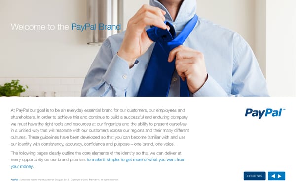
Welcome to the PayPal Brand At PayPal our goal is to be an everyday essential brand for our customers, our employees and shareholders. In order to achieve this and continue to build a successful and enduring company we must have the right tools and resources at our fingertips and the ability to present ourselves in a unified way that will resonate with our customers across our regions and their many different cultures. These guidelines have been developed so that you can become familiar with and use our identity with consistency, accuracy, confidence and purpose – one brand, one voice. The following pages clearly outline the core elements of the identity so that we can deliver at every opportunity on our brand promise: to make it simpler to get more of what you want from your money. ContentS PayPal | Corporate master brand guidelines | August 2013 | Copyright © 2013 PayPal Inc. All rights reserved.
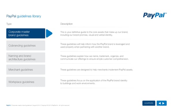
PayPal guidelines library TyTyppee Description Corporate master This is your definitive guide to the core assets that make up our brand, brand guidelines including our brand promise, visual and verbal identity. Cobranding guidelines These guidelines will help inform how the PayPal brand is leveraged and used properly when partnering with another brand. Naming and brand These guidelines explain how we name, trademark, organize, and architecture guidelines communicate our offerings to ensure simple customer comprehension. Merchant guidelines These guidelines are designed to help merchants implement PayPal assets. Workplace guidelines These guidelines focus on the application of the PayPal brand identity to buildings and work environments. ContentS PayPal | Corporate master brand guidelines | August 2013 | Copyright © 2013 PayPal Inc. All rights reserved.
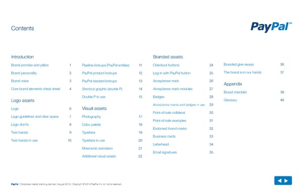
Contents Introduction Branded assets Brand promise and pillars 1 Pipeline lockups (PayPal entities) 11 Checkout buttons 24 Branded give-aways 36 Brand personality 2 PayPal product lockups 12 Log In with PayPal button 25 The brand is in our hands 37 Brand voice 3 PayPal stacked lockups 13 Acceptance mark 26 Appendix Core brand elements cheat sheet 4 Shortcut graphic (double P) 14 Acceptance mark modules 27 Brand checklist 39 Double P in use 15 Badges 28 Logo assets Glossary 40 Acceptance marks and badges in use 29 Logo 6 Visual assets Point-of-sale collateral 30 Logo guidelines and clear space 7 Photography 17 Point-of-sale examples 31 Logo don’ts 8 Color palette 18 Endorsed brand marks 32 Twin bands 9 Typeface 19 Business cards 33 Twin bands in use 10 Typeface in use 20 Letterhead 34 Mnemonic animation 21 Email signatures 35 Additional visual assets 22 PayPal | Corporate master brand guidelines | August 2013 | Copyright © 2013 PayPal Inc. All rights reserved. PayPal | Corporate master brand guidelines | August 2013 | Copyright © 2013 PayPal Inc. All rights reserved.
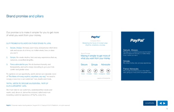
Brand promise and pillars Our promise is to make it simpler for you to get more of what you want from your money. Company Vision: Our PrOMISE IS fOuNDED ON ThESE BrAND PILLArS: Delivering the future of money today: Anytime, anywhere, any way. 1. Secure. Always: We keep your money and personal information Secure. Always. safe and secure at all times, no matter where, how or when We keep your money and personal information you use it. Brand Promise: safe and secure at all times, no matter where, Making it simpler to get more of how, or when you use it. 2. Simple: We create intuitive, fast, and easy experiences that we, what you want from your money ourselves, would find delightful. Simple. 3. fierce advocate for you: We do business honestly and Secure Simple Advocate We create intuitive, fast, and easy experiences. transparently, and we’re always innovating to give you more Fierce Advocate. control and greater value. We innovate tools that put you in the driver’s seat: giving you more control and greater value. To capitalize on our opportunity, and to deliver our corporate vision Human Innovative Helpful Courageous Vigilant of “The future of money anytime, anywhere, any way,” we need to occupy a new role in our customers’ lives, hearts and minds. paypal.com/brandcentral PAyPAL NEEDS TO BECOME AN ESSENTIAL PArT Of Our CuSTOMErS’ LIVES. We must listen to our customers, understand their needs and wants, and, above all, deliver the simplest, safest and most rewarding customer experience of PayPal, every time. ContentS PayPal | Corporate master brand guidelines | August 2013 | Copyright © 2013 PayPal Inc. All rights reserved. 1
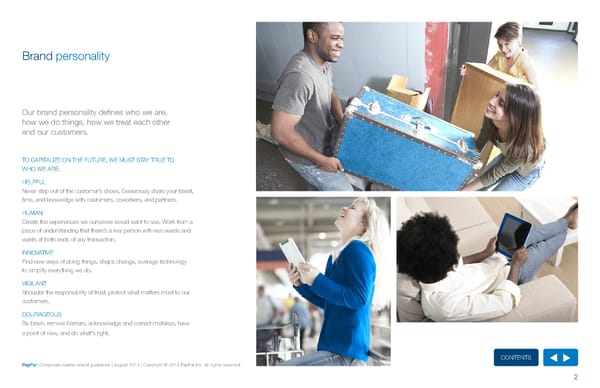
Brand personality Our brand personality defines who we are, how we do things, how we treat each other and our customers. TO CAPITALIzE ON ThE fuTurE, WE MuST STAy TruE TO WhO WE ArE: hELPfuL Never step out of the customer’s shoes. Generously share your talent, time, and knowledge with customers, coworkers, and partners. huMAN Create the experiences we ourselves would want to use. Work from a place of understanding that there’s a real person with real needs and wants at both ends of any transaction. INNOVATIVE find new ways of doing things, shape change, leverage technology to simplify everything we do. VIGILANT Shoulder the responsibility of trust, protect what matters most to our customers. COurAGEOuS Be brave, remove barriers, acknowledge and correct mistakes, have a point of view, and do what’s right. ContentS PayPal | Corporate master brand guidelines | August 2013 | Copyright © 2013 PayPal Inc. All rights reserved. 2
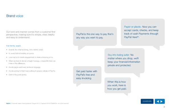
Brand voice Paper or plastic. Now you can Our tone and manner comes from a customer-first accept cards, checks, and keep perspective, making sure it’s simple, clear, helpful PayPal is the one way to pay that’s track of cash Payments through tm and easy to understand. any way you want to pay. PayPal here . ThE PAyPAL VOICE: • Sounds like a human being, not a robotic script. • Is clever, but not snobby or cynical. Buy into being safer: No • uses humor to create engagement, to share a knowing smile. matter where you shop, we’ll • When we have to deliver a tough message, a respectful tone can keep your financial information make all the difference. private and protected. • Avoids jargon and overly technical language. • Avoids acronyms that mean nothing to people outside of PayPal. Get paid faster with • Gets to the point quickly. PayPal’s free and easy invoicing. When this is how you work, here is how you get paid. ContentS PayPal | Corporate master brand guidelines | August 2013 | Copyright © 2013 PayPal Inc. All rights reserved. 3
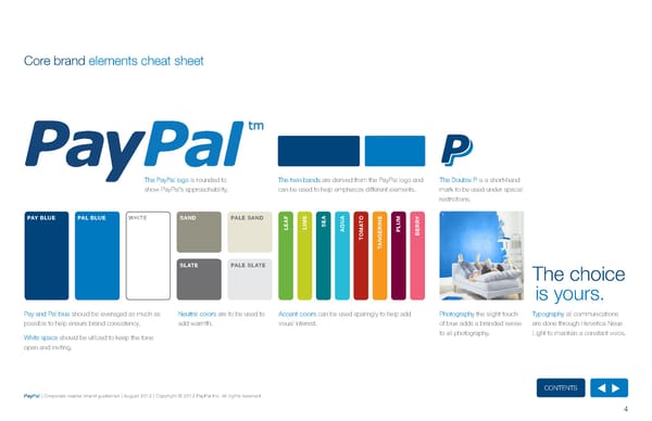
Core brand elements cheat sheet The PayPal logo is rounded to The twin bands are derived from the PayPal logo and The Double P is a short-hand show PayPal’s approachability. can be used to help emphasize different elements. mark to be used under spacial restrictions. PAY BLUE PAL BLUE WHITE SAND PALE SAND F E A A E M A M U TO N RY LE LI SE A RI LU R AQ M E P E TO B NG A T SLATE PALE SLATE The choice is yours. Pay and Pal blue should be leveraged as much as Neutral colors are to be used to Accent colors can be used sparingly to help add Photography the slight touch Typography all communications possible to help ensure brand consistency. add warmth. visual interest. of blue adds a branded sense are done through helvetica Neue White space should be utilized to keep the tone to all photography. Light to maintain a constant voice. open and inviting. ContentS PayPal | Corporate master brand guidelines | August 2013 | Copyright © 2013 PayPal Inc. All rights reserved. 4
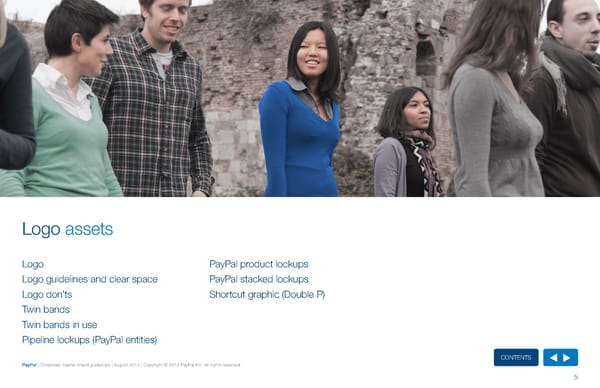
Logo assets Logo PayPal product lockups Logo guidelines and clear space PayPal stacked lockups Logo don’ts Shortcut graphic (Double P) Twin bands Twin bands in use Pipeline lockups (PayPal entities) ContentS PayPal | Corporate master brand guidelines | August 2013 | Copyright © 2013 PayPal Inc. All rights reserved. 5
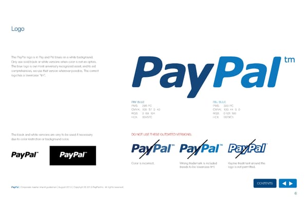
Logo The PayPal logo is in Pay and Pal blues on a white background. Only use solid black or white versions when color is not an option. The blue logo is our most universally recognized asset, and to aid comprehension, we use that version wherever possible. The correct logo has a lowercase “tm”. PAy BLuE PAL BLuE PMS: 295 PC PMS: 300 PC CMyK: 100 57 0 40 CMyK: 100 44 0 0 rGB: 0 69 124 rGB: 0 121 193 hEX: 00457C hEX: 0079C1 The black and white versions are only to be used if necessary DO NOT uSE ThESE OuTDATED VErSIONS: due to color restriction or background color. Color is incorrect. Wrong trademark is included Keyline treatment around the (needs to be lowercase tm) logo is not permitted. ContentS PayPal | Corporate master brand guidelines | August 2013 | Copyright © 2013 PayPal Inc. All rights reserved. 6
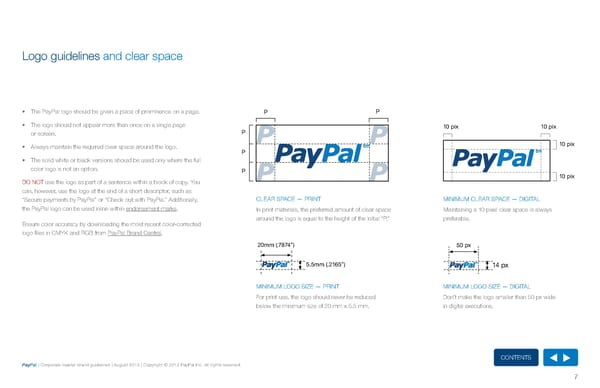
Logo guidelines and clear space • The PayPal logo should be given a place of prominence on a page. P P • The logo should not appear more than once on a single page 10 pix 10 pix or screen. P • Always maintain the required clear space around the logo. 10 pix P • The solid white or black versions should be used only where the full color logo is not an option. P 10 pix DO NOT use the logo as part of a sentence within a block of copy. you can, however, use the logo at the end of a short descriptor, such as “Secure payments by PayPal” or “Check out with PayPal.” Additionally, CLEAr SPACE — PrINT MINIMuM CLEAr SPACE — DIGITAL the PayPal logo can be used inline within endorsement marks. In print materials, the preferred amount of clear space Maintaining a 10 pixel clear space is always around the logo is equal to the height of the initial “P.” preferable. Ensure color accuracy by downloading the most recent color-corrected logo files in CMyK and rGB from PayPal Brand Central. 20mm (.7874”) 50 px 5.5mm (.2165”) 14 px MINIMuM LOGO SIzE — PrINT MINIMuM LOGO SIzE — DIGITAL for print use, the logo should never be reduced Don’t make the logo smaller than 50 px wide below the minimum size of 20 mm x 5.5 mm. in digital executions. ContentS PayPal | Corporate master brand guidelines | August 2013 | Copyright © 2013 PayPal Inc. All rights reserved. 7
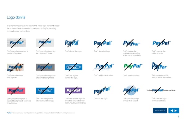
Logo don’ts The PayPal logo should not be altered. These logo standards apply for all content that is owned and controlled by PayPal, including cobranding and partnerships. Don’t place the logo over a Don’t place the logo over Don’t distort the logo. Don’t skew the logo. Don’t change the Don’t reverse the pattern of any kind. the “Double-P” mark. proportions of the Pay order of blues. to the Pal or vice versa. Don’t place the logo Don’t place the logo over Don’t put a glow Don’t add a mirror effect. Don’t alter the colors. Only use perspective over a photo. a textured background. behind the logo. effects within animations. Using saves me time. Don’t place the logo on a Don’t use a keyline or Don’t use a white logo on Don’t tilt the logo. Don’t place the logo Don’t use the logo colored background - even our stroke around the logo. any other color other than on top of an object. within a sentence. brand colors. black, Pay blue or Pal blue. ContentS PayPal | Corporate master brand guidelines | August 2013 | Copyright © 2013 PayPal Inc. All rights reserved. 8
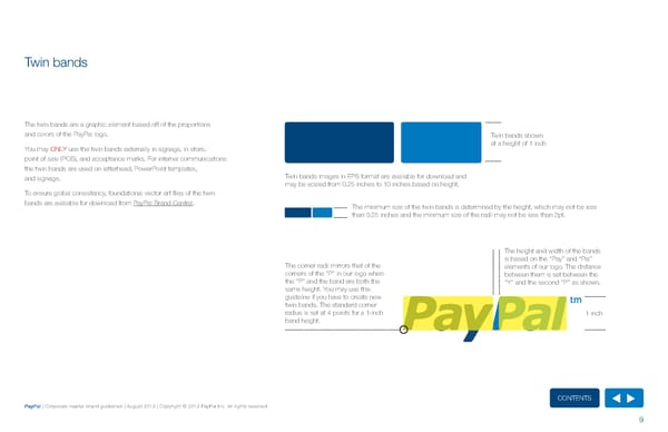
Twin bands The twin bands are a graphic element based off of the proportions and colors of the PayPal logo. Twin bands shown you may ONLy use the twin bands externally in signage, in store, at a height of 1 inch point of sale (POS), and acceptance marks. for internal communications the twin bands are used on letterhead, PowerPoint templates, and signage. Twin bands images in EPS format are available for download and may be scaled from 0.25 inches to 10 inches based on height. To ensure global consistency, foundational vector art files of the twin bands are available for download from PayPal Brand Central. The minimum size of the twin bands is determined by the height, which may not be less than 0.25 inches and the minimum size of the radii may not be less than 2pt. The height and width of the bands is based on the “Pay” and “Pal” The corner radii mirrors that of the elements of our logo. The distance corners of the “P” in our logo when between them is set between the the “P” and the band are both the “y” and the second “P” as shown. same height. you may use this guideline if you have to create new twin bands. The standard corner radius is set at 4 points for a 1-inch 1 inch band height. ContentS PayPal | Corporate master brand guidelines | August 2013 | Copyright © 2013 PayPal Inc. All rights reserved. 9
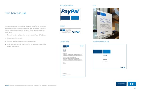
ACCEPTANCE MArK POS Twin bands in use you are not required to have a twin bands in every PayPal execution. BADGE When used correctly, the twin bands can help tie together the overall PayPal signature feel. here are some guidelines on how to use the SECURE twin bands: PAYMENTS BY • The twin bands must be in the primary colors (Pay and Pal blue). • Always orient horizontally. • use only one twin bands graphic per execution. LETTErhEAD POWErPOINT TEMPLATE • Short headlines or short blurbs of copy can be used in one of the bands, but not both. DEPARTMENT NAME January 1, 2036 FNAME LNAME TITLE HERE 123 First Street San Jose, CA 95131 Hello [fname, lname], This document is in Arial, PayPal’s new websafe typeface. It should be used across the company. The body copy is 10pt Arial. The color is Slate (RGB values: 113, 112, 116). The paragraph spacing is single. The letterhead at the top is light in color because it is attached to this document’s Master Page. It will print and pdf at full color. To change the address /contact information at the top or bottom: 1) On the Insert tab, in the Header & Footer group, click Header or Footer. 2) Click Edit Header or Edit Footer. 3) Make your changes to the address line by selecting the text and revising to your needs This document is in Arial, PayPal’s new websafe typeface. It should be used across the company. The body copy is 10pt Arial. The color is Slate (RGB values: 113, 112, 116). The paragraph spacing is single. The letterhead at the top is light in color because it is attached to this document’s Master Page. It will print and pdf at full color. Sincerely, [fname, lname] Office 555 555 1234 Fax 555 555 5678 2211 N. First Street | San Jose, CA 95131 USA www.paypal.com ContentS PayPal | Corporate master brand guidelines | August 2013 | Copyright © 2013 PayPal Inc. All rights reserved. 10
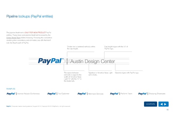
Pipeline lockups (PayPal entities) The pipeline treatment is ONLy fOr NON-PrODuCT PayPal entities. Please have your pipeline treatment reviewed by the Global Brand Team before releasing. following this convention creates global consistency and eliminates one-offs that don’t look like they’re part of PayPal. Divider line is centered vertically within Cap height aligns with the “a” of the cap height. PayPal logo. Austin Design Center The space between Typeface is helvetica Neue Light Baseline aligns with PayPal logo. elements is equal to the set in Slate. width of helvetica Neue Light “X” with the “m” in the trademark. EXAMPLES Internet retailer Conference Top Customer Merchant Services Platform Team Shopping Showcase ContentS PayPal | Corporate master brand guidelines | August 2013 | Copyright © 2013 PayPal Inc. All rights reserved. 11
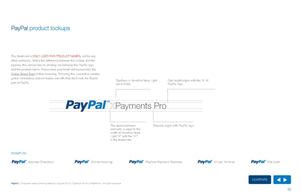
PayPal product lockups This treatment is ONLy uSED fOr PrODuCT NAMES, not for any other instances. Notice the difference between this lockup and the pipeline, this version has no dividing line between the PayPal logo and the product name. Please have your treatment reviewed by the Global Brand Team before releasing. following this convention creates global consistency and eliminates one-offs that don’t look like they’re Typeface is helvetica Neue Light Cap height aligns with the “a” of part of PayPal. set in Slate. PayPal logo. Payments Pro The space between Baseline aligns with PayPal logo. elements is equal to the width of helvetica Neue Light “X” with the “m” in the trademark. EXAMPLES Express Checkout Online Invoicing Payflow Payment Gateway Virtual Terminal Pay Later ContentS PayPal | Corporate master brand guidelines | August 2013 | Copyright © 2013 PayPal Inc. All rights reserved. 12
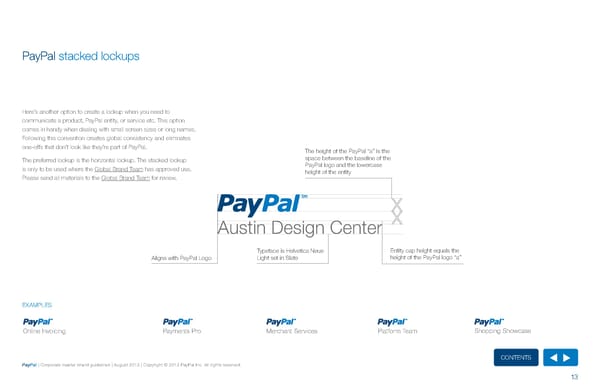
PayPal stacked lockups here’s another option to create a lockup when you need to communicate a product, PayPal entity, or service etc. This option comes in handy when dealing with small screen sizes or long names. following this convention creates global consistency and eliminates one-offs that don’t look like they’re part of PayPal. The height of the PayPal “a” is the The preferred lockup is the horizontal lockup. The stacked lockup space between the baseline of the is only to be used where the Global Brand Team has approved use. PayPal logo and the lowercase height of the entity Please send all materials to the Global Brand Team for review. Austin Design Center Typeface is Helvetica Neue Entity cap height equals the Aligns with PayPal Logo Light set in Slate height of the PayPal logo “a” EXAMPLES EXAMPLES Internet Retailer Conference Top Customer Merchant Services Platform Team Shopping Showcase Online Invoicing Payments Pro Merchant Services Platform Team Shopping Showcase ContentS PayPal | Corporate master brand guidelines | August 2013 | Copyright © 2013 PayPal Inc. All rights reserved. 13
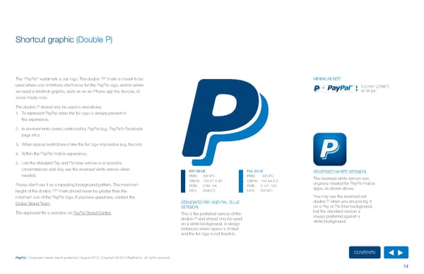
Shortcut graphic (Double P) The “PayPal” wordmark is our logo. The double “P” mark is meant to be MINIMuM SIzE used where size limitations don’t allow for the PayPal logo, and/or where = 5.5 mm (.2165”) we need a shortcut graphic, such as on an iPhone app tile, favicon, or or 14 px social media icon. The double P should only be used in executions: 1. To represent PayPal when the full logo is already present in the experience. 2. In environments clearly controlled by PayPal (e.g. PayPal’s facebook page etc.). 3. When spacial restrictions make the full logo impossible (e.g. favicon) 4. Within the PayPal mobile experience. 5. use the standard Pay and Pal blue version in all possible circumstances and only use the reversed white version when PAy BLuE PAL BLuE rEVErSED WhITE VErSION needed. PMS: 295 PC PMS: 300 PC The reversed white version was CMyK: 100 57 0 40 CMyK: 100 44 0 0 originally created for PayPal mobile Please don’t use it as a repeating background pattern. The maximum rGB: 0 69 124 rGB: 0 121 193 apps, as shown above. height of the double “P” mark should never be greater than the hEX: 00457C hEX: 0079C1 minimum size of the PayPal logo. If you have questions, contact the you may use the reversed out Global Brand Team. STANDArD PAy AND PAL BLuE double P when you are placing it VErSION on a Pay or Pal blue background, The approved file is available on PayPal Brand Central. This is the preferred version of the but the standard version is double P and should only be used always preferred against a on a white background, in design white background. instances where space is limited and the full logo is not feasible. ContentS PayPal | Corporate master brand guidelines | August 2013 | Copyright © 2013 PayPal Inc. All rights reserved. 14
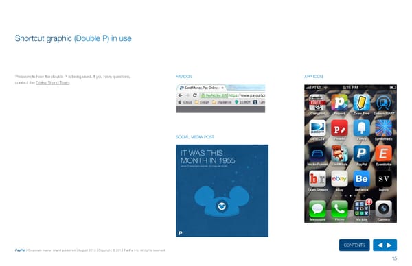
Shortcut graphic (Double P) in use Please note how the double P is being used. If you have questions, fAVICON APP ICON contact the Global Brand Team. SOCIAL MEDIA POST ContentS PayPal | Corporate master brand guidelines | August 2013 | Copyright © 2013 PayPal Inc. All rights reserved. 15
Visual assets Photography Color palette Typeface Typeface in use Mnemonic animation Additional visual assets ContentS PayPal | Corporate master brand guidelines | August 2013 | Copyright © 2013 PayPal Inc. All rights reserved. 16
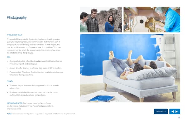
Photography A TOuCh Of BLuE An accent of blue against a desaturated background adds a unique quality to our photography, and communicates that PayPal is part of everyday life. When deciding what to “turn blue” in your images, the blue sky and blue water don’t count as your “touch of blue.” you can choose something small, like an earring or shoe, or something large, like a hat or bicycle. It’s up to you. DOs • Choose photos that reflect the brand personality of helpful, human, innovative, vigilent, and couragous. • Always strive for diversity in ethnicity, age, locale and the situation. • Please contact Worldwide Creative Services for photo selection help for external-facing executions. DON’Ts • Don’t use photos that were obviously posed or shot in a studio with models. • Don’t use multiple bright colors/saturated colors in the photo, cluttered backgrounds, or busy compositions. IMPOrTANT NOTE: The images found on Brand Central are for internal materials only (i.e. PowerPoint presentations, employee events). ContentS PayPal | Corporate master brand guidelines | August 2013 | Copyright © 2013 PayPal Inc. All rights reserved. 17
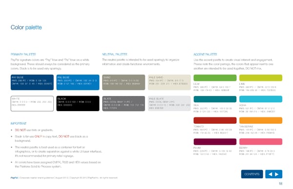
Color palette PrIMAry PALETTE NEuTrAL PALETTE ACCENT PALETTE PayPal signature colors are “Pay” blue and “Pal” blue on a white The neutral palette is intended to be used sparingly to organize use the accent palette to create visual interest and engagement. background. These should always be considered as the primary information and create functional environments. Please note the color pairings, the colors that appear next to one colors. Black is to be used very sparingly. another are intended to be used together, DO NOT mix. PAy BLuE PAL BLuE SAND PALE SAND PMS: 295 PC / rGB: 0 69 124 PMS: 300 PC / CMyK: 100 44 0 0 PMS: 416 PC / CMyK: 0 0 16 50 PMS: 454 PC / CMyK: 9 6 17 0 CMyK: 100 57 0 40 / hEX: 00457C rGB: 0 121 193 / hEX: 0079C1 rGB: 149 148 132 / hEX: 959484 rGB: 231 229 211 / hEX: E7E5D3 LEAf LIME PMS: 396 PC / CMyK: 59 0 100 7 PMS: 390 PC / CMyK: 22 0 100 8 rGB: 109 179 63 / hEX: 6DB33f rGB: 194 205 35 / hEX: C2CD23 WhITE BLACK SLATE PALE SLATE CMyK: 0 0 0 0 / rGB: 255 255 255 CMyK: 0 0 0 100 / rGB: 0 0 0 PMS: COOL GrAy 11 PC / PMS: COOL GrAy 2 PC hEX: ffffff hEX: 000000 CMyK: 0 2 0 68 / rGB: 113 112 116 CMyK: 0 0 0 10 / rGB: 230 231 232 SEA AQuA hEX: 717074 hEX: E6E7E8 PMS: 322 PC / CMyK: 100 0 33 35 PMS: 631 PC / CMyK: 67 0 12 2 rGB: 0 124 133 / hEX: 007C85 rGB: 38 188 215 / hEX: 26BCD7 IMPOrTANT TOMATO TANGErINE • DO NOT use tints or gradients. PMS: 484 PC / CMyK: 0 95 100 29 PMS: 144 PC / CMyK: 0 48 100 0 rGB: 179 35 23 / hEX: B32317 rGB: 248 152 29 / hEX: f8981D • Black is for use ONLy in copy text, DO NOT use black as a background. • The neutral palette is best used as a container for text or PLuM BErry infographics, or to create separation against a white uI (user interface). PMS: 229 PC / CMyK: 0 100 15 60 PMS: 198 PC / CMyK: 0 78 33 0 It’s not recommended for primary retail signage. rGB: 122 0 60 / hEX: 7A003C rGB: 241 95 124 / hEX: f15f7C • All colors have been assigned CMyK, rGB and hEX values based on the Pantone Solid to Process system. ContentS PayPal | Corporate master brand guidelines | August 2013 | Copyright © 2013 PayPal Inc. All rights reserved. 18
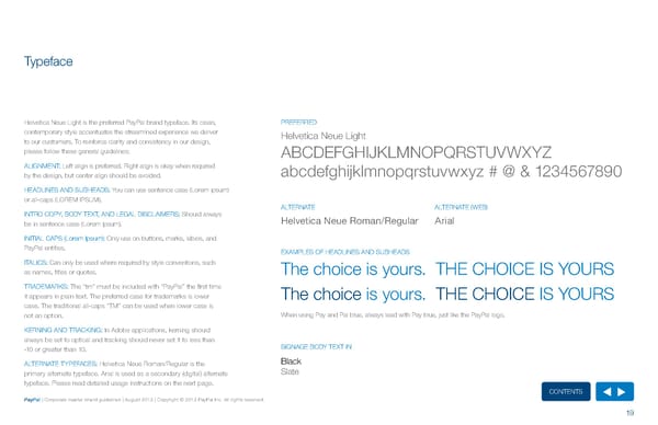
Typeface helvetica Neue Light is the preferred PayPal brand typeface. Its clean, PrEfErrED contemporary style accentuates the streamlined experience we deliver helvetica Neue Light to our customers. To reinforce clarity and consistency in our design, please follow these general guidelines: ABCDEfGhIJKLMNOPQrSTuVWXyz ALIGNMENT: Left align is preferred. right align is okay when required abcdefghijklmnopqrstuvwxyz # @ & 1234567890 by the design, but center align should be avoided. hEADLINES AND SuBhEADS: you can use sentence case (Lorem ipsum) or all-caps (LOrEM IPSuM). ALTErNATE ALTErNATE (WEB) INTrO COPy, BODy TEXT, AND LEGAL DISCLAIMErS: Should always Helvetica Neue Roman/Regular Arial be in sentence case (Lorem ipsum). INITIAL CAPS (Lorem Ipsum): Only use on buttons, marks, labels, and PayPal entities. EXAMPLES Of hEADLINES AND SuBhEADS ITALICS: Can only be used where required by style conventions, such as names, titles or quotes. The choice is yours. ThE ChOICE IS yOurS TrADEMArKS: The “tm” must be included with “PayPal” the first time it appears in plain text. The preferred case for trademarks is lower The choice is yours. ThE ChOICE IS yOurS case. The traditional all-caps “TM” can be used when lower case is not an option. When using Pay and Pal blue, always lead with Pay blue, just like the PayPal logo. KErNING AND TrACKING: In Adobe applications, kerning should always be set to optical and tracking should never set it to less than -10 or greater than 10. SIGNAGE BODy TEXT IN ALTErNATE TyPEfACES: helvetica Neue roman/regular is the Black primary alternate typeface. Arial is used as a secondary (digital) alternate Slate typeface. Please read detailed usage instructions on the next page. ContentS PayPal | Corporate master brand guidelines | August 2013 | Copyright © 2013 PayPal Inc. All rights reserved. 19
Typeface in use DIGITAL PrINT helvetica Neue Light is always the preferred typeface, but in digital DO NOT use Arial for any print materials. applications, the use of helvetica Neue roman/regular and Arial Preferred: use helvetica Neue Light for all printed materials. is also acceptable. Mac: helvetica Neue is installed as a default font on your machine. Alternate: use helvetica Neue roman/regular when the type size however, people viewing your work on a PC will see Arial. use Virtual PC is smaller than 5pt to ensure legibility. to test how the final will render. When creating presentations, use Arial. PC: To obtain the helvetica Neue font package, designers may contact IMPOrTANT NOTE: the Global Brand Team. There is a limited number of licenses available. The type settings “crisp,” “strong,” and “sharp” are Photoshop-specific until an enterprise solution is in place, you can use the Arial equivalents. options. All live text: use helvetica Neue Light Sharp. When the typeface is below 8pt, use helvetica Neue roman/regular Sharp. use Arial regular Crisp as the backup font. Buttons, Badges, and Acceptance Marks: use helvetica Neue roman/regular Sharp for all non-logo text. use Arial regular Sharp when text is smaller than 8pt. ContentS PayPal | Corporate master brand guidelines | August 2013 | Copyright © 2013 PayPal Inc. All rights reserved. 20
Mnemonic animation The mnemonic animation is to be used for animations and commer- MNEMONIC ANIMATION SOCIAL MEDIA ICONS cials. In the case that your needs require such a treatment, please follow these guidelines: • The right band in the mnemonic animation spins on a horizontal axis. • The message within the twin bands should ladder up to the PayPal value prop: It’s the one way to pay, any way I want to pay and everywhere I want to pay. • When showcasing social media icons in situations outside of the web, we strongly encourage, where permissible, the use of PayPal brand colors (shown to the right) when portraying these icons. In select cases, such as TV advertising, use the original colors of each social media brand icon. This unique example of the use of twin bands provided here gives an example of Mnemonic Animation. however, please note it is an exception to the rule and should not be taken as an accurate interpretation of the guidelines. Please don’t create your own mnemonic animation. If your execution calls for one, or if you have any questions regarding social media icons please contact the Global Brand Team. ContentS PayPal | Corporate master brand guidelines | August 2013 | Copyright © 2013 PayPal Inc. All rights reserved. 21
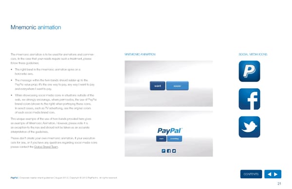
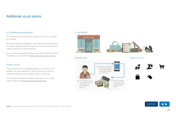
Illustration Guidelines Execution Buildings (Commercial) Additional visual assets There are three tiers of commercial architectural structures that vary depending on their prominence and placement in relation to the foreground. Illustration Guidelines Tier 1 (Street Level) Tier 2 (Foreground Metropolitan) Tier 3 (Background Metropolitan) Execution Objects ILLuSTrATIONS & INfOGrAPhICS ILLuSTrATIONS Objects in the PayPal Universe are more flexible with the grid than buildings, but not as flexible as people. In creating objects, Use the Saturated and Sand & Stone Palettes. They are, for the most part, built on a grid and contain 10% Grey shading. Objects aren’t tiered as they are typically created as a prominent element in a story such as infographics and editorial graphics. The illustrations were developed for web-use only; PayPal is a photo- driven brand. Illustration Guidelines FASHION BOUTIQUE Execution There are a number of infographics used in the PayPal universe. They are used for instructing users on pages like how To’s and are typically 3-step, guided process demonstrations. Infographics If you should have requests for further usage of the illustrations and/or There are a number of infographics used in the PayPal Universe. They are used for instructing users on infographics please contact the Worldwide Creative Services Team. processes on pages like How To’s and are typically 3-step, guided process demonstrations. Tier 1 structures are street-level flat Tier 2 structures are wide-views of Tier 3 structures are the most distant INfOGrAPhICS ICONS / GLyPhS perspective that use all of the color palettes. metropolitan areas in full scope. The used the and simple structure forms. They limit They are typically retail structures that are a Sand Color Palette in combination with the themselves to the Sand Color Palette nd single story, though exceptions can be made. blue of the Saturated Color Palette and cast typically only use 4 tones. These buildings ICONS / GLyPhS These building contain the most detail and shadows from the top of the window panes are the most distant and provide only partial the more drastic lighting of the three. with a 10% Grey on Multiply. supplementary atmosphere. These should be used as wayfinding graphics consistently across desktop and mobile experiences. They are not for use in tactical marketing executions such as banners, emails, or print ads. If you should have requests for further usage of the icons / glyphs please contact the Worldwide Creative Services Team. Interaction Lines These lines guide users through the steps of a process. They are created in Pal Blue. Above are the specs for the interaction lines. Tier 1 Character Cuts Step Numbering ContentS PayPal | Corporate master brand guidelines | August 2013 | Copyright © 2013 PayPal Inc. All rights reserved. Tier 1 Characters terminate in a cut into Each step has a numbered shape to make the canvas. These files can be found in it easier to follow along. These are already the perviously creating infographic pages created and need only changes to the and include a highlight and shadow to numbers if needed. 22 dimensionally create a character terminal.
Branded assets Checkout buttons Acceptance marks and badges in use Letterhead Log In with PayPal button Point-of-sale collateral Email signatures Acceptance mark Point-of-sale examples Branded give-aways Acceptance mark modules Endorsed brand marks Badges Business cards ContentS PayPal | Corporate master brand guidelines | August 2013 | Copyright © 2013 PayPal Inc. All rights reserved. 23
Checkout buttons Checkout buttons live in a digital merchant experience and trigger a VISuAL EXAMPLES COMING SOON checkout flow. • Sunrise is the preferred button color for buttons that lead to a payment flow. Silver buttons are only an option if the sunrise color doesn’t pop on a merchant’s page or for more high-end merchants (e.g. Neiman Marcus or Burberry). • The checkout button comes in three formats: º Branded: This option features the PayPal logo on the right and the call-to-action on the left. º unbranded: This option is just the call-to-action copy. º unbranded with acceptance marks: Similar to the unbranded version, this has the appropriate acceptance marks centered below the button. • All non-logo, call-to-action text should be in the alternate typeface, helvetica Neue roman/regular. The alternate typeface is used in this exceptional case to maximize legibility for on-screen experience. use Arial regular when text size is smaller than 8pt. • When CTA text does not fit on one line, text should appear on a second line below the first text line, and aligned-right with first text line. DO NOT create your own buttons. Please contact the Global Brand Team when a specific button is needed. ContentS PayPal | Corporate master brand guidelines | August 2013 | Copyright © 2013 PayPal Inc. All rights reserved. 24
Log In with PayPal button The Log In with PayPal button is the first introduction to the PayPal VISuAL EXAMPLES COMING SOON brand. It is important that we unify this experience to remain true to our one brand, one voice ethos. • Silver is the primary button color because it utilizes the full color PayPal logo. • Blue is the alternate color and should only be used if the silver button will not pop or if requested. • All non-logo, call-to-action text should be in the alternate typeface, helvetica Neue roman/regular. The alternate typeface is used in this exceptional case to maximize legibility for on-screen experience. use Arial regular when text size is smaller than 8pt. DO NOT create your own buttons. Please contact the Global Brand Team when a specific button is needed. ContentS PayPal | Corporate master brand guidelines | August 2013 | Copyright © 2013 PayPal Inc. All rights reserved. 25
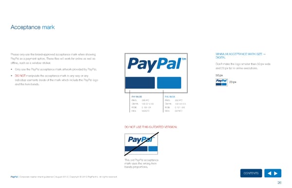
Acceptance mark Please only use the brand-approved acceptance mark when showing MINIMuM ACCEPTANCE MArK SIzE — PayPal as a payment option. These files will work for online as well as DIGITAL offline, such as a window sticker. Don’t make the logo smaller than 50 px wide • Only use the PayPal acceptance mark artwork provided by PayPal. and 23 px tall in online executions. • DO N OT manipulate the acceptance mark in any way or any 50 px individual elements inside of the mark which include the PayPal logo 23 px and the twin bands. PAy BLuE PAL BLuE PMS: 295 PC PMS: 300 PC CMyK: 100 57 0 40 CMyK: 100 44 0 0 rGB: 0 69 124 rGB: 0 121 193 hEX: 00457C hEX: 0079C1 DO NOT uSE ThIS OuTDATED VErSION: This old PayPal acceptance mark uses the wrong twin bands proportions. ContentS PayPal | Corporate master brand guidelines | August 2013 | Copyright © 2013 PayPal Inc. All rights reserved. 26
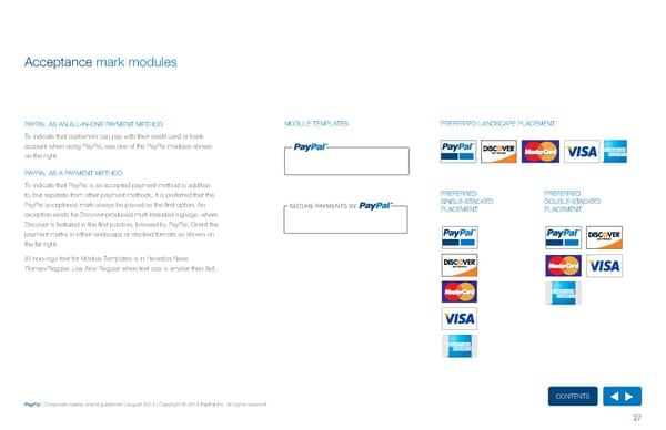
Acceptance mark modules PAyPAL AS AN ALL-IN-ONE PAyMENT METhOD MODuLE TEMPLATES PrEfErrED LANDSCAPE PLACEMENT To indicate that customers can pay with their credit card or bank account when using PayPal, use one of the PayPal modules shown on the right. ® ®® ® PAyPAL AS A PAyMENT METhOD To indicate that PayPal is an accepted payment method in addition to, but separate from other payment methods, it is preferred that the PrEfErrED PrEfErrED PayPal acceptance mark always be placed as the first option. An SECURE PAYMENTS BY SINGLE-STACKED DOuBLE-STACKED exception exists for Discover-produced multi-branded signage, where PLACEMENT PLACEMENT Discover is featured in the first position, followed by PayPal. Orient the payment marks in either landscape or stacked formats as shown on the far right. ® ® All non-logo text for Module Templates is in helvetica Neue roman/regular. use Arial regular when text size is smaller than 8pt. ® ® ® ® ContentS PayPal | Corporate master brand guidelines | August 2013 | Copyright © 2013 PayPal Inc. All rights reserved. 27
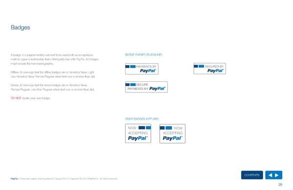
Badges A badge is a supplementary element to be used with an acceptance BADGE EXAMPLES (ONLINE) mark to signal a relationship that a third party has with PayPal. All badges must include the twin band graphic. PAYMENTS BY SECURED BY Offline: All non-logo text for offline badges are in helvetica Neue Light. use helvetica Neue roman/regular when text size is smaller than 5pt. Online: All non-logo text for online badges are in helvetica Neue SECURE roman/regular. use Arial regular when text size is smaller than 8pt. PAYMENTS BY DO NOT create your own badge. DOOr BADGES (OffLINE) NOW NOW ACCEPTING ACCEPTING ContentS PayPal | Corporate master brand guidelines | August 2013 | Copyright © 2013 PayPal Inc. All rights reserved. 28
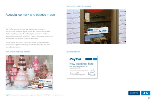
DISPLAyED IN A STOrE’S WINDOW Acceptance mark and badges in use The PayPal acceptance mark and badges must be used in accordance to the terms of your license or sublicense usage of the PayPal brand. you may not use the PayPal acceptance marks in anyway that may directly or indirectly impair or discourage acceptance or use of the PayPal name, products or services. When multiple acceptance marks are present, it is preferred that the PayPal acceptance mark be placed first and sized at the same proportion/dimension. DISPLAyED IN A STOrE’S WINDOW rEGISTEr STICKEr ContentS PayPal | Corporate master brand guidelines | August 2013 | Copyright © 2013 PayPal Inc. All rights reserved. 29
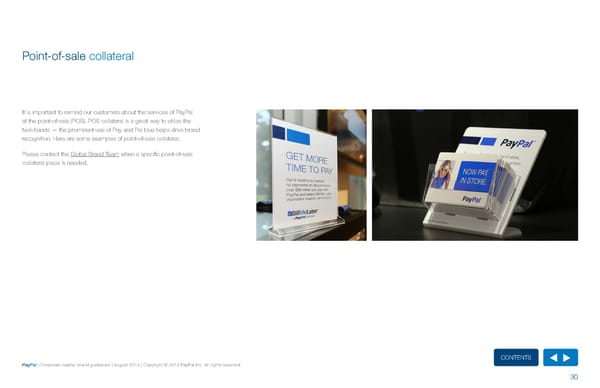
Point-of-sale collateral It is important to remind our customers about the services of PayPal at the point-of-sale (POS). POS collateral is a great way to utilize the twin bands — the prominent use of Pay and Pal blue helps drive brand recognition. here are some examples of point-of-sale collateral. Please contact the Global Brand Team when a specific point-of-sale collateral piece is needed. ContentS PayPal | Corporate master brand guidelines | August 2013 | Copyright © 2013 PayPal Inc. All rights reserved. 30
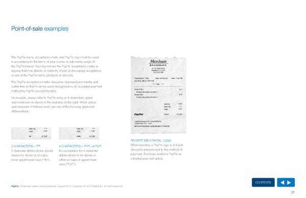
Point-of-sale examples The PayPal name, acceptance mark, and PayPal logo must be used in accordance to the terms of your license or sublicense usage of the PayPal brand. you may not use the PayPal acceptance marks in anyway that may directly or indirectly impair or discourage acceptance or use of the PayPal name, products or services. The PayPal acceptance marks should be displayed prominently and clutter free so that it can be easily recognized as an accepted payment method by PayPal account holders. On receipts, always refer to PayPal using all 6 characters, upper and lowercase as shown in the example on the right. When space and character limitations exist, use one of the following approved abbreviations: PP PYPL rECEIPT WITh PAyPAL LOGO 2 ChArACTErS – PP 4 ChArACTErS – PyPL or PyPl When available, a PayPal logo in all black 2 character abbreviations should It is acceptable for 4 character should be present next to the method of always be shown in all-caps, abbreviations to be shown in payment. This helps reinforce PayPal as never upper/lower case (“Pp”). either all-caps or upper/lower a trusted payment option. case (“PyPl”). ContentS PayPal | Corporate master brand guidelines | August 2013 | Copyright © 2013 PayPal Inc. All rights reserved. 31
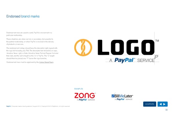
Endorsed brand marks Endorsement lines are used to clarify PayPal’s involvement in a particular relationship. These situations are when our role is secondary, but essential to TM the partner relationship, or when PayPal is involved in the delivery of products or services. The endorsement lockup should have the descriptor right aligned with the logo (not including any TM). The descriptor text should be all caps, helvetica Neue Light, in Slate (helvetica Neue roman/regular if smaller LOGO than 5pt), and the same height as the “a” in PayPal. The “a” height should then be placed one “P” below the logo baseline. A SERVICE Endorsement lines must be approved by the Global Brand Team. EXAMPLES ContentS PayPal | Corporate master brand guidelines | August 2013 | Copyright © 2013 PayPal Inc. All rights reserved. 32
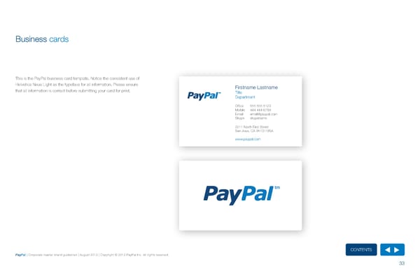
Business cards This is the PayPal business card template. Notice the consistent use of helvetica Neue Light as the typeface for all information. Please ensure Firstname Lastname that all information is correct before submitting your card for print. Title Department Office 555 555 5123 Mobile 444 444 6789 Email email@paypal.com Skype skypename 2211 North First Street San Jose, CA 95131 USA www.paypal.com ContentS PayPal | Corporate master brand guidelines | August 2013 | Copyright © 2013 PayPal Inc. All rights reserved. 33
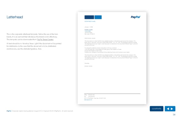
Letterhead DEPARTMENT NAME January 1, 2036 FNAME LNAME TITLE HERE 123 First Street This is the corporate letterhead template. Notice the use of the twin San Jose, CA 95131 bands. It is an element that introduces the brand colors effectively. This template can be downloaded from PayPal Brand Central. Hello [fname, lname], This document is in Arial, PayPal’s new websafe typeface. It should be used across the company. The All text should be in helvetica Neue Light if the document will be printed body copy is 10pt Arial. The color is Slate (RGB values: 113, 112, 116). The paragraph spacing is single. The letterhead at the top is light in color because it is attached to this document’s Master Page. It will print for distribution. In the case that the document is to be distributed and pdf at full color. electronically, use the alternate typeface, Arial. To change the address /contact information at the top or bottom: 1) On the Insert tab, in the Header & Footer group, click Header or Footer. 2) Click Edit Header or Edit Footer. 3) Make your changes to the address line by selecting the text and revising to your needs This document is in Arial, PayPal’s new websafe typeface. It should be used across the company. The body copy is 10pt Arial. The color is Slate (RGB values: 113, 112, 116). The paragraph spacing is single. The letterhead at the top is light in color because it is attached to this document’s Master Page. It will print and pdf at full color. Sincerely, [fname, lname] Office 555 555 1234 Fax 555 555 5678 2211 N. First Street | San Jose, CA 95131 USA www.paypal.com ContentS PayPal | Corporate master brand guidelines | August 2013 | Copyright © 2013 PayPal Inc. All rights reserved. 34
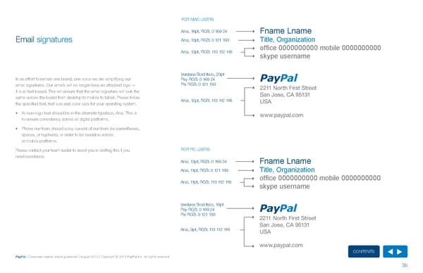
fOr MAC uSErS Arial, 16pt, rGB: 0 169 24 Fname Lname Email signatures Arial, 13pt, rGB: 0 121 193 Title, Organization Arial, 13pt, rGB: 113 112 116 office 0000000000 mobile 0000000000 skype username Verdana Bold Italic, 20pt In an effort to remain one brand, one voice we are simplifying our Pay rGB: 0 169 24 PayPal email signatures. Our emails will no longer have an attached logo — Pal rGB: 0 121 193 2211 North First Street it is all text based. This will ensure that the email signature will look the San Jose, CA 95131 same across the board from desktop to mobile to tablet. Please follow Arial, 12pt, rGB: 113 112 116 USA the specified font, text size and color calls for your operating system. • All non-logo text should be in the alternate typeface, Arial. This is www.paypal.com to ensure consistency across all digital platforms. • Phone numbers should soley consist of numbers (no parentheses, spaces, or hyphens), in order to be readable across all mobile platforms. Please contact your team leader to assist you in crafting this if you fOr PC uSErS need assistance. Arial, 13pt, rGB: 0 169 24 Fname Lname Arial, 11pt, rGB: 0 121 193 Title, Organization Arial, 11pt, rGB: 113 112 116 office 0000000000 mobile 0000000000 skype username Verdana Bold Italic, 18pt Pay rGB: 0 169 24 PayPal Pal rGB: 0 121 193 2211 North First Street San Jose, CA 95131 Arial, 9pt, rGB: 113 112 116 USA www.paypal.com ContentS PayPal | Corporate master brand guidelines | August 2013 | Copyright © 2013 PayPal Inc. All rights reserved. 35
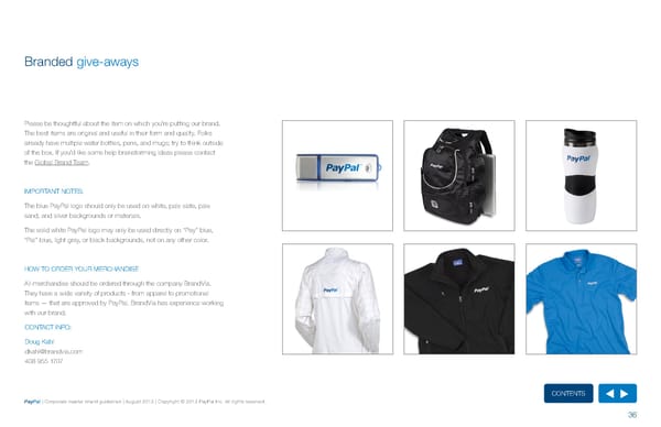
Branded give-aways Please be thoughtful about the item on which you’re putting our brand. The best items are original and useful in their form and quality. folks already have multiple water bottles, pens, and mugs; try to think outside of the box. If you’d like some help brainstorming ideas please contact the Global Brand Team. IMPOrTANT NOTES: The blue PayPal logo should only be used on white, pale slate, pale sand, and silver backgrounds or materials. The solid white PayPal logo may only be used directly on “Pay” blue, “Pal” blue, light gray, or black backgrounds, not on any other color. hOW TO OrDEr yOur MErChANDISE All merchandise should be ordered through the company BrandVia. They have a wide variety of products - from apparel to promotional items — that are approved by PayPal. BrandVia has experience working with our brand. CONTACT INfO: Doug Kahl dkahl@brandvia.com 408 955 1707 ContentS PayPal | Corporate master brand guidelines | August 2013 | Copyright © 2013 PayPal Inc. All rights reserved. 36
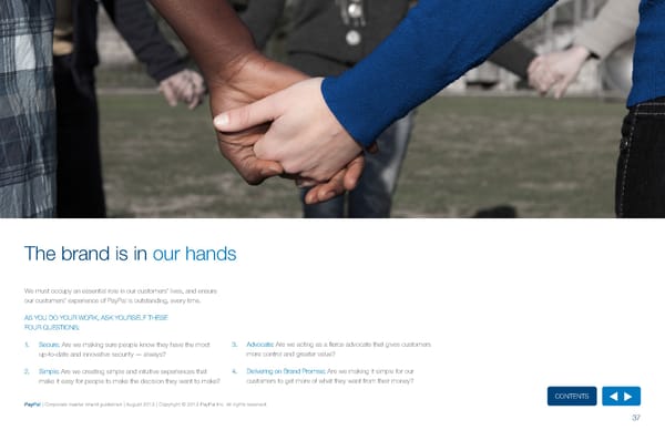
The brand is in our hands We must occupy an essential role in our customers’ lives, and ensure our customers’ experience of PayPal is outstanding, every time. AS yOu DO yOur WOrK, ASK yOurSELf ThESE fOur QuESTIONS: 1. Secure: Are we making sure people know they have the most 3. Advocate: Are we acting as a fierce advocate that gives customers up-to-date and innovative security — always? more control and greater value? 2. Simple: Are we creating simple and intuitive experiences that 4. Delivering on Brand Promise: Are we making it simple for our make it easy for people to make the decision they want to make? customers to get more of what they want from their money? ContentS PayPal | Corporate master brand guidelines | August 2013 | Copyright © 2013 PayPal Inc. All rights reserved. 37
Appendix Brand checklist Glossary ContentS PayPal | Corporate master brand guidelines | August 2013 | Copyright © 2013 PayPal Inc. All rights reserved.
Brand checklist The following is a short checklist that you can use against your PhOTOGrAPhy item to see how close you are to ‘on brand’. Please read through • Are you using photography that emphasize the PayPal brand the guidelines to make sure you have a good grasp of the scope personality (humanistic)? of your project. This checklist is just the essentials; it doesn’t • Are you adding a touch of blue to your photography? address specifics. If you have any challenges beyond those listed below, please contact the Global Brand Team. COPy BASICS • Is the language uncomplicated? Is it simple and straightforward? LOGO • Is the language and look people focused? • Are you addressing the principles of PayPal (It’s the one way to • Are you using the correct logo? pay, any way I want to pay and everywhere I want to pay)? • Are you following the clear space regulations? ACCEPTANCE MArK AND BADGES • Are you following the guidelines around the logo don’ts? TyPEfACE • Are you correctly using a PayPal acceptance mark? • Are you able to place the PayPal acceptance mark as the first • Are you using helvetica Neue Light or alternate typefaces? acceptance mark in a list? • Are you following the typeface in use rules? • Are you using the correct badge? COLOr PALETTE • Are PayPal’s primary colors the hero of the collateral? • have you used the accent / neutral palette appropriately (not a necessity)? ContentS PayPal | Corporate master brand guidelines | August 2013 | Copyright © 2013 PayPal Inc. All rights reserved. 39
Glossary CMyK LEADING rGB Abbreviations for the colors Cyan (C), Magenta (M), yellow (y), and The space between lines of type. It is generally measured from Screen-based applications such as websites and apps typically Black (K), the inks used in four-color printing. When these inks are baseline to baseline and expressed in points. select their color palette from the rGB color system - a palette combined in they can produce a wide spectrum of color. containing differing combinations of red (r), Green (G), and Blue (B). LOCKuP COLOr PALETTE The fixed arrangement of one, two, or more graphic elements – such TyPEfACE A combination of colors that are intended to be used together. In this as a logo and web address etc. – to create a single unit. A specific mark that is a combination of letters, symbols, or graphics case the colors are a key part of the branded experience and help used to identify a brand in a single instance. Logos often embody the form a sense of place. core values of a brand and use the brand colors. LOGO fAVICON A specific mark that is a combination of letters, symbols, or VECTOr ArT graphics used to identify a brand in a single instance. Logos often A small shortcut graphic that is 16 x 16 pixels, associated with a embody the core values of a brand and use the brand colors. A non-resolution dependent file format that consists of connected particular Web site and placed just in front of the urL. points; the size of these files can be altered without affecting the appearance. Vector files are often constructed in Adobe Illustrator. PANTONE (PMS) KErNING Pantone Matching System (PMS) is the world standard for the Adjustment of spacing between a pair of type characters. specification of printed inks between designers and printers. ContentS PayPal | Corporate master brand guidelines | August 2013 | Copyright © 2013 PayPal Inc. All rights reserved. 40