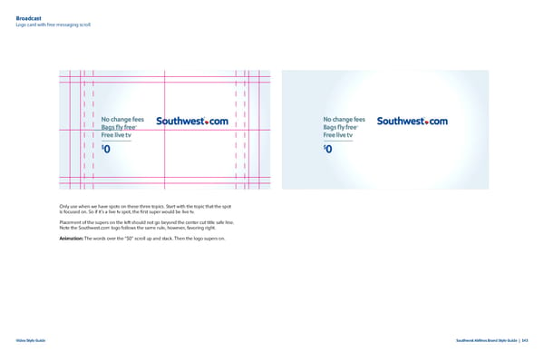
Broadcast Logo card with free messaging scroll Only use when we have spots on these three topics. Start with the topic that the spot is focused on. So if it’s a live tv spot, the first super would be live tv. Placement of the supers on the left should not go beyond the center cut title safe line. Note the Southwest.com logo follows the same rule, however, favoring right. Animation: The words over the “$0” scroll up and stack. Then the logo supers on. Video Style Guide Southwest Airlines Brand Style Guide | 143
 Southwest Airlines Brand Book Page 142 Page 144