Torlago Brand Book
Torlago create bespoke solutions to the African entrepreneur or business person that desires to be an internationally relevant company.
Brand Guidelines Brand Identity manual for Torlago InternationalConsultants Limited © 2020 Kishi Creative Agency June 2020
This document communicates the brand identity of Torlago International Consultants Limited. Clearly An Overview articulating the mission, values and persona for the design of all subsequent brand artifacts © 2020 Kishi Creative Agency 02
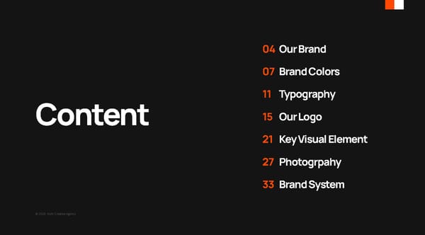
04 Our Brand 07 Brand Colors 11 Typography Content 15 Our Logo 21 Key Visual Element 27 Photogrpahy 33 Brand System © 2020 Kishi Creative Agency
Our Brand 04 © 2020 Kishi Creative Agency
© 2020 Kishi Creative Agency About us In recent times, there has been an increase in the Our Vision is to be the go-to immigration of people from Nigeria into Canada. Over time the flow of Nigerians into Canada is going to open consultants for businesses and business channels that both nations can benefit from. Torlago was birthed to help businesses and investors investors that want to expand into the to take advantage of the opportunities that arise from Nigerian and Canadian markets. the creation of these business channels . Torlago wants to be the link between both countries that facilitates the flow of business and investments from Canada to Nigeria and vice versa, such that the 04 businesses are best positioned for growth. OUR BRAND 05
© 2020 Kishi Creative Agency For businesses and investors that want to expand into the Nigerian and Positioning Canadian markets, Torlago helps to position and navigate them towards opportunities for growth. OUR BRAND 06
Brand Colors 07 © 2020 Kishi Creative Agency
© 2020 Kishi Creative Agency Eerie Black International Orange Sivler #141414 #B40C00 #C3C3C3 CMYK 00 00 00 92 CMYK 00 93 100 29 CMYK 00 00 00 24 RGB 20 20 20 RGB 180 12 00 RGB 195 195 195 White Color Palette Color is highly communicative and plays an important role within our identity. A range of curated colours are available which can be used to communicate in a wide range of tones. A consistency in approach to Red Orange colour is integral. #FF4800 CMYK 00 72 100 00 RGB 255 72 00 07 BRAND COLORS
© 2020 Kishi Creative Agency Valid Pairings A consistent approach to the application of colour is important for communicating in-line with our confident, clean and simple aesthetic. These are some examples of successful three and four color pairings. BRAND COLORS 09
© 2020 Kishi Creative Agency Invalid Pairings A consistent approach to the application of colour is important for communicating in-line with our confident, clean and simple aesthetic. These are some examples of some invalid parings of the color palette. BRAND COLORS 10
Typography 11 © 2020 Kishi Creative Agency
© 2020 Kishi Creative Agency AaOpen Sans Fonts Typography makes up a large part of our visual abcdefghijklmnopqrstuvwxyz identity. Our two typefaces and broad selection of weights allow us to communicate in a wide range of tones. ABCDEFGHIJKLMNOPQ RSTUVWXYZ0123456789 / ABCDEFGHIJKLMNOPQRSTUVWXYZ / abcdefghijklmnopqrstuvwxyz Open Sans Open Sans Open Sans Open Sans Open Sans Light Regular Semi-Bold Bold Extra-Bold 11 12 TYPOGRAPHY
© 2020 Kishi Creative Agency AaManrope Fonts Typography makes up a large part of our visual abcdefghijklmnopqrstuvwxyz identity. Our two typefaces and broad selection of weights allow us to communicate in a wide range of tones. ABCDEFGHIJKLMNOPQ RSTUVWXYZ0123456789 abcdefghijklmnopqrstuvwxyz / ABCDEFGHIJKLMNOPQRSTUVWXYZ / Manrope Manrope Manrope Semi-bold Bold Extra-Bold TYPOGRAPHY 13
© 2020 Kishi Creative Agency A B Typesetting Our brand has two formats for using the brand fonts. Main Heading Main Format A Lorem ipsum 1. Headline: Manrope Extra-Bold 48pts Leading: 56pts Tracking: -50 dolor sit amet, Heading 2. Sub-Copy: Open Sans Semi-Bold 12pts 2. 2. Leading: 14.4pts (Auto) Tracking: 0 (Default) Suppporting Heading Suppporting Heading Lorem ipsum dolor sit amet, consectetuer adipiscing elit, sed diam nonummy nibh Lorem ipsum dolor sit amet, euismod tincidunt ut. magna aliquam erat volutpat. Ut wisi enim ad consectetuer adipiscing elit, 3. Copy: Open Sans Bold/Light 10pts minim veniam, quis nostrud exerci tation sed diam nonummy nibh ullamcorper suscipit lobortis nisl ut aliquip ex ea Leading: 12pts(Auto) Tracking: 0 (Default) commodo consequat. Duis autem vel eum iriure euismod tincidunt ut. dolor in hendrerit in vulputate velit esse Format B 3. 3. Paragraph Heading Paragraph Heading 1. Headline: Manrope Extra-Bold 80pts Leading: Lorem ipsum dolor sit amet, consectetuer adipiscing elit, sed Lorem ipsum dolor sit amet, consectetuer adipiscing elit, sed diam nonummy nibh euismod tincidunt ut laoreet dolore diam nonummy nibh euismod tincidunt ut laoreet dolore magna aliquam erat volutpat. Ut wisi enim ad minim veniam, magna aliquam erat volutpat. Ut wisi enim ad minim veniam, 90pts Tracking: -50 quis nostrud exerci tation ullamcorper suscipit lobortis nisl ut quis nostrud exerci tation ullamcorper suscipit lobortis nisl ut aliquip ex ea commodo consequat. Duis autem vel eum iriure aliquip ex ea commodo consequat. Duis autem vel eum iriure dolor in hendrerit in vulputate velit esse molestie consequat, dolor in hendrerit in vulputate velit esse molestie consequat, vel illum dolore eu feugiat nulla facilisis at vero eros et vel illum dolore eu feugiat nulla facilisis at vero eros et accumsan et iusto odio dignissim qui blandit praesent accumsan et iusto odio dignissim qui blandit praesent 2. Sub-Copy: Open Sans Regular 21pts Leading: luptatum zzril delenit augue duis dolore te feugait. luptatum zzril delenit augue duis dolore te feugait. 25.2pts (Auto) Tracking: 0 (Default) 3. Copy: Same as A TYPOGRAPHY 14
Our Logo 15 © 2020 Kishi Creative Agency
© 2020 Kishi Creative Agency Logo mark Our Logo is an essential for our organisation. It embodies our core proposition and acts as a recognisable signature uniting all parts of our brand. It should be used consistently across all communications. Brand mark The design emphasizes boldness, modernity, abstractness, and readability. The main element of the logo is an abstract combination of the letters 'T' 15 and 'C'- which also forms an ambigram. OUR LOGO 16
© 2020 Kishi Creative Agency 1:4 1:4 Logo usage A minimum area of surrounding space is required 1:4 across all visual communication. The exclusion zone must be relaive to the size of the brandmark 1:4 1:4 therefore equal to 1:4 of the brandmark size. Minimum Size Avoid using the full logo mark at a size smaller than 30mm/114px and the brand mark at 35px or 10mm 30mm/114px 10mm/35px OUR LOGO 17
© 2020 Kishi Creative Agency Positoning In all communications, the logo should be anchored top-left or alternatively, bottom-left. In instances where this is not possible, the other two corners can be used. OUR LOGO 18
© 2020 Kishi Creative Agency Correct application Please use the full color logo on black backgrounds, the alternate logo can be used on a white background. When applying the logo images, the mono variation (all white) of the logo should be used, depending on the image contrast. OUR LOGO 19
© 2020 Kishi Creative Agency Incorrect application Please ensure that you; -Do not change the logo in an unspecified color or combination of colors. -Do not scale, scretch or disproportionately resize the logo. - Torlago Do not use the logo other than Horizontally International -Do not attempt to recreate the logo. Consultants -Do not use the logo as a repeated pattern. -Do not apply graphical elements such as drop shadow or glow. -Do not change the composition of the logo. - Do use the wrong logo color on a background without proper contrast. OUR LOGO 20
Key Visual Element 21 © 2020 Kishi Creative Agency
© 2020 Kishi Creative Agency Design The key visual element was created from the brand mark. It was broken down into equal & even parts to create repetitions that stand as an identifier for the brand. 21 22 KEY VISUAL ELEMENT
© 2020 Kishi Creative Agency Usage Depending on the color, dimension, and orientation of the design, the combinations are different. The Quad- combination can be used for both landscape and portait document orientations; The 16-combination should be used on for portrait designs. Quad-combination 16-combination The mono-combination can be used for both portiat and lanscape designs. However, the use of this combination on portrait is stricted. Examples will be shown in the next pages. Mono-combination KEY VISUAL ELEMENT 23
© 2020 Kishi Creative Agency 1. 2. Usage 1. 16- Combination MUST be used with black portrait designs 2. Quad-Combination MUST be used with white portrait designs. 3. 16-Combination MUST be used with orange 3. 4. portrait designs. 4. Quad-Combination MUST be used with grey portrait designs. KEY VISUAL ELEMENT 2423
© 2020 Kishi Creative Agency 5. 6. Usage 5. Quad- Combination MUST be used with red portrait designs 2. Mono-Combination can be used with images. The key visual must be in the background without interfaring with the main subject of the image. 7. Quad-Combination can be used with landscape designs. 8. Mono-Combination can be used with all the colors of a landscape design. 7. 8. KEY VISUAL ELEMENT 2325
© 2020 Kishi Creative Agency Cultured Eerie Black #f6f6f6 #1e1e1e CMYK 00 00 00 04 CMYK 00 00 00 88 RGB 246 246 246 RGB 30 30 30 Colors Rufous These are the only valid color pairings of the brand’s #a30f0f color palette with the key visual element. No other CMYK 00 91 91 36 colors parings should be used in any of our brand RGB 163 15 15 communications. Rosso Corsa #df0fo1 CMYK 00 93 100 13 RGB 223 15 01 Silver Chalice #b2b2b2 CMYK 00 00 00 30 RGB 178 178 178 KEY VISUAL ELEMENT
Photography 27 © 2020 Kishi Creative Agency
© 2020 Kishi Creative Agency People Incedental and professional photography that captures the natural interaction in the workplace. Where the subject occasionally lacks immediate interest, unusual perspectives can also be considered. Resolution Images printed on collateral should be 300dpi in resolution to prevent pixelation. For screen resolution, 72dpi is the minimum standard. 27 PHOTOGRAPHY 28
© 2020 Kishi Creative Agency What to avoid -Steriotypical and staged photography. -Images without genuine warmth. -Images with only caucasians(white people). -Obvious stock images - Low resolution images PHOTOGRAPHY 29
© 2020 Kishi Creative Agency Abstract Abstract images that tie into the services provided by the company can be used. It can also be used ith respect to the brand communications as a subtle way of conveying a message. (see website home page and its use of Image 1 for reference.) Resolution Images printed on collateral should be 300dpi in resolution to prevent pixelation. For screen resolution, 72dpi is the minimum standard. PHOTOGRAPHY 30
© 2020 Kishi Creative Agency What to Avoid -Images unrelated to services provided. - Do not crop subject matter. - Avoid using low resolution images. PHOTOGRAPHY 31
© 2020 Kishi Creative Agency Profiles Our people- Staff, supporters and partners are our most valuable assets. When profiling our people, grey-scale images are first preference. Removing color equalizes and normalizes imagery of individual people, allowing the brilliance and uniqueness of what they do to shine without any distraction from the visual The image background should be plain and grey to avoid any distraction from the main subject. 31 PHOTOGRAPHY 32
Brand System 33 © 2020 Kishi Creative Agency
© 2020 Kishi Creative Agency Stationery The Torlago International consultants Letterhead, Envelope and Business card design. BRAND SYSTEM
© 2020 Kishi Creative Agency Stationery The Torlago International consultants Binder, Identity Card and Corpoerate folder design. BRAND SYSTEM
© 2020 Kishi Creative Agency Email Signature The Torlago International consultants email signature. The signature adheres to the brand guidelines and was created for Google Suite (Gmail), the font used is Open Sans small. BRAND SYSTEM 36
© 2020 Kishi Creative Agency www.torlago.com +234 802 XXX XXXX Lorem ipsum dolor sit amet, consectetuer adipiscing elit, sed diam nonummy nibh euismod tincidunt ut laoreet dolore magna aliquam erat volutpat. Ut wisi enim ad minim veniam, quis nostrud exerci tation ullamcorper suscipit lobortis nisl ut aliquip ex ea commodo consequat. Duis autem vel eum iriure dolor in hendrerit in vulputate velit esse molestie consequat, vel illum dolore eu feugiat nulla facilisis at vero eros et accumsan et iusto odio dignissim qui blandit praesent luptatum Sports and zzril delenit augue duis dolore te feugait. Brand communications entertainment Real estate Sample application for posters and flyers, these Lorem Ipsum odlor layouts and designs can also be used for et umsir velisd ut. promotional, digital or print materials including Lorem sed newpaper and magazine advertisement or promotional materials like notepads and calenders. ipsum sit. Lorem ipsum dolor sit amet, consectetuer adipiscing elit, sed diam nonummy nibh euismod tincidunt ut. www.torlago.com +234 802 XXX XXXX BRAND SYSTEM 37
© 2020 Kishi Creative Agency www.torlago.com +234 802 XXX XXXX Brand communications Lorem ipsum The design adhere to the photography, typography, dolor sit amet, logo usage and key visual element guide. The layout consectuer elit serves as a template for all digital and print communications. sed diam. We help Lorem ipsum dolor sit amet, consectetuer investors expand adipiscing elit, sed diam nonummy nibh euismod tincidunt ut. their investment portfolios. www.torlago.com +234 802 XXX XXXX BRAND SYSTEM 38
© 2020 Kishi Creative Agency In use Mockups of the brand communications style in use. We have a simple and modern approach to design with an empasis on clean and simple layouts. BRAND SYSTEM
© 2020 Kishi Creative Agency Webste/UI Our website completely follwos the brand guidelines when using all our brand’s visual elements with regards to typography, photography and our logo. Visit www.torlago.com to view the live website. BRAND SYSTEM
© 2020 Kishi Creative Agency Torlago International Consultants Limited’s visual identity was carefully crafted with two goals in mind; simplicity and modernity and that should be at the back of your mind when creating communications for our brand we are a progressive and forward-thinking group of individuals and we do not want to curb your creative expression. However, it is important to also keep in mind that the perception of our brand is of utmost importance to us and that is why we have created this document to guide your decisions. Attached to this document are files containing the brand logos and the key visual element. The fonts used for our brand are open-sourced google fonts and can easily be downloaded on fonts.google.com, no commercial license is required to use them. CONCLUSION 41
© 2020 Kishi Creative Agency