RELAYTO Best Practices for Navigation
Estimated reading time - 5 minutes | Guidelines about creating the navigation of your RELAYTO interactive documents to create seamless experiences
RELAYTO/ BEST PRACTICES FOR NAVIGATION Best practices for the navigation of your RELAYTO interactive documents to create seamless experiences. Academy
TABLE OF CONTENT 1. Navigation Layout 6. Add Icons to KeyAreas 2. Navigation Layout-Top 5. Add Call-To-Action 3. Navigation Layout-Side 4. Optimize Titles for Layout
Navigation Navigation for your documents is essential for creating seamless experiences. It provides viewers the ability to know where they are within an experience, along with the ability to deep dive & go broad again during an oral presentation. This rla.to/pitch RELAYTO feature creates conversational experiences, rather than maintain the feel of an ordinary presentation.
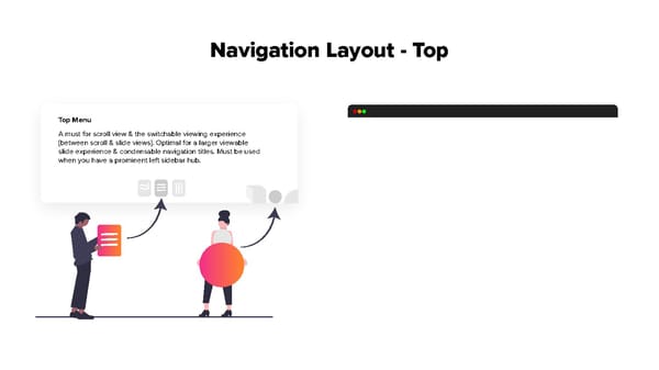
Navigation Layout - Top Top Menu A must for scroll view & the switchable viewing experience [between scroll & slide views]. Optimal for a larger viewable slide experience & condensable navigation titles. Must be used when you have a prominent left sidebar hub.
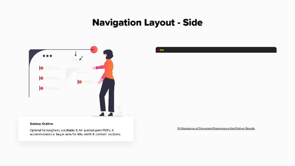
Navigation Layout - Side Sidebar Outline 10 Signatures of Document Experiences that Deliver Results Optimal for longform, scrollable & A4 portrait print PDFs. It accommodates a larger area for title, width & content sections.
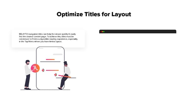
Optimize Titles for Layout RELAYTO navigation titles can help the viewer quickly & easily find the desired content page. To achieve this, titles must be condensed to fit into a digestible reading experience, especially, in the Top Menu where you have limited space.
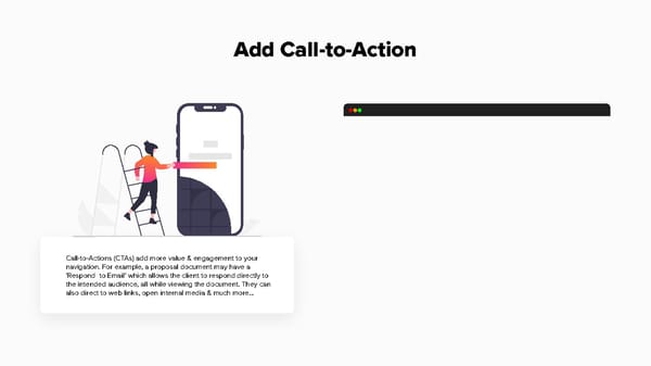
Add Call-to-Action Call-to-Actions (CTAs) add more value & engagement to your navigation. For example, a proposal document may have a ‘Respond to Email’ which allows the client to respond directly to the intended audience, all while viewing the document. They can also direct to web links, open internal media & much more...
Add Icons to Key Areas RELAYTO has the capability to add any PNG icon to both navigation views. This practice can improve the overall look & feel of navigating through the experience, along with clearly distinguishing the sections of the document.
