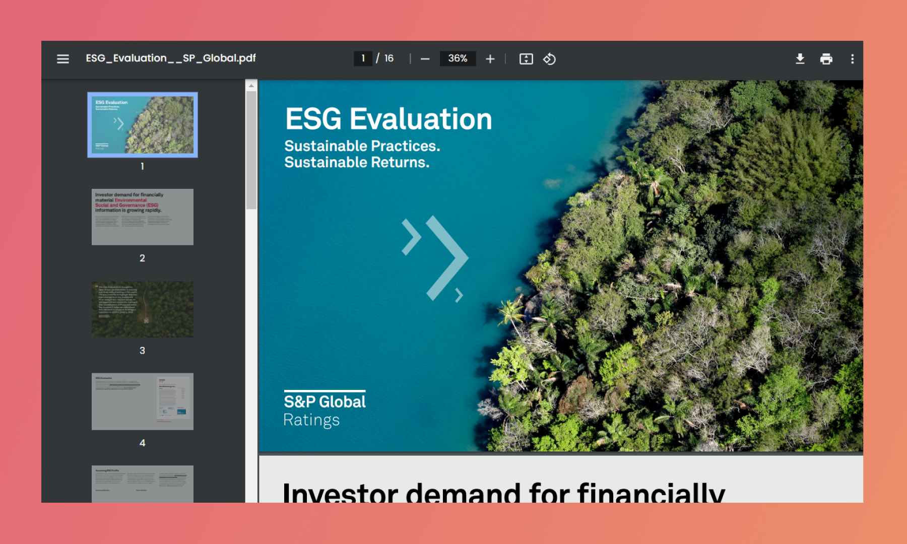
Think of your PDF as a starting point, not the end result. Take advantage of the possibilities that an interactive document experience offers. You can enrich medias, links and animations and maximize the impact of your ideas.
Choose 16:9 Aspect Ratio
Using a wider aspect ratio like 16:9 prevents a cramped feeling typically associated with zoomed-in PowerPoint slides. Also, maintain consistent padding around the edges of your slides. This creates a clean and uncluttered look, making it easier for viewers to focus on your content.
💡 Tips: To understand it better, please read Best Performance Guide
.gif)
Click here to view the experience being shown.
Keep Slides Clear and Concise
The bulky text makes it hard for viewers to read, especially on smaller screens. They shouldn't have to zoom in and out constantly. But less text keeps viewers focused on your message and presentation, not struggling to decipher slides.
.gif)
Click here to view the experience being shown.
Leave Empty Space for Interactivities
RELAYTO allows you to add videos, images, and other interactive elements within the platform itself; leaving some breathing room between text and visuals can enhance readability.
While you don't need pre-planned spaces, consider the layout to ensure smooth visual flow between text and interactive components.
.gif)
Avoid Blank Spaces on the PDF
It's essential to ensure that your content remains engaging and informative, even after it's downloaded.
✅ For media. Instead of leaving blank pages where you plan to add interactive elements like videos, embed the same media or a link to the media directly into your PDF. This way, when someone downloads the PDF, they won’t be faced with a blank page but will have access to the media, maintaining the context and enhancing the experience.
✅ For background videos. Ensure you add a corresponding background image in the PDF version. This ensures that when the PDF is downloaded, users won’t encounter a white space but will see a relevant image that conveys the intended message.
RELAYTO offers a powerful feature that allows you to maintain two different versions of your PDF: one for the online interactive experience and one for download. This flexibility enhances how you share and present your content.
💡 Tips: To understand it better, please read A Complete Guide on Downloading Features

Use Hyperlinks
RELAYTO automatically detects hyperlinks within your experience, turning them into clickable elements. You can add links to webpages, videos, and documents and it will open as widgets on the screen.
💡 Tips: To understand it better, please read How to Use Immersive Links
.gif)
Use Big Fonts
Larger fonts make it easier for viewers to read your content, especially on smaller screens or for those with visual impairments. This ensures your message is clear and accessible to a wider audience. The recommended minimum font size is 18px.
.gif)
Click here to view the experience being shown.
Add Bookmarks
RELAYTO's AI automatically detects bookmarks you've added to your PDFs and uses them to create a built-in navigation system within the experience.
💡 Tips: To understand it better, please read A Complete Guide on Navigation
.gif)
Stick to Linear Gradients
While RELAYTO can handle some gradients, linear gradients (smooth color transitions in a straight line) are the most reliable choice.
Transparency effects within your PDF might not translate perfectly. To avoid unexpected outcomes, it's recommended to flatten any transparency before uploading it. This ensures your desired gradient effect appears correctly in the experience.
.gif)
Ditch the Footers
Removing footers creates a cleaner and more streamlined layout, allowing your content to take center stage. Without page numbers interrupting the flow, viewers can focus more easily on your content and absorb your message.
.gif)
Separate Elements for Animation
Instead of using flat images in your PDF, consider creating the elements within your design software as separate objects. This allows you to import them individually into RELAYTO.
With separate elements, our AI Animator shines! It can analyze these individual components and generate custom animations for each one, bringing your content to life.
💡 Tips: To understand it better, please read How to Use Auto-animations
.gif)
Reduce File Size
✅ Web-Friendly Format. When exporting your initial PDF, choose a "web-optimized" option if available. This reduces file size without sacrificing significant quality, which is perfect for online delivery.
✅ High-resolution images are great for print, but for online content, using lower resolutions can significantly reduce file size without a noticeable drop in quality for most viewers.
✅ Color Profile. Ensure your colors are converted to the sRGB color profile, a standard format widely used on the web. This helps maintain color consistency across different devices.
If your document is still too large, consider splitting it into smaller, more focused sections.
💡 Tips: To understand how to create a hub, please read A Complete Guide on Hubs
Optimal Size of Documents:
Great - 10mb for every 50 pages
Normal - 20-30mb for every 50 pages
Poor - 50mb+ for every 50 pages
.gif)
Related Articles:
🔍 How to change the view of your content
Thank you for joining us in this tutorial! If you have any questions or need help, feel free to email us at support@relayto.com or book a call here.