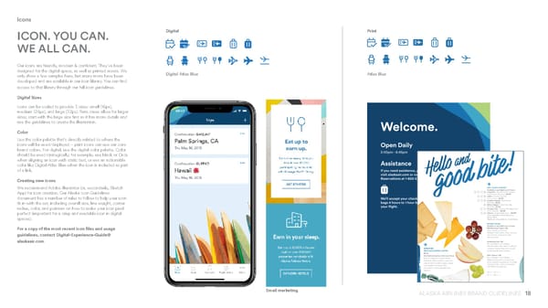
18 ALASKA AIRLINES BRAND GUIDELINES Icons ICON. YOU CAN. WE ALL CAN. Our icons are friendly, modern & confident. They’ve been designed for the digital space, as well as printed assets. We only show a few samples here, but many more have been developed and are available in our icon library. You can find access to that library through our full icon guidelines. Digital Sizes Icons can be scaled to provide 3 sizes: small (16px), medium (24px), and large (32px). Rare cases allow for larger sizes; start with the large size first as it has more details and use the guidelines to create the illustration. Color Use the color palette that’s directly related to where the icons will be used/displayed – print icons can use our core brand colors. For digital, use the digital color palette. Color should be used strategically; for example, use black or Orca when aligning an icon with static text, or use an actionable color like Digital Atlas Blue when the icon is included as part of a link. Creating new icons We recommend Adobe Illustrator (or, secondarily, Sketch App) for icon creation. Our Alaska Icon Guidelines document has a number of rules to follow to help your icon fit in with the set, including overall size, line weight, corner radius, color, and pointers on how to make your icon pixel perfect (important for a crisp and readable icon in digital spaces). For a copy of the most recent icon files and usage guidelines, contact Digital-Experience-Guide@ alaskaair.com Digital Print Atlas Blue Digital Atlas Blue Email marketing
 Alaska Airlines Brand Book Page 17 Page 19