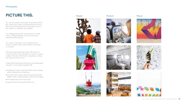
17 ALASKA AIRLINES BRAND GUIDELINES Photography PICTURE THIS. Our world is positive and bright. It’s honest but finds the colorful and modern elements of the real world. We would like to freeze-frame happiness all over in the most local, authentic way possible. Our photography should reach beyond our brand colors, adding brightness, vibrancy and overall happiness to the layouts. Our world is not plastic, overly stylized, dark or surreal. It doesn’t have posed models. It isn’t busy or complex. We show people exploring places. We show our product in natural use. We show our places in unique context. We leave a little to the imagination, inviting the viewer to explore more. Contact the Alaska Brand Studio for any photography requests. (Link to photo request brief) • Contextual imagery should be 80% visually resting, with no interference in that area. • Accents in the imagery should be anchored to the bottom of the image and take up 25% of real estate. • All images should use cool colors. • Logos should live above the 25% mark. Product People Places
 Alaska Airlines Brand Book Page 16 Page 18