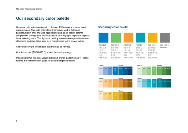
The Alcoa Visual Design System Our secondary color palette Our color palette is a combination of select PMS colors and associated Secondary color palette screen values. The solid colors lend themselves well to full-bleed backgrounds in print and web applications and as an accent color to complement photographs and illustrations or to highlight important aspects in a marketing piece. The lighter-appearing screen values provide a sense of balance and should be used as a complement to the accent colors. Additional screens and shades can be used as needed. Aluminum color (PMS 8400 C) should be used sparingly. Please note that the color values indicated are for guidelines only. Please refer to the Pantone color guide for accurate representation. 8
 Alcoa Brand Book Page 7 Page 9