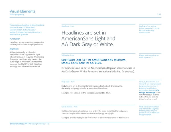
Visual Elements Print Typography 1.12 The American typeface is AmericanSans. Headlines - Print Leading or line spacing It is at the heart of American’s should always be +2 to the identity. Clean, distinctive and text size when using legible, it bridges both contemporary Headlines are set in AmericanSans. and classical qualities. Punctuation AmericanSans Light and Headlines are set in sentence case using correct punctuation and proper nouns. AA Dark Gray or White. Alignment Although typically set flush left, headlines can be aligned flush right Subheads - Print Always set the tracking on when the imagery requires. When using small caps to +75. flush right headlines, align text to the subheads are set in americansans medium, outer edge of American Airlines in the small caps and in aa blue. logo, not the Flight Symbol. Headlines and copy should never be centered. Or subheads can be set in AmericanSans Regular, sentence case in AA Dark Gray or White for non-transactional ads (i.e., fare/route). Body Copy - Print Callouts, Brand terms and keywords can be emphasized Body Copy is set in AmericanSans Regular and in AA Dark Gray or white. by setting them in -line in Generally, body copy is half the point size of headlines. AmericanSans Medium and AA Blue. Example: LGA, Chicago, AAdvantage. If the Example: Text size is 9 pt, the line spacing should be 11 pt. rest of the copy is reversed out in white, the callouts should be white as well. Call to Actions - Print URLS are set all lowercase and in the same weight as Call to Actions are set sentence case and in the same weight as the body copy. the body copy. They are They can be placed in-line or below the body copy paragraph. placed in-line or below the body paragraph. Example: Donate today on aa.com/joinus or aa.com/newplanes or #newplanes © American Airlines, 2015 Advertising Guidelines, v 3.0
 American Airlines Brand Book Page 15 Page 17