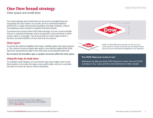
One Dow brand strategy DOW RESTRICTED Clear space and small sizes Our brand strategy and investments are focused on strengthening and supporting One Dow brand. As a result, all of our individual initiatives 1/2 X = clear space benefit from a single strong brand reputation and high credibility, without the additional costs needed to establish individual brands. To preserve the impact of the DOW Diamond logo, it is only used to identify X Dow as a complete enterprise, and is not placed in close proximity to other words, logos or messages. This ensures that our iconic logo remains a timeless, powerful identifier of Dow and of all we achieve. Clear space To ensure the optimum legibility of the logo, maintain ample clear space around NOTE: The DOW Diamond used with the with the notch configuration is no longer for general use, but limited to Dow it. The minimum recommended clear space is one-half the height of the DOW signage and other special brand applications upon approval Diamond, represented at right by the white area surrounding the Diamond. Do not place the brandline, type or graphic elements within this clear space. Using the logo at small sizes The DOW Diamond: words in text To maintain brand integrity, be sure that the logo stays legible when small. Whenever we talk about the DOW Diamond in text, the word DOW Best practice is to review the logo in real-world media, such as in a printed is always in ALL Caps, and the word Diamond is initial capped. test and on-screen at various screen resolutions. Do not copy logos directly from these guidelines. Always use the approved digital artwork files available from the Brand Center. Contents | The DOW Diamond | Brandline | Logo and brandline together | Contact us Dow brand summary v2.2 | February 2021 4
 Dow Chemical Brand Book Page 3 Page 5