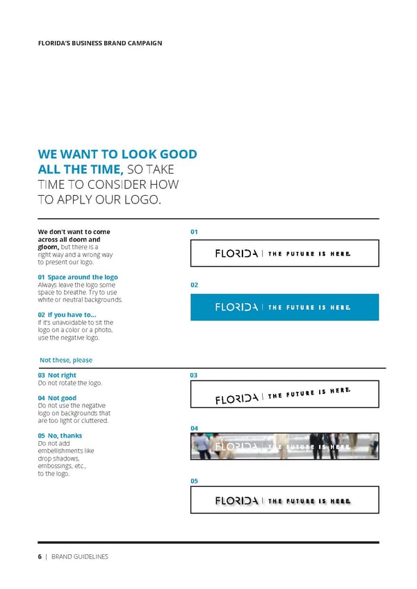
FLORIDA’S BUSINESS BRAND CAMPAIGN WE WANT TO LOOK GOOD ALL THE TIME, SO TAKE TIME TO CONSIDER HOW TO APPLY OUR LOGO. We don’t want to come 01 across all doom and gloom, but there is a right way and a wrong way to present our logo. 01 Space around the logo Always leave the logo some 02 space to breathe. Try to use white or neutral backgrounds. 02 If you have to... If it’s unavoidable to sit the logo on a color or a photo, use the negative logo. Not these, please 03 Not right 03 Do not rotate the logo. 04 Not good Do not use the negative logo on backgrounds that are too light or cluttered. 04 05 No, thanks Do not add embellishments like drop shadows, embossings, etc., to the logo. 05 6 | BRAND GUIDELINES
 Florida Future Is Here Brand Book Page 5 Page 7