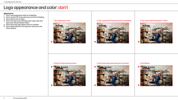
1. Logo appearance and color Logo appearance and color: don’t Appearance 1. Don’t use progressive mark for marketing. 2. Don’t use the HP Corporate blue mark for marketing. 3. Don’t apply color to logos. 1. No Progressive mark. 2. Don’t use the HP Corporate blue for marketing. 3. No colors other than black or white. 4. Don’t mix type color and logo color. Logo color and type color should always match. 5. Don’t place the logo where it has no contrast. 6. Don’t apply effects to the logo (for contrast or any other reason). 4. Don’t mix type and logo colors. 5. Don’t place logo where there is no contrast. 6. No effects. 4 HP Visual Identity 2022
 HP Brand Book Page 3 Page 5