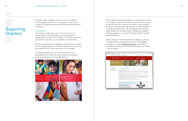
68 JOHNSON & JOHNSON CORPORATE DESIGN STANDARDS VERSION 2.1 69 Graphic Style Our Graphic Style Our graphic style is straightforward, clean, and rich in authentic, When creating the transparency graphic, the resulting color must be Photography warm photography. These are our core design principles, and we manipulated so it appears to be Johnson & Johnson red as closely Color Palette must avoid diluting them by adding unnecessary decorative elements as possible. There are no specific instructions on how to create a Typography and graphics. transparency, because each image may require a different degree Supporting of opacity, and perhaps some color adjustment to the underlying TRANSPARENCY image. Effects such as Normal, Darken, or Multiply vary between ® ® ® ® Graphics Transparency is a meaningful way in which we can enrich our software programs such as Adobe Illustrator , Adobe InDesign , ® ® communications without distracting or conflicting graphics. It Adobe Photoshop . Websites symbolizes the connection Johnson & Johnson has to the lives of the Presentations people we serve, as well as our collaborations and partnerships. When using type on the transparent color, white type is preferred. Our Credo In certain situations, colored text may be used. The highlighted A color may be placed over a photograph using a transparency effect blue text on our website (http://www.jnj.com) is an example of (print and digital applications). Transparent materials may also be used acceptable colored type over the transparency graphic—it is limited to emulate this effect in other applications, such as signage. in use and legible. The preferred transparency color is Johnson & Johnson red. A transparency color effect may only be used over a photograph, never over typography or the Corporate Signature.
 Johnsons & Johnsons Brand Book Page 38 Page 40