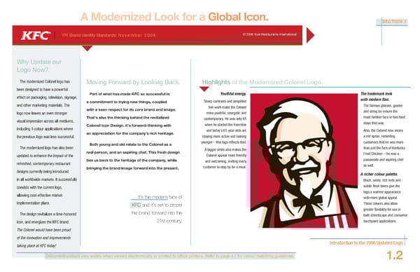
A Modernized Look for a Global Icon. SECTION 1 YRI Brand Identity Standards: November 2006 © 2006 Yum Restaurants International Why Update our Logo Now? The modernized Colonel logo has Moving Forward by Looking Back. Highlights of the Modernized Colonel Logo. been designed to have a powerful effect on packaging, television, signage, Part of what has made KFC so successful is Youthful energy. The trademark look a commitment to trying new things, coupled Sharp contrasts and simplified with modern flair. and other marketing materials. The line work make the Colonel The famous glasses, goatee logo now leaves an even stronger with a keen respect for its core brand and image. more youthful, energetic and and string tie ensure the Thats also the thinking behind the revitalized contemporary. He was only 65 most familiar face in fast food visual impression across all mediums, stays that way. Colonel Icon Design. Its forward-thinking with when he started the franchise including 1-colour applications where and todays 65-year-olds are Also, the Colonel now wears the previous logo was less successful. an appreciation for the companys rich heritage. staying more active and looking a red apron, reminding Both young and old relate to the Colonel as a younger—this logo reflects that. customers that he was more The modernized logo has also been A bigger smile also makes the than just the face of Kentucky updated to enhance the impact of the real person, and an aspiring chef. This fresh design Colonel appear more friendly Fried Chicken—he was a ties us back to the heritage of the company, while and welcoming, inviting every passionate and aspiring chef refreshed, contemporary restaurant as well. bringing the brand image forward into the present. customer to stop by for a meal. designs currently being introduced A richer colour palette. in all worldwide markets. It successfully Black, white, rich reds and coexists with the current logo, subtle flesh tones give the allowing cost-effective market logo a warmer appearance Its the modern face of with more global appeal. implementation plans. KFC and its set to propel These colours also allow the brand forward into the greater flexibility for use in The design revitalizes a time-honored both streetscape and consumer icon, and energizes the KFC brand. 21st century. touchpoint applications. The Colonel would have been proud of the innovation and improvements taking place at KFC today! Introduction to the 2006 Updated Logo DocumenDocumentt colour colours vs ary widely when viewed electronically or printed to office printers. Refer to page 4.1 for colour matching guidelines. 1.2
 KFC Brand Book Page 3 Page 5