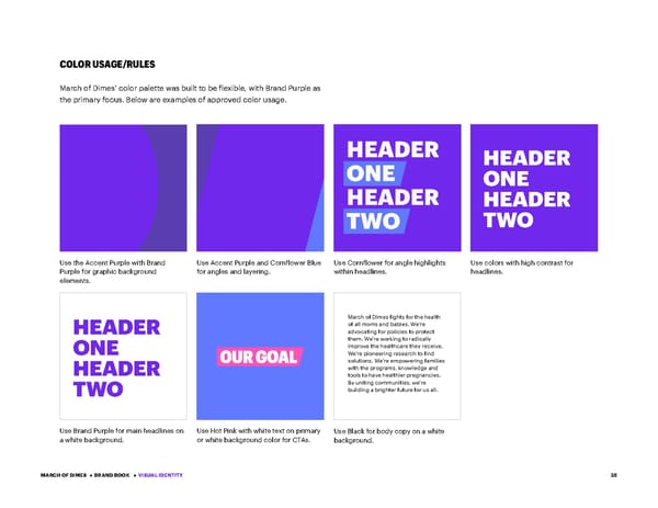
35 COLOR USAGE/RULES March of Dimes’ color palette was built to be flexible, with Brand Purple as the primary focus. Below are examples of approved color usage. Use the Accent Purple with Brand Purple for graphic background elements. Use Brand Purple for main headlines on a white background. Use Accent Purple and Cornflower Blue for angles and layering. Use Hot Pink with white text on primary or white background color for CTAs. Use Cornflower for angle highlights within headlines. Use Black for body copy on a white background. Use colors with high contrast for headlines. March of Dimes fights for the health of all moms and babies. We’re advocating for policies to protect them. We’re working to radically improve the healthcare they receive. We’re pioneering research to find solutions. We’re empowering families with the programs, knowledge and tools to have healthier pregnancies. By uniting communities, we’re building a brighter future for us all. HEADER ONE HEADER TWO HEADER ONE HEADER TWO HEADER ONE HEADER TWO MARCH OF DIMES • BRAND BOOK • VISUAL IDENTITY
 March of Dimes Brand Book Page 34 Page 36