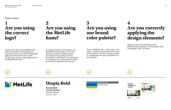
MetLife Visual Identity Guidelines Creative Philosophy 2.5 Issue 1: December 2016 Designer Checklist 1 2 3 4 Are you using Are you using Are you using Are you correctly the correct the MetLife our brand applying the logo? fonts? color palette? design elements? Always use the correct elements of the MetLife design language: our photographic style, Use the color version of the MetLife logo In customer-facing communications, use The core MetLife colors —blue, green, and iconography, colors, and fonts. whenever possible. Use transparent or the MetLife fonts (Utopia and Circular) white— should be the dominant colors on all grayscale versions only when the application whenever possible. In digital media or communications. Use the secondary palette does not permit the full-color version. for internal communications (such as on a limited basis for data visualization or to All other logo versions require approval from PowerPoint® or MS Word®), it is permissible aid navigation. the MetLife brand team. to use Georgia as a replacement for Utopia and Arial as a replacement for Circular. Product Name Product Name Flexible Flexible solutions Utopia Bold for real life solutions for Circular Bold real life Circular Medium Circular Normal Circular Light
 MetLife Brand Book Page 12 Page 14