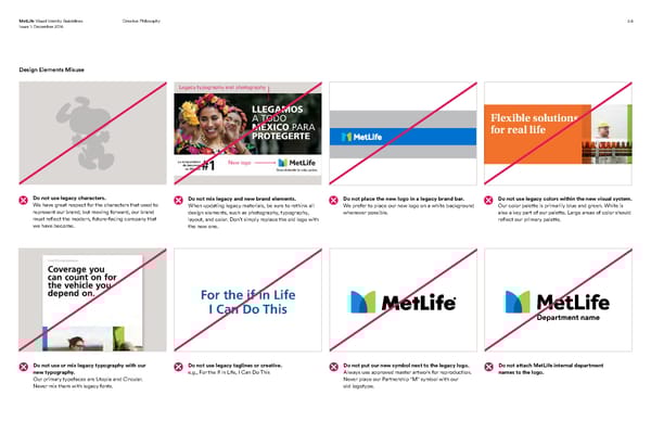
MetLife Visual Identity Guidelines Creative Philosophy 2.6 Issue 1: December 2016 Design Elements Misuse Legacy typography and photography Flexible solutions for real life New logo Do not use legacy characters. Do not mix legacy and new brand elements. Do not place the new logo in a legacy brand bar. Do not use legacy colors within the new visual system. We have great respect for the characters that used to When updating legacy materials, be sure to rethink all We prefer to place our new logo on a white background Our color palette is primarily blue and green. White is represent our brand; but moving forward, our brand design elements, such as photography, typography, whenever possible. also a key part of our palette. Large areas of color should must reflect the modern, future-facing company that layout, and color. Don’t simply replace the old logo with reflect our primary palette. we have become. the new one. For the if in Life I Can Do This Department name Do not use or mix legacy typography with our Do not use legacy taglines or creative. Do not put our new symbol next to the legacy logo. Do not attach MetLife internal department new typography. e.g., For the if in Life, I Can Do This Always use approved master artwork for reproduction. names to the logo. Our primary typefaces are Utopia and Circular. Never place our Partnership "M" symbol with our Never mix them with legacy fonts. old logotype.
 MetLife Brand Book Page 13 Page 15