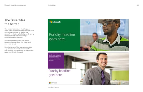
MicrMicrosoosofft visual identity guidelinest visual identity guidelines Content tiles 46 The fewer tiles the better Tiles establish a consistent visual language across all Microsoft brand communications. Tiles form natural structures for placing type, especially on photographic backgrounds, giving Punchy headline us an opportunity to start meaningful conversations with customers. goes here. As useful and memorable as tiles can be, overusing them can dilute their impact and crowd your layout. Limit the number of tiles to as few as possible. A good rule of thumb is to incorporate two tiles, including the cornerstone tile, if applicable. Add a third tile only if needed. Rum quati se eveles volup tas dust, optae eleseditem aces eum repudae voloren duciam cus, nis evente consequi officta inctibus deliq uam. Punchy headline goes here. External web banners
 Microsoft Brand Book Page 48 Page 50