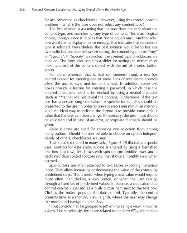
236 Personal Content Experience: Managing Digital Life in the Mobile Age for are presented as checkboxes. However, using this control poses a problem – what if the user does not select any content type? The fi rst solution is assuming that the user does not care about the content type, and searches for any type of content. This is an illogical choice, though, since it implies that “none equals any”. Another solu- tion would be to display an error message that indicates that no content type is selected. Nevertheless, the best solution would be to fi rst use two radio buttons (see below) for setting the content type to be “Any” or “Specify”. If “Specify” is selected, the content type checkboxes are enabled. The form also contains a slider for setting the minimum or maximum size of the content object with the aid of a radio button group. For alphanumerical (that is, text or numbers) input, a text box control is used for entering one or more lines of text. Some controls allow the user to style and format the text. In addition, some text boxes provide a feature for entering a password, in which case the entered characters need to be masked by using a neutral character (such as “*”) that will not reveal the content. Furthermore, if the text box has a certain range for values or specifi c format, this should be presented to the user in order to prevent errors and minimize memory load. An ideal way to indicate the format is to provide some default value that the user can then change. If necessary, the user input should be validated and in case of an error, appropriate feedback should be given. Radio buttons are used for choosing one selection from among many options. Should the user be able to choose an option indepen- dently of others, checkboxes are used. Text input is required in many tasks. Figure 6-19 illustrates a special case: controls for date entry. A date is entered by using a formatted text box (top row), text boxes with spin buttons (middle row), and a dedicated date control (bottom row) that shows a monthly view when opened. Spin-buttons are often attached to text boxes expecting numerical input. They allow increasing or decreasing the value of the control by predefi ned steps. This is useful when typing a new value would require more effort than clicking a spin button, or when the user can go through a fi xed set of predefi ned values. In essence, a dedicated date control can be visualized as a push button right next to the text box. Clicking the button pops up the date control. Typically, the control presents time as a monthly view (a grid), where the user may change the month and navigate across days. Input controls may be grouped together into a single view, known as a form. Not surprisingly, forms are related to the form fi lling interaction
 Personal Content Experience Page 259 Page 261