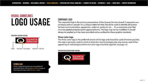
INTRODUCTION / BRANDING / MESSAGING & WRITING / VISUAL GUIDELINES / OPERATING UNIT VISUAL GUIDELINES / ELEMENTS OF DESIGN / RESOURCES / LEGAL / QUICK LINKS / CONTACT INFORMATION VISUAL GUIDELINES CORPORATE LOGO The corporate logo is the primary presentation of the Quanta Services brand. It represents our LOGO USAGE company and our people. It’s a unique trademark that should be used to identify all Quanta Services communications, equipment, uniforms, products, etc… It’s a corporate asset that must be applied properly and in approved forms. The logo may not be modified. It should always be applied as it has been provided and as outlined in these graphic standards. PROPER COLOR USAGE: Three-color logo The three-color logo is the preferred version of the logo and should be used whenever possible. The logo is generally used on white or black but neutral backgrounds may also be used. When appearing on red background the one color logo should be applied (see page 15). Black Pantone® 1235 yellow Pantone® 1795 red PROPER BACKGROUND USAGE: DOWNLOAD Various corporate logo formats are available for download. Please visit the MarCom Qportal page to find Corporate Logos under Pictures > Logos. PAGE 14
 Quanta Services Brand Book Page 13 Page 15