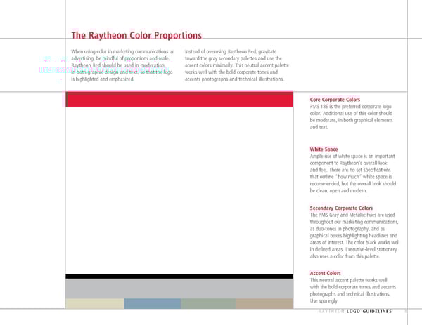
The Raytheon Color Proportions When using color in marketing communications or Instead of overusing Raytheon Red, gravitate advertising, be mindful of proportions and scale. toward the gray secondary palettes and use the Raytheon Red should be used in moderation, accent colors minimally. This neutral accent palette in both graphic design and text, so that the logo works well with the bold corporate tones and is highlighted and emphasized. accents photographs and technical illustrations. Core Corporate Colors PMS 186 is the preferred corporate logo color. Additional use of this color should be moderate, in both graphical elements and text. White Space Ample use of white space is an important component to Raytheon’s overall look and feel. There are no set specifications that outline “how much” white space is recommended, but the overall look should be clean, open and modern. Secondary Corporate Colors The PMS Gray and Metallic hues are used throughout our marketing communications, as duo-tones in photography, and as graphical boxes highlighting headlines and areas of interest. The color black works well in defined areas. Executive-level stationery also uses a color from this palette. Accent Colors This neutral accent palette works well with the bold corporate tones and accents photographs and technical illustrations. Use sparingly. RAYTHEON LOGO GUIDELINES 8
 Raytheon Brand Book Page 8 Page 10