Raytheon Brand Book
Raytheon Brand Guidelines
Raytheon Logo Guidelines October 2013, 4.0 © 2013 Raytheon Company. All rights reserved. “Customer Success Is Our Mission” is a registered trademark of Raytheon Company.
The Raytheon logo is the core component of our corporate identity system. It creates a distinctive graphic presence for our company and serves as an instantly recognizable visual cue for customers. Along with our tagline, Customer Success Is Our Mission, the Raytheon logo is our unique visual signature. Raytheon Logo Guidelines Tools to Control the Brand . . . . . . . . . . . . . . . . . . . . . . . . . . . 2 Components of Our Brand . . . . . . . . . . . . . . . . . . . . . . . . . . . 3 The Power of Our Positioning . . . . . . . . . . . . . . . . . . . . . . . . 4 The Raytheon Logo . . . . . . . . . . . . . . . . . . . . . . . . . . . . . . . . . 5 The Raytheon Color Palette . . . . . . . . . . . . . . . . . . . . . . . . . . 7 The Raytheon Color Proportions . . . . . . . . . . . . . . . . . . . . . . 8 The Raytheon Logo Clearspace and Sizing . . . . . . . . . . . . . . . 9 Logo Violations . . . . . . . . . . . . . . . . . . . . . . . . . . . . . . . . . . . 10 Co-branded Initiatives . . . . . . . . . . . . . . . . . . . . . . . . . . . . . . 11 Business Lockups . . . . . . . . . . . . . . . . . . . . . . . . . . . . . . . . . . 12 Internal Branding . . . . . . . . . . . . . . . . . . . . . . . . . . . . . . . . . 13 Product and Program Icons . . . . . . . . . . . . . . . . . . . . . . . . . 14 The Boston Group 10/13. Approved for public release. © 2013 Raytheon Company. All rights reserved. “Customer Success Is Our Mission” is a registered trademark of Raytheon Company. RAYTHEON LOGO GUIDELINES 1
Tools to Control the Brand The Raytheon logo should appear in a specified and Adherence to these standards is mandatory and consistent manner on all marketing and internal should not be interpreted as mere suggestion. communications, from advertising and collateral to Please read these standards, absorb them and use stationery and signage. These guidelines will provide them consistently. By doing so, you will be helping you with the tools that will enable you to maintain the Raytheon brand grow and prosper. the integrity of the Raytheon brand. Our Brand A good brand creates demand; provides a com petitive edge; attracts and retains customers; unites and empowers employees; focuses communications, decisions and actions; sets performance standards; and illustrates corporate goals and perspectives. Our brand is one of our most valuable assets and encompasses all parts of the company. It represents who we are, what we stand for, and why customers should be loyal to us. The Raytheon brand comprises the many interactions (visual, verbal, personal and conceptual) the public has with our people, products and services. Our brand encompasses all of these interactions, from our positioning statement and communications personality all the way through our approach — providing systems, products and services. For help, contact your Business communications VP or you may contact corporate_identity@raytheon.com. All marketing literature requires customer approval prior to publication and distribution. RAYTHEON LOGO GUIDELINES 2
Components of Our Brand A brand represents the relationship between Strong brands endure, build loyalty and inspire a company and its customers. A brand reflects the confidence. Research demonstrates that strong images, ideas, values and behaviors that define brands have significantly higher shareholder value. who we are and how we’re different. Our brand makes a promise, which we express with our identity and prove with our performance. Our Brand A brand has several components that make it distinct, strong and memorable. Our corporate logo works in conjunction with the verbal messages we convey, our business positioning, and our relationships with our employees and partners. The brand also is embodied in the marketing communications we produce. The Raytheon Logo The Raytheon identity displays strength and unique character. The logotype is bold and the letters are unique and should not be substituted. Tagline Our tagline, Customer Success Is Our Mission, is the public shorthand expression of our promise and intentions — a unique maxim in our market. Like our positioning, our tagline focuses first on the value we return to our customers, rather than on the actual products and services we provide. Corporate Positioning The Raytheon positioning statement is a clear, brief statement of our value proposition, target audience and market positioning. All communications, products and services should be formulated within this context. Brand Attributes Brand attributes differentiate Raytheon from our competitors and represent our corporate personality. Brand Colors Raytheon has an approved color palette for use in all marketing communications. Using the palette makes our brand consistent and unique, and strengthens identity. RAYTHEON LOGO GUIDELINES 3
The Power of Our Positioning The Raytheon positioning statement is a clear, Anything that doesn’t reflect and reinforce our brief statement of our value proposition, target brand positioning is potentially off-message. audience and market positioning. The role of This does not mean that these exact words must our positioning statement is to serve as a point be used in every communication. Rather, this is of reference for the company. what we want customers to think — and say — about us. Brand Attributes Forthright Brand attributes differentiate Raytheon from our competitors and represent Raytheon is widely recognized as a responsible, ethical corporate citizen. our corporate personality. They’re the words we want customers to use We adhere to the highest standards of integrity and honesty in our when they describe us. communications with employees, customers and business partners. Pioneering Precise Raytheon’s heritage of innovation and invention is unparalleled. Our Raytheon technology is repeatedly chosen for critical situations where lives technology continues to serve as a catalyst for smarter, faster and more depend on exact performance and error-free protection. We are committed powerful systems. to continuous process improvement through the lifetime of our contracts Astute and products. Raytheon thinks three moves ahead to anticipate technology that aligns Confident with the rapidly changing defense and aerospace landscape. Customers can be confident in their choice to work with Raytheon. Collaborative We have all the right ingredients for stable operations and positive Raytheon works in close partnership with customers to leverage our financial growth. specialized technology and experience to create integrated solutions that meet their exact specifications. RAYTHEON LOGO GUIDELINES 4
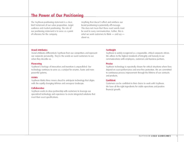
The Raytheon Logo Laurence K. Marshall and Vannevar Bush, along Because of the success of the Raytheon radio tube, Historical involvement in the development and with scientist Charles G. Smith, founded Raytheon company officials elected to extend the use of creation of then-new technologies such as Company in Cambridge, Mass., as the American the name to describe the entire organization, and magnetron tubes, shipboard radar, microwave Appliance Company in 1922. In 1925, an Indiana the company’s name was changed to Raytheon cooking and guided missiles has seen the company made it known that it held prior claim Manufacturing Company. Raytheon name come to stand for a company that to that name. “Ray” from rai, French for “a beam of light” excels in the development of new technologies. “theon” from Greek for “from the gods” Customized Logo Distinctive, bold letterforms, letterspacing and ligatures. Tagline Lockup Our tagline, Customer Success Is Our Mission, defines the brand and is the core of the brand identity. This line, along with the Raytheon logo, embodies the personality of the Raytheon brand and should appear as the sign-off line for all advertising and most marketing communications vehicles. This includes: print advertising, the initial slide of presentations, sign-off on back pages of collateral, and trade show signage. A footnote should appear at the end of any document referencing this mark: Customer Success Is Our Mission is a trademark of Raytheon Company. Color To ensure consistency, use the established logo-tagline versions. Color is a vital part of the Raytheon visual Do not re-create the combined logo-taglines. Never separate the tagline identity. It connotes power and integrity. from the logo. The preferred expression of the logo ® is in full color using Pantone Matching System (PMS) 186. RAYTHEON LOGO GUIDELINES 5
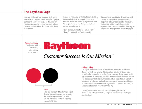
The Raytheon Logo: CONTINUED Preferred Version Whenever possible, the PMS 186 version of the logo should be used. However, there may be instances when the 186 logo is not visually compatible with the overall design or the specific medium being used. Alternate Versions When the PMS 186 logo is not visually compatible with the overall design or the specific medium being used, the logo may be used in one of three acceptable color variations. Black This option is for use in black-and-white advertising and in applications where use of the preferred PMS 186 would conflict with the overall context. White This is also known as “reversed out.” This option works well when background tonal values are 50 percent black or darker. PMS Cool Gray 10 This is used only for executive-level stationery. It is not to appear in marketing or advertising materials. RAYTHEON LOGO GUIDELINES 6
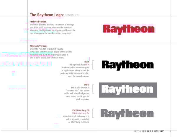
The Raytheon Color Palette Consistent use of color can help build strong Color is one of the most powerful identifying Integral to the Raytheon brand identity is its brand recognition, leaving the impression, through elements, often the first attribute perceived, primary color — Raytheon Red, otherwise known association, that an organization can “own” a and when used consistently and correctly, as PMS 186. Whenever possible, the Raytheon logo specific color. The Raytheon PMS 186 was selected can help build strong brand recognition. should be reproduced using PMS 186. for its clarity, strength and distinctiveness. Core Corporate Colors Accent Colors PMS 5425 c30, m4, y0, k31 r124, g150, b161 hex #7C96A1 Raytheon Red Black Brilliant White PMS 5635 PMS 186 c0, m0, y0, k100 c0, m0, y0, k0 c13, m0, y18, k33 c0, m100, y81, k4 r0, g0, b0 r255, g255, b255 r149, g162, b137 r206, g17, b38 hex #000000 hex #FFFFFF hex #95A289 hex #CE1126 Secondary Corporate Colors PMS 7530 c0, m8, y21, k32 r172, g159, b137 hex #AC9F89 PMS 453 c14, m10, y27, k0 PMS Cool Gray 10 PMS Cool Gray 5 PMS 877 Metallic* r218, g217, b173 c0, m2, y0, k60 c0, m0, y0, k29 hex #DAD9AD r102, g100, b101 r181, g181, b181 * for use on high-level corporate marketing materials hex #666465 hex #B5B5B5 RAYTHEON LOGO GUIDELINES 7
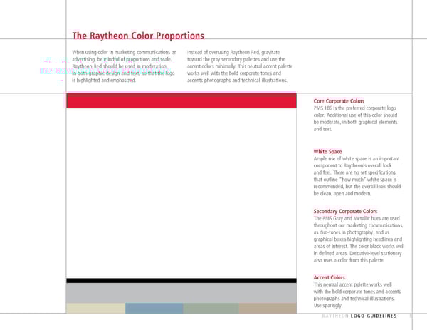
The Raytheon Color Proportions When using color in marketing communications or Instead of overusing Raytheon Red, gravitate advertising, be mindful of proportions and scale. toward the gray secondary palettes and use the Raytheon Red should be used in moderation, accent colors minimally. This neutral accent palette in both graphic design and text, so that the logo works well with the bold corporate tones and is highlighted and emphasized. accents photographs and technical illustrations. Core Corporate Colors PMS 186 is the preferred corporate logo color. Additional use of this color should be moderate, in both graphical elements and text. White Space Ample use of white space is an important component to Raytheon’s overall look and feel. There are no set specifications that outline “how much” white space is recommended, but the overall look should be clean, open and modern. Secondary Corporate Colors The PMS Gray and Metallic hues are used throughout our marketing communications, as duo-tones in photography, and as graphical boxes highlighting headlines and areas of interest. The color black works well in defined areas. Executive-level stationery also uses a color from this palette. Accent Colors This neutral accent palette works well with the bold corporate tones and accents photographs and technical illustrations. Use sparingly. RAYTHEON LOGO GUIDELINES 8
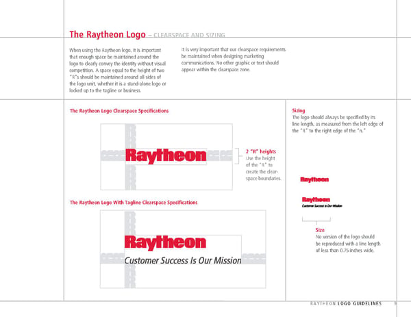
The Raytheon Logo – CLEARSPACE AND SIZING When using the Raytheon logo, it is important It is very important that our clearspace requirements that enough space be maintained around the be maintained when designing marketing logo to clearly convey the identity without visual communications. No other graphic or text should com petition. A space equal to the height of two appear within the clearspace zone. “R”s should be maintained around all sides of the logo unit, whether it is a stand-alone logo or locked up to the tagline or business. The Raytheon Logo Clearspace Specifications Sizing The logo should always be specified by its line length, as measured from the left edge of the “R” to the right edge of the “n.” 2 “R” heights Use the height of the “R” to create the clear- space boundaries. The Raytheon Logo With Tagline Clearspace Specifications Size No version of the logo should be reproduced with a line length of less than 0.75 inches wide. RAYTHEON LOGO GUIDELINES 9
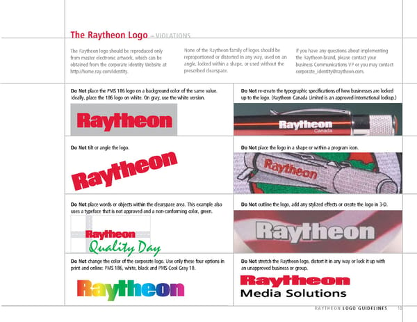
The Raytheon Logo – VIOLATIONS The Raytheon logo should be reproduced only None of the Raytheon family of logos should be If you have any questions about implementing from master electronic artwork, which can be reproportioned or distorted in any way, used on an the Raytheon brand, please contact your obtained from the corporate identity Website at angle, locked within a shape, or used without the business Communications VP or you may contact http://home.ray.com/identity. prescribed clearspace. corporate_identity@raytheon.com. Do Not place the PMS 186 logo on a background color of the same value. Do Not re-create the typographic specifications of how businesses are locked Ideally, place the 186 logo on white. On gray, use the white version. up to the logo. (Raytheon Canada Limited is an approved international lockup.) Do Not tilt or angle the logo. Do Not place the logo in a shape or within a program icon. Do Not place words or objects within the clearspace area. This example also Do Not outline the logo, add any stylized effects or create the logo in 3-D. uses a typeface that is not approved and a non-conforming color, green. Quality Day Do Not change the color of the corporate logo. Use only these four options in Do Not stretch the Raytheon logo, distort it in any way or lock it up with print and online: PMS 186, white, black and PMS Cool Gray 10. an unapproved business or group. RAYTHEON LOGO GUIDELINES 10
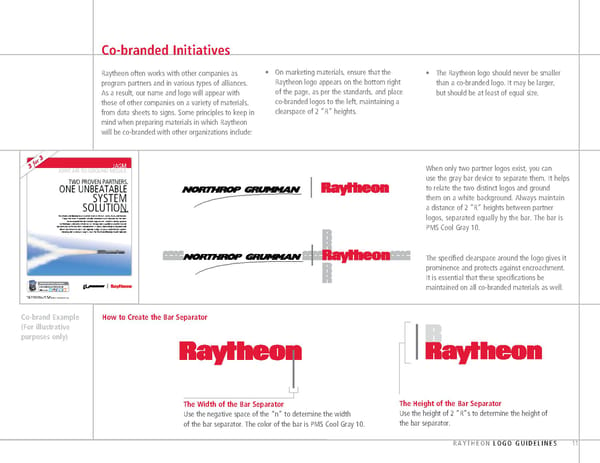
Co-branded Initiatives Raytheon often works with other companies as • On marketing materials, ensure that the • The Raytheon logo should never be smaller program partners and in various types of alliances. Raytheon logo appears on the bottom right than a co-branded logo. It may be larger, As a result, our name and logo will appear with of the page, as per the standards, and place but should be at least of equal size. those of other companies on a variety of materials, co-branded logos to the left, maintaining a from data sheets to signs. Some principles to keep in clearspace of 2 ”R” heights. mind when preparing materials in which Raytheon will be co-branded with other organizations include: 3 or ™ f JAGM 3 JOINT AIR-TJOINT AIR-TOO-GROUND -GROUND MMISSILEISSILE When only two partner logos exist, you can TWO PROVEN PARTNERS. use the gray bar device to separate them. It helps ONE UNBEATABLE to relate the two distinct logos and ground SYSTEM them on a white background. Always maintain . a distance of 2 ”R” heights between partner SOLUTION Raytheon and Boeing have teamed to offer the U.S. Army, Navy and Marine Corps the most affordable, reliable and lowest-risk solution for the Joint logos, separated equally by the bar. The bar is Air-to-Ground Missile (JAGM) requirement. JAGM’s combat-proven technologies and unmatched aircraft integration capabilities enable trusted performance in the harshest environments — plus a lower logistics burden and PMS Cool Gray 10. lower total lifecycle costs. For superior range, accuracy and lethality against moving and stationary targets, trust the Raytheon/Boeing JAGM solution. The specified clearspace around the logo gives it prominence and protects against encroachment. It is essential that these specifications be INNOVATION IN ALL DOMAINS www.raytheon.com | Keyword: Jag1 maintained on all co-branded materials as well. Follow us on: © 2011 Raytheon Company. All rights reserved. “Customer Success Is Our Mission” is a registered trademark of Raytheon Company. APPROVAL Co-brand Example How to Create the Bar Separator (For illustrative purposes only) The Width of the Bar Separator The Height of the Bar Separator Use the negative space of the “n” to determine the width Use the height of 2 ”R”s to determine the height of of the bar separator. The color of the bar is PMS Cool Gray 10. the bar separator. RAYTHEON LOGO GUIDELINES 11
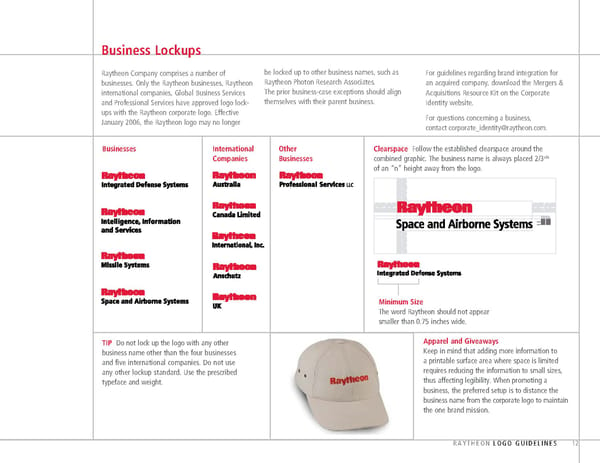
Business Lockups Raytheon Company comprises a number of be locked up to other business names, such as For guidelines regarding brand integration for businesses. Only the Raytheon businesses, Raytheon Raytheon Photon Research Associates. an acquired company, download the Mergers & international companies, Global Business Services The prior business-case exceptions should align Acquisitions Resource Kit on the Corporate and Professional Services have approved logo lock- themselves with their parent business. Identity website. ups with the Raytheon corporate logo. Effective For questions concerning a business, January 2006, the Raytheon logo may no longer contact corporate_identity@raytheon.com. Businesses International Other Clearspace Follow the established clearspace around the rds Companies Businesses combined graphic. The business name is always placed 2/3 of an “n” height away from the logo. Minimum Size The word Raytheon should not appear smaller than 0.75 inches wide. TIP Do not lock up the logo with any other Apparel and Giveaways business name other than the four businesses Keep in mind that adding more information to and five international companies. Do not use a printable surface area where space is limited any other lockup standard. Use the prescribed requires reducing the information to small sizes, typeface and weight. thus affecting legibility. When promoting a business, the preferred setup is to distance the business name from the corporate logo to maintain the one brand mission. RAYTHEON LOGO GUIDELINES 12
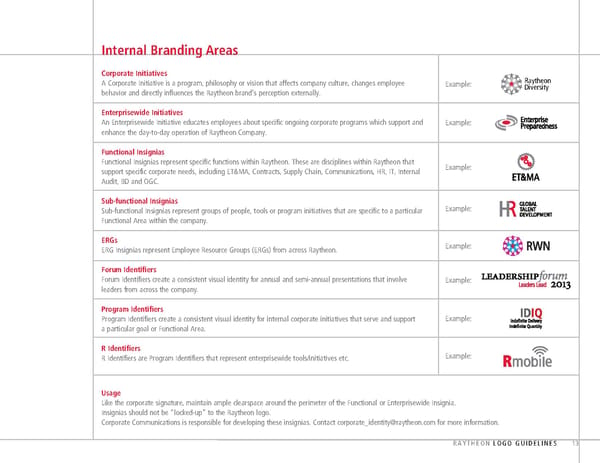
Internal Branding Areas Corporate Initiatives A Corporate Initiative is a program, philosophy or vision that affects company culture, changes employee Example: Raytheon behavior and directly influences the Raytheon brand’s perception externally. Diversity Enterprisewide Initiatives An Enterprisewide Initiative educates employees about specific ongoing corporate programs which support and Example: enhance the day-to-day operation of Raytheon Company. Functional Insignias Functional Insignias represent specific functions within Raytheon. These are disciplines within Raytheon that Example: support specific corporate needs, including ET&MA, Contracts, Supply Chain, Communications, HR, IT, Internal Audit, BD and OGC. Sub-functional Insignias Sub-functional Insignias represent groups of people, tools or program initiatives that are specific to a particular Example: Functional Area within the company. ERGs Example: ERG Insignias represent Employee Resource Groups (ERGs) from across Raytheon. Forum Identifiers Forum Identifiers create a consistent visual identity for annual and semi-annual presentations that involve Example: leaders from across the company. Program Identifiers Program Identifiers create a consistent visual identity for internal corporate initiatives that serve and support Example: a particular goal or Functional Area. R Identifiers R Identifiers are Program Identifiers that represent enterprisewide tools/initiatives etc. Example: Usage Like the corporate signature, maintain ample clearspace around the perimeter of the Functional or Enterprisewide Insignia. Insignias should not be “locked-up” to the Raytheon logo. Corporate Communications is responsible for developing these insignias. Contact corporate_identity@raytheon.com for more information. RAYTHEON LOGO GUIDELINES 13
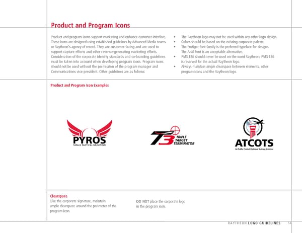
Product and Program Icons Product and program icons support marketing and enhance customer interface. • The Raytheon logo may not be used within any other logo design. These icons are designed using established guidelines by Advanced Media teams • Colors should be based on the existing corporate palette. or Raytheon’s agency of record. They are customer-facing and are used to • The Frutiger font family is the preferred typeface for designs. support capture efforts and other revenue-generating marketing efforts. The Arial font is an acceptable alternative. Consideration of the corporate identity standards and co-branding guidelines • PMS 186 should never be used on the word Raytheon; PMS 186 must be taken into account when developing program icons. Program icons is reserved for the actual Raytheon logo. should not be used without the permission of the program manager and • Always maintain ample clearspace between elements, other Communications vice president. Other guidelines are as follows: program icons and the Raytheon logo. Product and Program Icon Examples Clearspace Like the corporate signature, maintain DO NOT place the corporate logo ample clearspace around the perimeter of the in the program icon. program icon. RAYTHEON LOGO GUIDELINES 14
