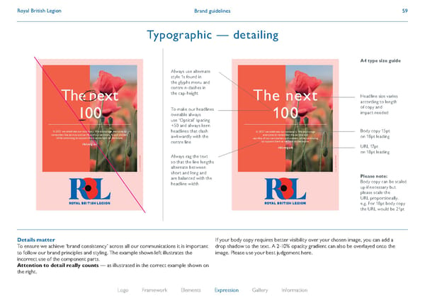
Brand guidelines Royal British Legion 59 Details matter To ensure we achieve ‘brand consistency’ across all our communications it is important to follow our brand principles and styling. The example shown left illustrates the incorrect use of the component parts. Attention to detail really counts — as illustrated in the correct example shown on the right. If your body copy requires better visibility over your chosen image, you can add a drop shadow to the text. A 2-10% opacity gradient can also be overlayed onto the image. Please use your best judgement here. 1921– 2021 Registered charity number: 219279 The next 100 In 2021 we celebrate our centenary. We encourage everyone to remember the service and sacrifice of our servicemen and women, w hile continuing to support them as we look to the future. rbl.org.uk 1921– 2021 Registered charity number: 219279 The next 100 Always use alternate style 1s found in the glyphs menu and centre n-dashes in the cap-height To make our headlines ownable always use ‘Optical’ spacing +50 and always kern headlines that clash awkwardly with the centre line Always rag the text so that the line lengths alternate between short and long and are balanced with the headline width A4 type size guide Headline size varies according to length of copy and impact needed Body copy 15pt on 18pt leading Please note: Body copy can be scaled up if necessary but please scale the URL proportionally. e.g. For 18pt body copy the URL would be 21pt URL 17pt on 18pt leading In 2021 we celebrate our centenary. We encourage everyone to remember the service and sacrifice of our servicemen and women, while continuing to support them as we look to the future. rbl.org.uk Logo Framework Elements Expression Gallery Information 59 Typographic — detailing
 Royal British Legion Brand Book Page 58 Page 60