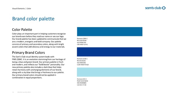
Visual Elements | Color Brand color palette BRAND GUIDELINES 12 Color Palette Color plays an important part in helping customers recognize our brand even before they read our name or see our logo. Our brand palette has been updated to communicate that we are a modern, energetic and bold company. Our palette consists of primary and secondary colors, along with bright accent colors that add vibrancy and energy to our materials. Primary Brand Colors The Sam’s Club visual identity system leads with PMS 2384C. It is an evolution stemming from our heritage of being a blue and green brand. Our primary palette is fresh and modern, and reflects our “bold bestie” personality. Our new primary palette also includes a dark blue that helps retain harmony with unchanging elements of our brand, along with a sky blue that brings a freshness to our palette. Our primary brand colors should not be applied in combination in equal proportions. Pantone 2384 C R0 G103 B160 HEX #0067A0 C96 M60 Y14 K1 Pantone 2146 C R0 G53 B142 HEX #00358E C100 M68 Y0 K20 Pantone 635 C R164 G219 B232 HEX #A4DBE8 C34 M1 Y7 K0
 Sam's Club Brand Book Page 11 Page 13