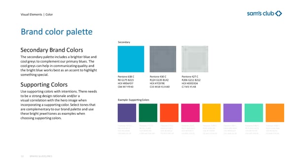
Visual Elements | Color Brand color palette BRAND GUIDELINES 13 Secondary Brand Colors The secondary palette includes a brighter blue and cool greys to complement our primary blues. The cool greys can help in communicating quality and the bright blue works best as an accent to highlight something special . Supporting Colors Use supporting colors with intentions. There needs to be a strong design rationale and/or a visual correlation with the hero image when incorporating a supporting color. Select tones that are complementary to our brand palette and use these bright jewel tones as examples when choosing supporting colors. Pantone 638 C R0 G175 B215 HEX #00AFD7 C84 M7 Y9 K0 Pantone 430 C R124 G135 B142 HEX #7C878E C33 M18 Y13 K40 Pantone 427 C R206 G211 B212 HEX #D0D3D4 C7 M3 Y5 K8 Pantone 7671 C R81 G70 B137 HEX #514689 C83 M81 Y0 K4 Pantone 7727 C R0 G111 B68 HEX #006F44 C100 M0 Y94 K46 Pantone 172 C R250 G70 B22 HEX # FA4616 C0 M73 Y87 K0 Pantone 213 C R227 G28 B121 HEX # DE1B73 C0 M92 Y18 K0 Pantone 7549 C R255 G181 B0 HEX #FFB500 C0 M22 Y100 K2 Pantone 265 C R144 G99 B205 HEX #9063CD C52 M66 Y0 K0 Pantone 3385 C R71 G215 B172 HEX #47D7AC C43 M0 Y28 K0 Pantone 1495 C R225 G143 B28 HEX #FF8F1C C0 M46 Y78 K0 Secondary Example: Supporting Colors
 Sam's Club Brand Book Page 12 Page 14