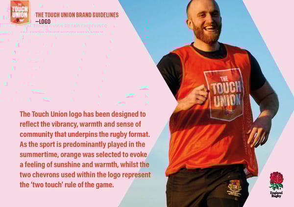
STANDARD LOGO WITH LIGHT KEYLINE – MAIN LOGO STANDARD LOGO WITH ORANGE KEYLINE SECONDARY LOGO THE THE THE THE THE TOUCH UNION BRAND GUIDELINES —LOGO LOGO WITH STRAP – LIGHT KEYLINE LOGO WITH STRAP – LIGHT KEYLINE SECONDARY LOGO WITH STRAP THE THE THE THE WELCOME TO THE SQUAD NON-CONTACT. TOTAL FEEL GOOD WELCOME TO THE SQUAD WELCOME TO THE SQUAD LOGO WITH STRAP – ORANGE KEYLINE LOGO WITH STRAP – ORANGE KEYLINE The Touch Union logo has been designed to THE THE reflect the vibrancy, warmth and sense of NON-CONTACT. TOTAL FEEL GOOD community that underpins the rugby format. WELCOME TO THE SQUAD As the sport is predominantly played in the summertime, orange was selected to evoke a feeling of sunshine and warmth, whilst the two chevrons used within the logo represent the ‘two touch’ rule of the game.
 Touch Union Brand Book Page 5 Page 7