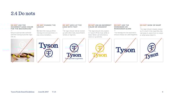
2.4 Do nots DO NOT USE THE DO NOT CHANGE THE DO NOT LOCK UP THE DO NOT USE AN INCORRECT DO NOT USE THE DO NOT SKEW OR WARP INCORRECT LOGO COLOR LOCKUP LOGO WITH TEXT COLOR OR GRADIENT WORDMARK OR — FOR THE BACKGROUND — — — MONOGRAM ALONE The logo should always appear — Maintain the lockup of the The logo should not be locked The logo should only appear — as it is built in the logo files. Do Ensure appropriate contrast monogram and wordmark in up with other text, department in Tyson’s Pride blue, white or The monogram and wordmark not skew it, place it on an angle with the background the logo size and orientation. names or taglines. black. Never use secondary should always be used together. or otherwise distort it. sits on. colors or gradients. Your partner in protein. Tyson Foods Brand Guidelines June 30, 2017 V 1.0 8
 Tyson Foods Brand Book Page 7 Page 9